
Is your landing page converting enough?
If you answered yes to that, great.
But here’s the truth: Your landing page, no matter how good (or bad) it is, can still bring you more businesses if optimized well.
While a bad landing page can kill your conversion rate and slash your business, top-performing landing pages are a marketer’s treat. That’s basically because a high-converting landing page can turn your website into a lead-generating machine, which means increased conversion for you.
So, whether you want to up your sales, increase conversion or boost just any metric, landing pages are the answer.
There’s a catch, however:
To boost conversion, you need to make your landing page as effective as possible.
That’s where Landing Page Optimization (LPO) comes in. By optimizing your landing pages, you can improve the number of website visitors that turn into sales leads or purchasing customers.
Contents
Landing Pages Are Different
All landing pages are not the same. They may differ by intent, niche, product, focus, industry, angle, audience, buy-in, value proposition, purpose, messaging, and by many other elements.
Despite the differences, all conversion-guaranteed landing pages have certain factors in common; there are specific steps to optimizing landing pages that kick butt…
…and to effectively optimize your landing pages, you’d need to follow these steps.
10 Guaranteed Steps to Landing Page Optimization
Step #1. Nail the Headline
The headline can make or break your landing page. When prospects come to your website, the first thing they’ll see is the headline.
But. . .
. . .it can also be the last thing they see if it doesn’t clutch their attention.
With that in mind, the headline of your landing page should be able to capture visitors’ attention quickly.
Recent statistics show that the average attention span of a web user is now a little over 8 seconds.
If you want to achieve high percentage in conversion, you should be able to make use of those first 8 seconds shrewdly. . .
. . .and it all begins at the headline.
Here are some landing page headline best practices to help you write headlines that rock:
- Keep it simple and sweet
- Make it attention-grabbing, specific, and clear
- Let it tell prospects what you’re offering
- Focus on a highly-desirable benefit (that you can provide, of course)
If you’re not bang on writing great headlines, no worries. There are helpful headline template resources like this one and this one available online which you could put to use.
Why should you nail the headline?
Well, a great headline is the first milestone to ensure your landing page’s success.
What harm do mediocre headlines make?
Not offering any engagement, they turn visitors away even if your offer is great.
Depending on your landing page structure and theme, there might be a need for not only the main headline but a supporting headline as well.
Though not needed in every headline, adding a sense of urgency in a headline can improve conversion.
When it comes to landing page optimization, the simple strategy is to make the headline to sell the page—not the product.
You’d have to give users reason to stick around on the page first of all.
So, how then do you sell the product?
It’s through the copy.
Once you can hold prospects attention (through the headline) and draw them into the copy, you can then sell them on your offering.
And that means you’d have to. . .
. . .write conversion-driving copy, our next step.

Step #2. Write Better Copy
Great copy has a way of optimizing conversion. Copy-writing requires some sort of skills to master but that doesn’t mean you can’t learn it.
So, how do you optimize your landing page copy?
Let’s start with the opening.
After the headline, the next most important sentence in your landing page is the opening sentence.
Still considering the 8 seconds average attention span a web user (which is lower than that of a goldfish, by the way), you’d need to impress prospects off their shoes and haul them in with the first few words of the copy…
…users will be turned off if the headline promises gold, but the opening looks opposite.
Great copy helps to make prospects see the benefits that your product offers.
When prospects click on your ad, the first investment they make is of their time put into reading the copy. Your landing page copy should provide prospects with Return on Time Invested; it should be worthwhile to stay on the page.
Without getting their attention through your landing page copy you may not be able to get them to be interested in your product.
Keep the copy consistent with both the headline and the offer you’re making.
Tell them what they need to know, and tell them right away. Don’t make them comb the whole page looking for it, otherwise they’ll leave.
When optimizing your landing page, you might also want to look into the structure and format of the copy.
So, use bullet points.
- It’ll help break the content down into a “digestible form.”
- It’s useful for summarizing benefits
- It’s useful for summarizing features
No blocks of text. Let there be enough white space in the content.
Oh and, use sub-headings too.
Step #3. Use Well-Configured Forms
Most times, conversion is more than just an event…
…it’s a process.
And in the process, you’d have to collect information from leads. This is where forms come in.

Here are some tips on how to optimize your landing page form to convert better:
- Use compelling, benefit-oriented button text
- Do not ask for too much information. Ask for only the information essential for your purpose
- Avoid frictions such as CAPTCHA
- People tend to be reluctant on giving out sensitive information, so you may have to cut down on asking for such details.
Use short forms. To do this, keep both the fields and the spaces between fields to the minimum. For instance, instead of asking for “First Name” in a field, and “Surname” in another field, try merging the two fields together to get something like “Name” or “Full Name.”

Short forms appear to ask for less information that wouldn’t take lots of time to complete, so prospects tend to respond better to them versus long forms.
When it comes to collecting information, the idea is to ease into a relationship with the visitor.
A good landing page should be distraction-free.
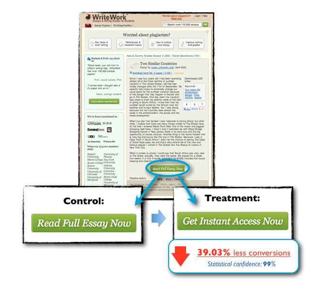
You don’t want prospects to click on other links but on your call-to-action (CTA). A study found that removing links and navigation menus from landing pages can increase conversion.
Yuppiechef, an online food & drink community, saw a 100% increase in conversion after removing links and navigation menus.
Here’s the original page (with navigation menus):

And the variation page (without navigation):

When optimizing your landing page forms, the links to get rid of include:
- Main/top navigation menus
- Sidebars
- Footers
- Ads
- Branding links
- Social media links etc.
Step #5. Use Persuasive Call-to-Action
The call-to-action (CTA) button on your landing page is immensely important because it’s the last thing visitors will interact with in the conversion process.

You want your CTA to convert effectively, right? It’ll be easy to turn ordinary visitors into customers if your CTA is set up properly.
To optimize your call-to-action button, write CTA text that get visitors clicking and choose the right button color.
Changing just a word on a call-to-action button increased conversion by 14.79%
Here’s another one:
Another thing to look at is the number of CTAs you have on a landing page. Visitors may end up taking no action at all if you tell them to do 9 different things on a single page.
So, you have to be specific and focused on one things you want prospects to do.
While being specific and focused is important, also remember to make your CTA as visible and clear as possible.
Let visitors know what they are about to do.
The folks over at My Perfect Resume did a good job with this:

Step #6. Include Great Images
An interesting image on a landing page will help visitors visualize the benefits of the offering made.
It is said that a picture tells a thousand words. This study shows that our brains process images faster than text.
But beyond that…
…a picture can help deliver your message (or at least make your message clearer) to prospects.
Don’t just add images for the sake of doing so, ensure that every image on your landing page communicates an aspect of your product/offer, or at least directs visitors to where you want them to go.
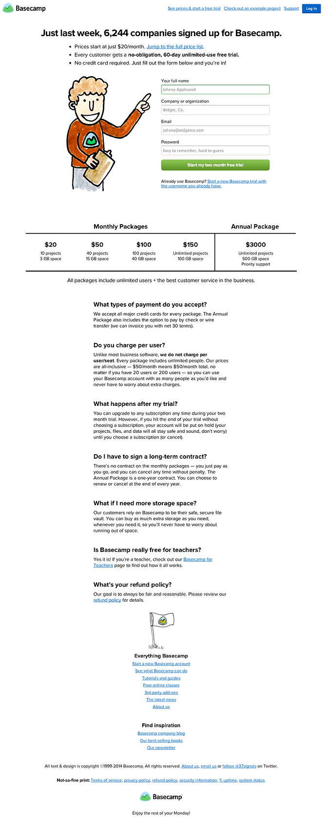
Basecamp nailed this by using an image that points visitors to the lead form.
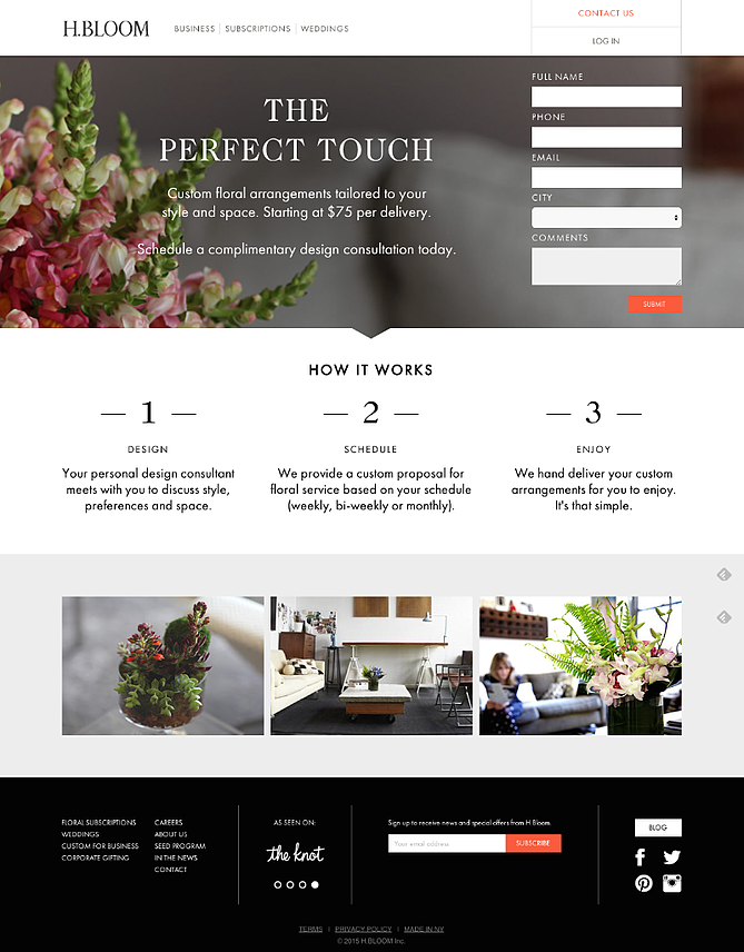
If what you’re offering requires practical usage, simple images showing the product in use can work well in driving home the benefits.
Here’s an example from H.BLOOM:
Step #7. Social Proof
Social proof can be anything from customer testimonial to the number of people who are already using your product or service.

Social proof comes in handy in easing the minds of clients. It also helps in quickly establishing trust and presenting you as one who knows the job well.
Social proof works better with pictures…

…so, if you’re using a testimonial, also consider adding a little nice headshot. This increases trust.
Step #8. Placement is Important
Where you place each component on your landing page is important and can determine, to quite an extent, how well your landing page does.
For one, you should place CTAs in positions where leads are likely to click. On that front, it’s not enough to have just one CTA on a landing page…
CTAs above and below the folds tend to do well.
CTAs above the fold will help clutch in impatient visitors.
The positions you place your content and images also matter a lot. Content placed above the fold can attract 80% of a consumer’s attention.
Step #9. Redirect the “Thank You” page
Your landing page should automatically redirect your leads to a “Thank You” page after completing a form.
This gives you the opportunity to show prospects your appreciation, further build a relationship, or even make another offer.
An interesting example to note is of RoboForm. The password management firm employs its Thank You page to get users to refer the service to their friends.
RoboForm does this after a user upgrades to the latest version of its software. The insight is that the user is satisfied with the service and is likely to refer someone to use it as well.

Since a visitor already started out on buying from you, it’ll be easy to get them to take another action.
You want visitors to remain on your website as long as they have to, right?
Redirecting visitors to a thank you page will help you keep them for long.
Step #10. Testing is Vital
After touching on all the components mentioned above, you should test to see what needs improving or changing.
There are different kinds of tests to consider here:
1. Blink Test

When a visitor lands on your landing page, they immediately judge the page and decide whether to stay or leave. They use about 3 to 8 seconds to do this.
Blink test helps to prevent or reduce landing page abandonment rates and keep people on your page to complete the conversion process.
2. A/B Test
When optimizing a landing page, you might have to test different headlines, images, CTAs and so on.
Great Landing Page Examples
Here are some great landing pages for your inspiration:
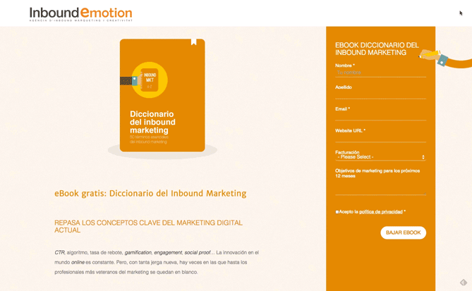
Inbound Emotion
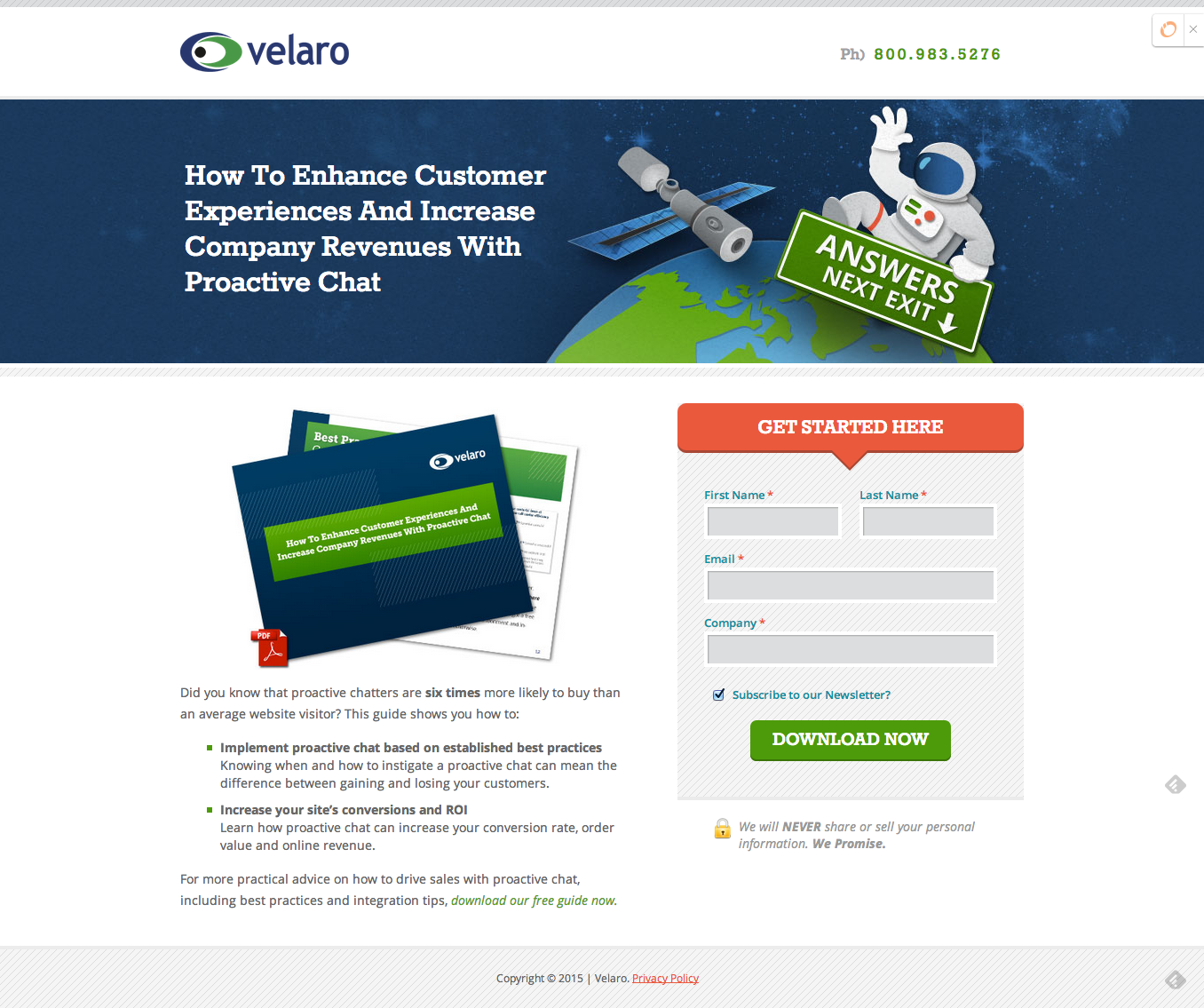
Velaro Live Chat
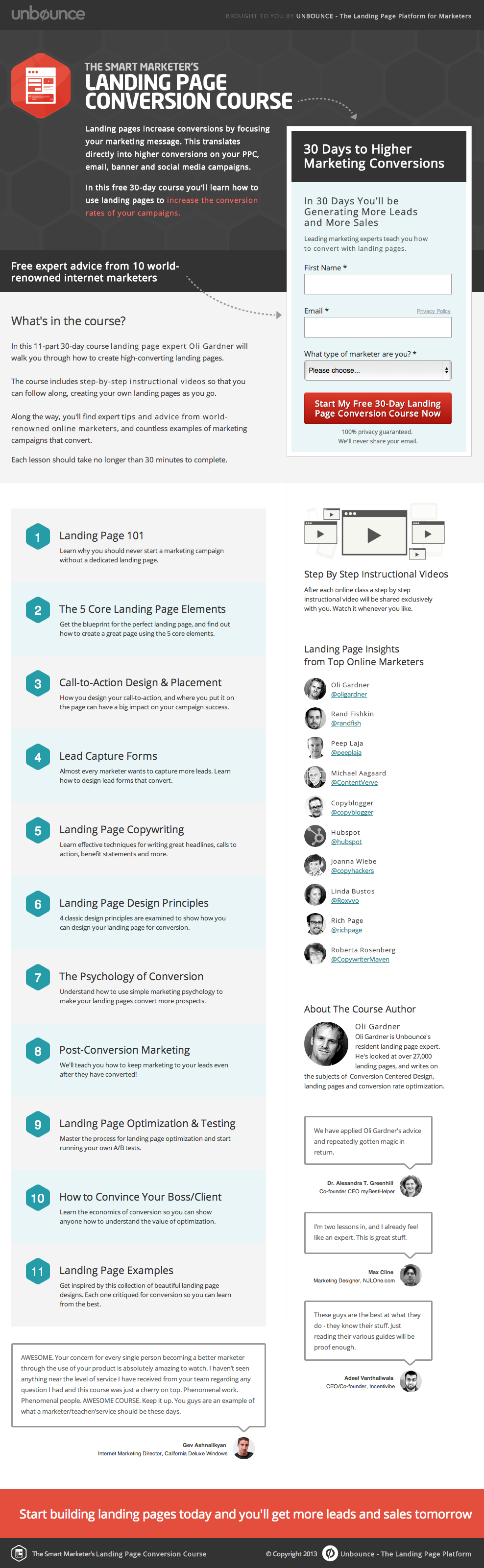
Unbounce
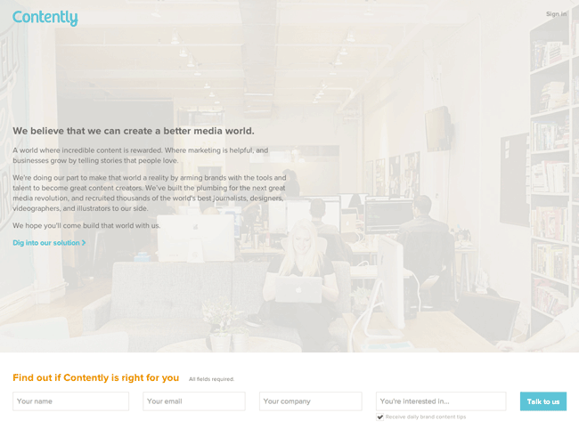
Contently
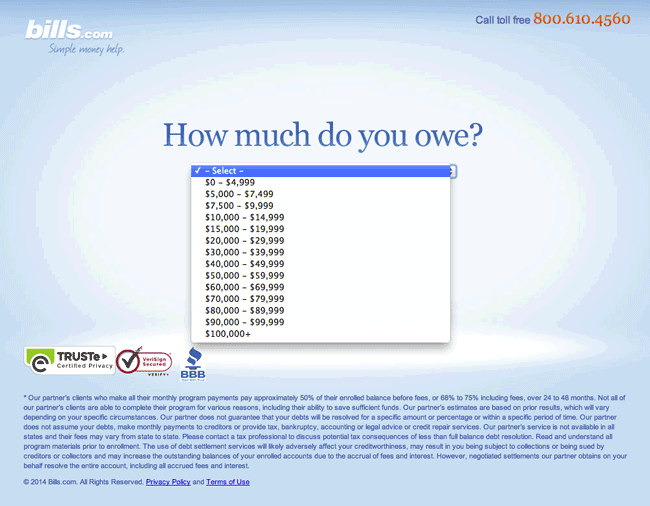
Bills.com
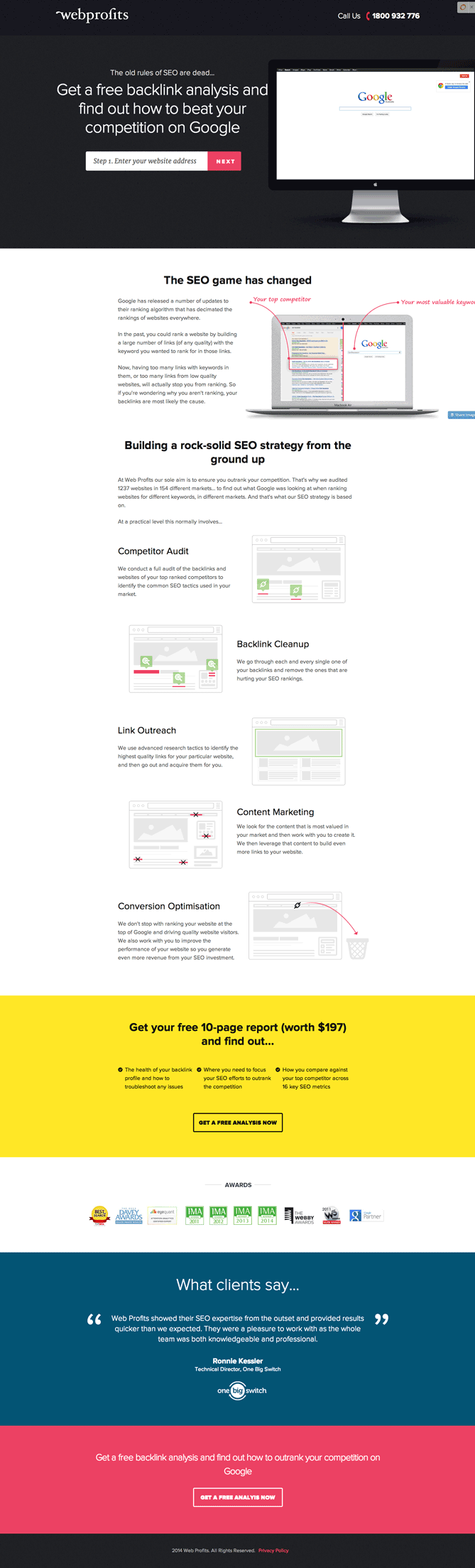
Webprofits
Conclusion
Optimizing a landing page to convert better shouldn’t be difficult, especially if you know the right steps to take. Follow the steps shared above to get your landing pages optimized.
Happy Optimization!
Found this article useful? Take a moment to share it using the social sharing buttons above. We’d also love to hear from you in the comments section below.


2 Responses
Great article. But, I would further suggest you apply your own teachings, and discard your anti-human robotic checker; it is a point that may cause hesitation, deliberation…bounce! You will immediately see greater conversions, re: the number of comments, if you eliminate this device.
A friendly suggestion from one landing page expert to another. 🙂
Andrew, Thanks for your advise 🙂 We had done this to prevent bots and spammers !! Let me know if you need help with anything else.
Comments are closed.