“One Page. One Purpose. Period.” – Oli Gardner
It is quite understandable that a page with a single goal serves the best purpose indeed.
We have heard a lot about variety adding spice to life and choices making one’s life colorful, but trust me, it adds on to the confusion most of the times.
Similarly, when we talk about web pages, offering limited and focused material to the visitors is always the best option in order to grab their attention and interest for a longer span.
This post will be giving some very useful tips on how to limit the choices on your website. Here is the list of components that this post will take you through:
Contents
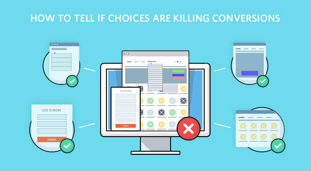
What to offer on your web page:
Whenever we are talking about availability of choices online, we are mainly talking about the kind of web pages you have made and the options you are giving to your users.
But:
Choice and options that we see online can vary in a lot of terms. Web pages have a list of elements which can be confusing at times for the visitors.
The point is to make sure you are not offering excessive options which create confusion. Keep your site focused, goal-oriented and limited in terms of options.
A lot options might turn off your visitor and make him leave out of confusion.
Remember:
Having a lot of choices on your site does not make it a successful site. But having a concentrated and smartly designed web page can ,though it differs with every kind of website
Some sites require choices and variety, for instance, an eCommerce page would have to have variety under every category or else it would lose the customers.
Now:
I’ll be heading towards some handy tips for making your website focused and less confusing.

Tips to Limit your Choices and Increase Conversions:
-
Categorize Everything:
Your site is just like any real-life super-store. Whenever a visitor lands on your site he would have to find where is that very thing for which he is looking for.
Since you do not have customer representative or salesperson other than the live chat option, you really have to design your site in a way which makes it extremely easy for the visitors to hunt and find what they are there for.
Categorize each and every product and put them into the right categories so that it is easier for the customer to locate, identify and buy.
Here is an example of a poorly designed ecommerce store called, Arngren.net. It has no clue of what categories are, what an aesthetically appealing site is and basically how to create a quality online store.

-
Choices and Conversions: Less is More!
Another ease which we can provide to our visitors is bothering them less than usual. I know we love to dig out maximum information from our visitors but remember they are not always in the mood of giving their personal information.
They might have just randomly landed on your site, why do you think that they’d make you their best friend.
The graph below shows the effect shortening your form has on your conversions. Studies always exhibit that customers love filling short and precise forms.

Here an amazing Guide on building high converting forms.
Social Sharing Buttons are another thing which we need to look at. Keep in mind that that offering all the possible buttons on your site is not a good thing AT ALL!
Keep it limited and nice, which also looks possible for the visitor, he would really think about sharing.
Also, design your social sharing CTA buttons in a way that they grab user’s attention instantly.


Now when we compare these two pages, we see that the first one has a lot of choices but it doesn’t grab the user’s attention. While the second one has less choices but with the stats, they have attracted many visitors.
The numbers also act as an encouraging point for the visitor, he gets bound to click on the sharing button.

While in this screenshot, the left one is even more better. Compact tabs along with numbers of shares too.
So, the number of social platforms is not important, instead making your users click on them and actually share, is what is important.
Here is another example of the very famous ‘Jam Study’, conducted by Sheena Iyengar, also referenced in her book, ‘The Art of Choosing’.
In the study, over a period of two consecutive Saturdays, research assistants dressed up as the employees and offered samples of either 6 or 24 flavors of Wilkin and Sons Jams, a British jelly purveyor known for exotic flavors.
Prior to this study, most people believed in the marketing theory that more choices are better for consumers and that people like more options, hence providing variety of flavors should boost sales.
It turned out that when 24 flavors of jam were offered, only 3% of those who tasted the samples actually purchased the jam.
However, when there were only six options, 30% purchased at least one jar of jam. Hence proving that less choices make it easier and faster to make the decision and perform the task.

The above graph shows how did the stats go and how many choices brought how much conversions. This result is quite obvious.
In fact this is one very popular study to prove the point that too many choices end up killing the conversion rates.
So offer less variety!
Do not always think that a wider variety will give you higher sales, it can be opposite also.
Do no add on to the confusion of your visitors.
Keep it optimum!
Navigation on your site is way important than what you have thought about it earlier. Your customer runs away, when you make your page complex and confusing.
Customer is always looking for the final step, the final checkout. Do not confuse him to drift way.
These navigators help your customers find these checkout process as an easy one.
Your site should have simple indicative tabs, proper categories and and a user-friendly layout.
Check out this post to create a foolproof Checkout Process.
-
Simple and Single CTA Optimizes Conversions:
Online Marketing Coach showed that 70% out of 200 small businesses failed to display their CTA buttons in an effective way and 47% of the websites had a clear and visible CTA which could be spotted in around 3 seconds.
It is very important to figure out that there is very slight difference between the conversion rate and bounce rate, there are few very important factors which can turn your conversion into bounce and one of those is your CTA.
If you haven’t designed your CTA in a proper way then you’re making sure that your bounce rate increases. Thus, CTA designing and copywriting should be given extra importance.
How Heatmap and Click Data help in telling what to offer:
When the user comes to your site, it is the first gateway you open for him to actually become your customer.
Now that the first meet up should be really attractive and attention-grabbing
The landing page design should be created in the most optimal way. Most of us think that giving too many choices and offering a wide range to the customer is the best thing we can do.
But No…
Keep it precise, simple and shot.
The qualitative analytical tools like Heatmap and Click Data help see the visitor’s interaction with our site and see what is he actually into.
By observing user activity, you’ll see what the user is liking and what he isn’t.
Heatmaps tell you where your visitors click, where is most of the mouse movement done, what tab turns them off and makes them exit, what confuses them…
And even after spending so much time on a site, makes them leave.
So, these tools help you design a site which customer really requires.

In this chart, each bar shows the amount of time users spent on a site.
People spent more than twice as much time looking at the left side of the page as they did the right:
- Left half of screen: 69% of viewing time
- Right half of screen: 30% of viewing time
Tools like Heatmaps and scroll maps differ from conventional web analytics as they focus on users movement with the page.
These tools are generally used to understand behavior for optimizing a website’s usability and conversions.
Hence it is much easier to track customer activity and tweak the website according to their requirements.

Click data can detect the unwanted distractions on your web page to streamline the user experience and make it worthwhile. It digs out all the distracting elements from your page which lower down your conversions.
It lets us see which is link is overshadowing the other and basically what elements are cannibalizing other elements, more importantly conversions.
Conclusion:
Making changes to your site like limiting your customer choices doesn’t mean you’ll instantly cut down on thousands of shares or customers.
What it actually means is that tweaking your site and seeing what is important to put in there.
Don’t think that I mean to increase your conversions in seconds but at least some percentage would definitely raise.
Putting important and special stuff at your landing pages will always give you advantage, it’s your first impression and your first impressions should always be great.
Step forward and start using the analytical tools like heatmaps, scrollmaps and session recording to gain the maximum insights and act upon what customers demand from you.
Also, don’t forget to use TruConversion. Because it offers you a set of great tools which will boost your conversions than ever before!