We’re back again with another marketing quiz! If you missed the first one, click here to give it a shot after you’ve taken this quiz.
Same rules apply. We’re using the honor system so in a second I’m going to show you the new page design (you can see the full page here) and give you three options to choose from.

A. The ‘Continue Reading’ ghost button
B. The ‘Facebook Messenger Ad’ blog post headline
C. The ‘Page 2’ navigation button
Like I said, we’re going with the honor system here. So make a guess then scroll down to see the winner! As a bit of a bonus I’ll also share the 6 most clicked elements on the page, put those in context, and share exactly what I can learn from this data.
So lock in your vote now!
.
..
…
….
…
..
.
Contents
1. Most Clicked Element
If you guessed B and just high five’d yourself…well…you were wrong because the element with the most clicks was C the ‘Page 2’ page navigation section at the bottom of the page.

Results:
The heatmap showed this button got a total of 787 clicks which was 10.13% of total page clicks.

It’s also worth noting that an additional 2% of clicks could be added if we opted to add the‘Next page’ button clicks.
Context:
There are a total of 17 blog posts a visitor could select on the blog including 5 options above the fold, 5 popular posts in the right hand margin and 7 recent posts.
Despite having all of this content, people still wanted to browse the site to find content that was relevant to them.
Previously DigitalMarketer didn’t provide an onsite search function. Despite having a metric butt ton of content, they didn’t really make it easy to find what people were looking for. With this redesign, they provided a search function and this will likely reduce the number of people clicking navigation buttons.
Next Steps:
Knowing that people aren’t finding exactly what they’re looking for on page 1, there are a few things I could do.
1. Nothing and monitor how clicks change as people start using the on-site search.
2. Change up the post types above the fold with historically popular posts to get more engagement here.
Since this is a recent redesign, the team will likely get more data and then segment by visitor type (new/returning) to see if new visitors use onsite search more than returning visitors. If this is the case, then the team doesn’t need to change any of the posts just yet.
2. Second Most Clicked Element
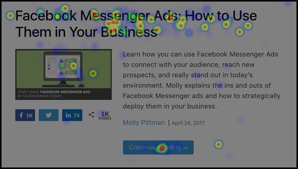
Results:
The heatmap showed this headline got 583 total clicks which was 7.50% of total page clicks.
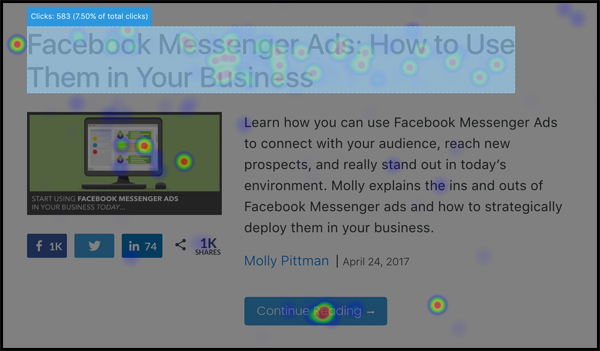
Context:
This one surprised me and it really shouldn’t have! When DigitalMarketer launched their previous blog redesign, they ran a user test on UsabilityHub asking the following question:
Where would you click to select the article you’d like to read?
They showed them the blog page image and this was the response:
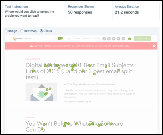
The vast majority of people browsing for blog content knew that if they clicked the headline they’d be able to read the post.
In each blog post section of the new design, the headline always beats the blue CTA button.
Next Steps:
The team doesn’t have to do anything new here. The headline is a high click density area that sends the visitor to the selected blog post.
It’s also worth noting that just because the headline gets more clicks than the CTA button doesn’t mean they should remove the CTA button. Keep both!
3. Third Most Clicked Element

Results:
The heatmap showed the ‘Podcast’ text in the navigation got 348 total clicks which was 4.48% of total page clicks.
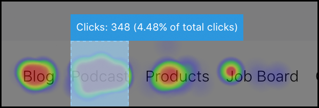
Context:
Navigation tends to sneak into a list of top clicked page elements. However, these navigation links that get the most clicks are generally reserved for ‘Products’, ‘Support’, or ‘Sign In’.
This tells DigitalMarketer that people interested in their content are VERY interested in the Podcast. This is a bit of a double edged sword and I’ll go into why next.
Next Steps:
The goal of the blog is to get people to consume top funnel content. Ideally you are going to have someone read content, pixel them, and offer them a lead magnet to get them on your list.
The podcast is also top funnel content, but is lacking in the lead magnet department. Sure, they can pixel the traffic and get more downloads and subscribers but it gets more difficult to monetize this traffic.
So, if the blog traffic is easier to monetize the team might want to test a variation without ‘Podcast’ in the navigation to keep the visitors focused on the written content that is easier to monetize.
However, this could backfire and just lead to more people bouncing from the page because they were looking for a specific type of content.
Really this all comes down to prioritizing goals and seeing if the inclusion of ‘Podcast’ in the navigation has a noticeable difference on blog content consumption and the blog’s overall goals.
4. Fourth Most Clicked Element
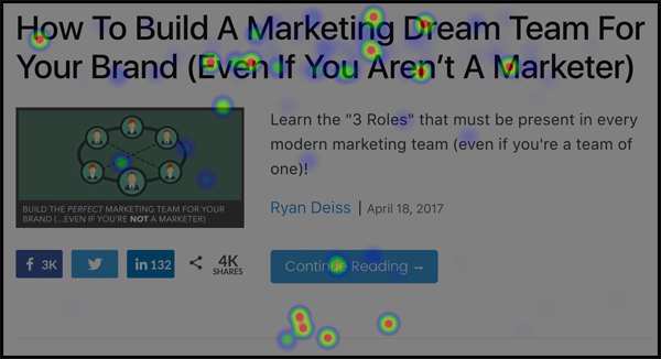
Results:
The heatmap showed this headline got 348 total clicks which was 4.48% of total page clicks.
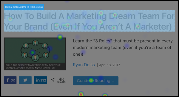
Context:
I’m just showing this one because it had the fourth highest clicks. If you skimmed through the #2 most clicked element, I’d recommend giving that a read because that all applies there too!
Next Steps:
No next steps here, this is all good!
5. Fifth Most Clicked Element
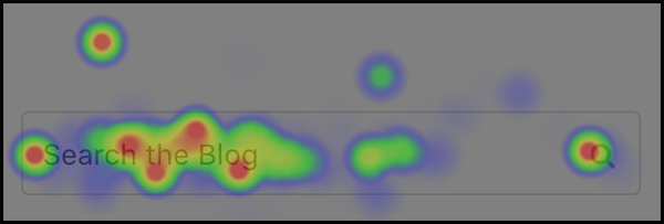
Results:
The heatmap showed this section got 256 total clicks which was 3.30% of total page clicks.

Context:
This is the first time DigitalMarketer has included onsite search in over 3 years.
Site search is one of the best types of information a marketer can have and is extremely useful for visitors who are looking for something specific and don’t have time to browse.
In fact, visitors who use site search are more likely to convert if they can find what they’re looking for on page 1 of the search results!
DigitalMarketer was well aware of this, but due to poor onsite search functionality removed it because it would cause more harm than good for the visitor.
Well, they added it back and now visitors are happy and the marketing team can use this very important data set. Win-win.
Currently, return visitors are using this functionality less than new site visitors, but this section well begin to get heavy use once people know it’s there!
Next Steps:
This is another one of those ‘wait and see’ next steps. Though I outlined the benefits of using site search, you don’t want to make that the primary option. Ideally you should be providing relevant content to your visitors already and site search should be more of a last resort.
The team could analyze when people search and what they search for to figure out the best placement for the search box and come up with new content ideas.
6. Sixth Most Clicked Element

Results:
This button got 218 total clicks which was 2.81% of total page clicks.
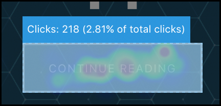
Context:
The featured article is the 6th most clicked element on the page…let that sink in for a second.
This article takes up the most real estate above the fold but gets less clicks than an individual blog post headline below the fold.
That said…the sky isn’t falling!
DigitalMarketer did this by design, so they expected to see a low CTR on this post. Just look at it:
1. No compelling image
2. Bland coloration
3. Ghost button CTA
This is a checklist of how to not make something convert!
However, this is a pillar piece of content. Many readers have probably seen this before and it is primarily tailored to new visitors.
In fact, the content above the fold all stays static and is designed to be a more prescriptive way to interact with the blog content. The design is trying to articulate:
Read this stuff first then everything else is going to make a lot more sense.
Now there are more elegant ways to show the right content to the right people and I’ll cover that next!
Next Steps:
This is where the blog would really benefit from using personalize content based on segmented data. DigitalMarketer could try highlighting the post they hadn’t completed yet as the featured story and once they’ve read all 5 that section goes away entirely.
This would require more investment in technology but would make for a much better user experience.
If they opted to go this route they could use more imagery, better coloration, and get rid of that damn ghost button.
Why?
Because this section wouldn’t be a ‘look over’ section for returning visitors it would be their primary spot for choosing the most relevant post for them.
Final Thought & The ONE Thing To Take Away From This Post
So if there is one thing you should take away from this post it’s this:
Always have customer behavior data set up during a redesign or launch.
DigitalMarketer wasn’t surprised by most of the behavior on the page. However, there were some things that shocked the team and fueled minor changes that would have a big impact.
Stop guessing about what works or what doesn’t work during launches. Set up a heatmap and figure out what the heck is going on so you can apply some agile changes.


3 Responses
Awesome blog post. The team here guessed ‘B’ as, whilst it is below the fold, we tend to find more people click the blog title than a hero bar generic button (let alone ghost button which I’m not a massive fan of).
Very surprised by the results though, I think we better go assess our own blog archive page!
Kudos for thinking that the headline text would get the most clicks. I remember how surprised I was when I initially ran that UsabilityHub test. I’ve always been of the mind that you have to get rid of any cert of ‘interpretation’ when it comes to the user taking action. However, it seems as though people know that if they click the text then they can expect to see the rest of the content!
Nice blog post!
FYI you have a typo in the main heading image for this page – it says “MAREKTING”:
https://www.truconversion.com/blog/wp-content/uploads/pop-quiz.png
Comments are closed.