Have you ever thought how colors can impact your sales? How to make people buy your product while using different colors?
Or…
Which color get the highest conversions on websites?
If yes, then you are going on the right track, my friend!
And if you haven’t thought about it, you have come to the right place and YOU REALLY NEED TO THINK OVER THIS!!
You wouldn’t believe the fact that colors make up to 85% of the effect on your buying decisions!
There are more color theories which further explain how consumer act after seeing colors. There is also a 90 second theory which says that consumers judge your site in terms of the visual appeal within 90 seconds.
And they would simply leave if the site doesn’t appeal them.

Here’s the link to this complete colors and conversion rate optimization infographic
I wonder what is the science behind all these color theories….
What makes some colors affect more than others?
Let’s talk about the color psychology that exists in this online world and which effects a million people and their buying decisions.
Contents
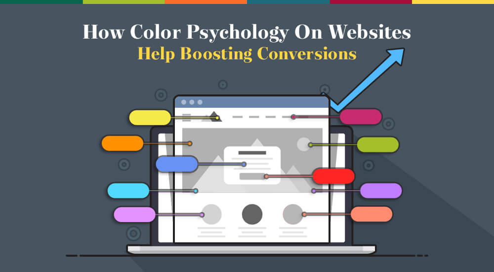
Colors and Psychology
There is a whole psychology behind the colors that people use for different purposes at different platforms.
Color psychology is basically a science about how colors impact the human behavior. Color psychology is a part of behavioral psychology.
Researches state that colors play a vital role in everyone’s life and colors tend to be very effective when it come to human brain.
You know what?
Human brain processes images 60,000 times faster than the text and the images. Such is the consumer psychology so it is no harm in saying that colors play such a significant role in the web world.
People process all colors in unique manners. Colors affect a person’s mood, feelings, choice and overall behavior.
Well, conversions can be the result of many psychological elements like a need, a desire to belonging, a sense of achievements and maybe a sense of urgency. Now all these factors combine and create an urge of clicking the CTA button.
For a detailed analysis, check out this very useful post on Psychology of Colors in Business by Mike Dane.
What’s the next best part?
These psychological factors also differ among male and females, let’s move on the gender differences now.

Colors and Genders
The color psychology for both the genders is entirely a new chapter.
A general human psychology of color would be very less detailed than that of the separate genders because women likings and dislikings differ than men, while very few things remain common.
Women prefer bright colors especially primary colors and avoid earthy colors while men prefer dark and decent colors more.
And there are some colors in between like White and Blue which are preferred by both the genders. No wonder PayPal & Facebook use Blue color to attract men and women equally.

Want to know more details about Colors and Genders?
In a Color Assignment conducted by Joe Hallock, he figured out all the details about colors.
These were his main findings about the Favorite Colors by Genders:

Let’s clear one more myth about colors.
Most of the people think that women around the worlds just love the color, Pink. While it is the biggest myth around. Women showed the most aversion about the color Pink when asked about their favorite color.
Now:
After the discussion about color psychology and the gender preferences, we shall move on to how these factors combine and make the websites run and boost conversions.
Impact of Colors on Conversions
Have you ever thought about how does using different colors in digital marketing affect conversion?
I believe, you must have!
Colors have a major impact on your sales and conversions!
You should never forget the fact that color is one of the most important factors in the consumer buying decision!
Check out some Tweets about Colors and Conversions:

Now you must be wondering what exactly can bring these conversions?
Where to use the right colors?
Remember:
A website has various elements which need to designed and coloured according to the theme.
Now for boosting your conversions you need to look at each of the elements in detail use the colors that make people want to buy from your website.
Let’s move on to the elements now:
Background:
Your site’s background has a major role in your website overall theme.
First you need to decide on what kind of website do you have, then you need to decide on the colors you should use.
Here is an Infographic which tell about various colors that stimulate buying:

Along with the theme colors, the background picture and its tones also matter a lot. See how Spotify has used the background picture and the CTA button color. It’s all bright and attractive, capturing the visitor’s attention in a super cool way.

Optimize CTA Buttons with Colors:
Whenever I‘m wondering about boosting a site’s conversions, I end up thinking of various different ways and the question which always raises up in my mind is:
Do colors of call to action buttons affect the conversion rates? Or the font colors used for the CTA copy affects the user’s mood?
Well, the ultimate answer is: Yes, they do!
Dmix conducted a case study where they checked the effectiveness of different colors on the CTA buttons.
In this case it proved out that when they changed the green CTA button into an orangish red color, it raised the conversions by 34%. Hence, proving that colors do have an high impact on conversions.

Another research by Wider Funnel stated that Orange is the new color for the CTAs.
They say that the future demands the CTA buttons to be b ig, shiny and animated at the same time. Marketing Call-to-Action Button requires something bright now and they are done with boring and dull CTAs.
Now, the best part:

In the Tweet given above, Naomi Niles states his misery and sadness about people believing that conversion rates really depend on the CTA button colors.
He just wants to tell that A/B testing is not about the colors only, if raising conversions was so damn easy then anybody could have changed the CTA button color and gained millions.
It’s about the whole website, each and every element, not just about the colors. However, this is an important point and needs to be given importance as well.
So the best web buttons need not to be in a particular shape, color or size; in fact it is the whole package. You need to look at your website’s genre, your form design, your form type and the kind of audience you are trying to grab. A/B testing has a lot of other factors to analyze as well.
However, bright colors are more preferred by the users as they are easy to locate and get attracted towards.
Boost Forms with Color Psychology:
Now:
Which colors make the best conversion rates on sign up forms?
Forms are generally designed as per the theme of the website and according to the type and seriousness of the form as well.
Though, the most popular colors for the CTA buttons in the forms are; green, red, orange and blue because of their vibrant feel.
Samantha Mykyte in her informative post 7 Best Practices for Web Form Design mentions to have contrast in your website and your form so that the form and it’s offer stands out:

The articles also talks about how you should use complementary colors for your website so that all due importance is given to your form only.
Check how SalesForce does it:

Shopping Cart Color:
The next thing you should see is your cart.
The whole cart design or the checkout process should be designed in the best way and in the most suitable colors according to the nature of the website.
You just make sure that the whole cart design is attractive enough to grab the customer’s attention and interest.
As far as the colors are concerned, there is a wider choice from which you can choose the best color for add to cart button, just make sure to choose the one going with your website theme.

You also need to put in the colors that stimulate buying among your consumers. Here’s a chart showing the colors that stimulate different kinds of chopping needs:

From this chart, you can choose your add to cart button color or the overall web page color also. We see different colors for different product types, keep those in mind while designing.
Conclusion

These figures above show how consumers put their buying decision in the hands of colors alone at times.
After looking at this graph you should really focus on what colors are being displayed if being rejected is so easy just because of the choice of colors.
The fact is that color do matter and they are significant for a lot of purposes but this doesn’t mean that conversions are solely dependant on the usage of colors on a website.
We also need to understand that the use of colors would be different for different platforms, for one site one color would be too good for the other one that would not be suitable at all.
However, most of the graphs and post shared above give us a very detailed knowledge about the best colors for ecommerce site and sites in general.
You just need to be a little vigilant before selecting the color for your CTAs, fonts, backgrounds, forms or the overall theme. Referring to the color chart above which shows various colors and the associated products would definitely be a great idea.
So…
Just be creative, have amazing aesthetics and use amazing colors on your sites!
Don’t forget to make your sites captivating and compelling with the use of awesome contrasts!!