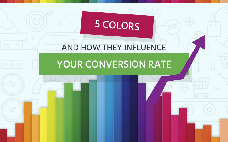
Do you want to increase your landing page conversion rate?
Of course you do!
That’s why we’re here.
We’re really going to get deep in understanding the colour of it all. Color is all around us, it impacts our mood and each colour means something different to each of us.
In this article we’re going to take a look at some great examples and analyse what colours work on what websites and what button colors to use on what colour landing page – everything you need to know about color to positively impact that conversion rate!
So I want to ask you now…
For a few moments, take a break from chasing the next best tactic, and look back to the colors chosen and placed on the landing page you want to optimize for conversion.
Did you know that color accounts for 85% of the reason why you purchased a specific product? Or that full-colored ads in magazines are recognized 26% more than black and white ads?
Now check this out:
Color psychology statistics that arise from analysis show that:
- Color has a persuasive psychological effect on the human psyche, because we process images 60,000 times faster than text;
- Blue is the favourite color of 35% of women and 57% of men (regardless of age and gender);
- Women’s liking for the color purple increases with age;
- 0% of men like the color purple;
- According to the guys over at Kissmetrics, 85% of customers say that color influences their buying decision.
- They also say that color increases brand recognition by 80%. That’s a no brainer, right? For example, what brand comes to mind when I say red. Coca-Cola maybe?!
And where do we first get acquainted with a brand color?
When we see the logo!
Brand logo colors are very important, because they’re a big part of your identity; whatever you want to express, whatever you want the brand name to mean to your target audience, you have to do it through color as well. Your customers will identify you by your logo.
The 90 seconds of fame

Once the prospective customer reaches your landing page, you have 90 seconds to convert him, (where 69-90% of which is impacted by color) or you lose him.
Right now you might be thinking:
“How the heck am I going to do that?!
Well, my friends, you attract them with color and convince them with content. Or, as the statistics say use color to persuade as well. For example, dark blues are said to inspire sincerity and trust.
These are the reasons why it’s tremendously important to use the right color scheme, videos and other types of content in the best way possible.
They say that People from tropical countries respond most favorably to warm colors and people from northern climates prefer the cooler colors.
And now you’re probably thinking: “Sure, sure this is all very speculative. Is color really as influential as you say?”
The answer: YES
Color affects a region of our brains called the hypothalamus – that sends signals to the thyroid gland – that, in turn, affects our emotions, mood and of course, behavior. So there you have it!
To help designers as well as marketers get right to the essence of this matter, we will talk about 5 main colors and their emotional impact, the objectives that they can help achieve (with focus on increasing your conversion rate), and where to use and not to use them on your landing pages.
We’ve structured this article like so:
- RED and urgency
- ORANGE, YELLOW and impulse shoppers
- GREEN and harmony
- BLUE and conservative brands
- BROWN and equality
I promise that by the end of this article you will have a very good grip on the color influence reality and a great skill set to properly apply color psychology.
So let’s dig in, shall we?
Contents
Psychology of Color Red and Urgency
I’m going to start with the color red because I consider it to be the most important color.
And it’s not just me!
If you take a look at the history of advertising, you will observe that red has been used heavily because even if many people associate red with negativity and mistakes, it attracts the eye better than any other causing us to act when we otherwise wouldn’t.
Red produces 21% more squeeze page conversions than green (in certain niches) according to Venture Harbour.
Red has a number of effects on the human psyche:
- It quickens the heart rate, increases blood pressure and speed of respiration,
- It presents a sense of urgency;
- Bright red is associated with stop or caution;
- brings out emotions of passion and love, as well as anger or danger;
- Impulse shoppers like an orangey red and that’s why fast food, outlet malls, and clearance sales use this color;
- It’s linked to excitement, strength and energy.
To support this last affirmation, we would like to give the following example:
In a study on performance, analyzing boxing, taekwondo, Greco-Roman wrestling in the 2004 Olympics, University of Durham researchers Russell Hill and Robert Barton observed: wrestlers were assigned blue or red shorts. The wrestlers in red outperformed the ones in blue, indicating that red may make you more competitive.
But in another study in an academic environment, shows that red can inhibit performance in this kind of medium (Researchers at the University of Rochester).
President Obama wears red ties when delivering important policy statements (and he’s not the only politician who does this).
Potential conclusion here: Wearing red clothing may influence how salesmen are perceived.
Restaurants have tried to use red to stimulate appetite, but studies suggest that actually red actually inhibits appetite in humans. Even so, it appeals to our primary feelings and that’s why Coca Cola has been so successful for over 100 years.
For example:

Situations when red really works like a charm:
Now that you understand how red can impact the way people view a page structure and how this color works as a non-verbal call to action, here are a few tips:
- If you have a food related website, make sure to use red as a background for your most important products (the ones you want to sell the most – red will appeal to people’s basic needs such as hunger).
- Use red as a color for your conversion buttons. Of course the rest of the page needs to be an “opposite” color such as green, blue etc. The point here is attracting attention through contrast.
- Make sure that the call to action / the writing on the button stands out through color and font style (of course, without making it look ridiculous).
- Cross out the prices you have on your landing page with an evident line and put the new, limited offer price in red.
Bonus tip: This is not that much related to color as it is to asking the landing page reader to do too many actions at once. This will overwhelm and confuse, and make most of your users take no action at all.
So don’t put 7 different CTAs on your landing page (for example: “Subscribe to our newsletter”, “Buy this product”, “Ask for a demo”, “Fill in the form to get this great guide or tutorial” – all on one page).
If you still want to do that, at least only use red on the one that matters most (buying the product). Every page should serve one main purpose, have one conversion as a goal.
And if you want even more actionable insight on this matter, check out this article:
The colour has different effects based on context. Because it makes the viewer very aware and “on his feet” let’s say, it has proven to work very well in environments where a quick and risky move is necessary.
For example: in an auction. This is according to the researchers from the University of Virginia that conducted a study in 2013, which showed that when product scarcity was significant, consumers were more willing to pay when confronted with a red background. And if the product was easy to find on the market, the blue background worked better.
Another color study or survey showed that the same color can have different meaning to each viewer (this is why the context that I was talking about in the above paragraph is extremely important). In this survey people were asked what words they associate with the color red.
The results were extremely interesting:
- Love, desire, passion, hot;
- Red also signals dominance and mating in the animal kingdom;
- Survival, danger, determination, energy;
- Friendliness;
- Strength, power;
- Aggression, war, rage, horror movies;
- stop lights;
- Christmas;
- Valentine’s Day;
- speed (76% of people said that);
- courage (28% said that);
- and fear/terror (41%).
These results are very much influenced by personal experiences as well, whether negative or positive.
Don’t forget culture as an aspect when trying to penetrate foreign markets, because every culture understands a color differently. For example, in India, red means purity.
In the following infographic image you can observe the connections between color, logo color and how we perceive a brand.

Case study 1
Doing an AB test, HubSpot found that red buttons worked better than the green ones. I agree, as I said earlier in this article, that the reason for these findings is that reen being the dominant color in the page, red made a contrast and gathered a lot of attention.(see image below)

Case study 2
Dmix found in their testing with over 600 subjects that conversions increased by 34% when they used red button instead of the green one they had before.

Performable increased its conversions by 21% when they changed their call-to-action button from green to red (link).
No wonder in one study by researchers at the University of British Columbia red was shown to increase memory and attention to detail.
34% is a decent lift in conversion. 1:0 for red buttons!
To get the maximum power and contrast a color that is opposite to your dominant color on the color wheel. (see the example below).

So we have established that red attracts attention to an element, but if not used with moderation, it can become overwhelming for the reader or viewer to “digest”.
For more information you can take a look at this color psychology degree infographic. It’s covered with useful info.
ORANGE and YELLOW- How they can make people buy your Product
We’re judging these two colors together because they have quite few similarities. They’re right and promote optimism, confidence, friendliness and fun while triggering se sense of caution and urgency that attracts kids, “window shoppers” and impulsive buyers (according to a report by Business Insider). To be sure of this fact all you have to do is look at fast food, outlet malls and clearance sales.
Did you know that yellow is the first color infants respond to?
Guess why McDonald’s is yellow?
Because the red and yellow they use appeals to kids and creates a sense of high-energy and urgency. Attracting the kids and agitating parents equals fast turnover. Can you even imagine McDonald’s having so much success if it used the color green?! No, me neither.
Does one color top the other in conversion related situations?
Orange is more safe and warm offering a more confident sense of security, whereas yellow is like a beacon, attracting everyone to pay attention.
So to answer the above question:
Each of them serve the purpose of attracting attention well, but each should be used according to the particularities of the product you are selling: orange for more expensive, professional products, yellow for cheap and attention required products (for example, your could think of construction machinery and tools).
Orange, a blend of red and yellow, is naturally eye-catching, bright and sunny. It can express manliness, warmth and sometimes even affordability (for example, the the Big Lots logo).
Yellow and orange are those “ugly colours” that don’t look good just anywhere, but make people go the extra mile when well placed on your website landing-pages. A pinch or well placed orange or yellow is perfect for a landing page, but too much of a good thing is unprofessional and naive.
Check out these great examples:
Amazon uses yellow for their “Add to Cart” button and gray for their secondary conversion buttons (exactly what I was saying in the RED section of this article – each landing page must have one major goal, and that’s where you should use your conversion impulsing color).

Another example of something yellow we all recognize?
The yellow pages – and they came up with a great idea to market their app:

Who knows best…
When it comes to advertising and selling, marketing agencies have it nailed down. Just look at this amazing and impressive example from Mooze Design (from Rotterdam, Netherlands). Their website, as you can see, has yellow as their background color, and they use it perfectly.

How about that Harley, huh?
A darker landing page, a touch, rugged, wild and masculine brand – that orange call to action button fits like a charm.

That’s how you can use these two effectively on landing pages.
And if there’s something I want you to remember from this…
It’s the following tips:
- Use orange to highlight your unique sales proposition (USP) and you call to action (CTA). It you want to use yellow and your brand is a serious, professional one – use orange. (I’m thinking or an orange CTA button on a dark blue background maybe).
- Use yellow to attract attention to your offer when you sell any type of hardware. The biggest contrast combination possible is yellow and black – that’s why yellow is used for street signs, emoticons and front-window displays.
- Only use these colors when not used prominently elsewhere on the site.
- If you have a secondary call to action, you might choose a darker color for them, in order to draw more attention toward the brightly colored primary CTA.
Check out this infographic from QuickSprout Customer Psychology.
Psychology of Color Green and How it can Increase Sales
Did you know that green is the second color we recognize?
Benvil Conway, a neuroscientist explains that we have groups of brain cells in our brain that detect color. The first color detected is red, the second is green, followed by blue and yellow.
That said, green is a very important color for people.
It stands for hope, growth, balance, health, encouragement, clean, restoration, environmentalism, relaxation, new, fresh, tranquility, eco-friendly, harmony, healing, safety, nature, greed, jealousy, cowardice, inexperience, protection – and that’s all the words I could think of that describe what the color green means to people.
PS: It’s typically associated with jealousy in North America.
As you can see the meaning varies, and that’s because of context and personal experience. The good news is we can use green effectively by taking into account what it means for the audience we are targeting.
It’s a popular color for both men and women and it’s the easiest color on the eyes, helps creativity and perfect for nature lovers. Outdoor equipment website? Go for green!
When it comes to determining an action to be taken…
Green means “GO!” – is symbolizes positive action because we’re trained to understand this symbol in traffic.
It stimulates harmony in our brains…
Yes, you read right! It encourages a sense of balance that leads to taking decisions more quickly, and helping us focus on landing page elements.
Now let’s take a few examples of how a few popular brands have used green:
Heinz – Although they changed the color of their ketchup from red to green and sold over 10 million bottles in the first 7 months, resulting in $23 million in sales, the sales soon plummeted because people weren’t used to ketchup being green, they didn’t associate that as being a naturally occurring food source.
What have we learned from this?
People will buy something out of curiosity, to try it out, but if it doesn’t feel natural (and people are picky with their food) they will stop buying immediately.
Starbucks – The only major brand that used green as it’s main color, and it did so to promote a sense of relaxation when drinking their coffees, thus inviting people to take a break in their day and have a Starbucks coffee.
Content is king, context is God!
You can use green to:
- brand environmental issues (for example, Timberland’s R.E.E.N standard);
- or to brand financial spaces (for example, com).
This infographic from TruConversion shows a few essentials of how color can affect conversions:
Case study:
Check out this wonderful makeover!
Notice as they didn’t just change their main color to green through the means of that representative picture, but they also eliminated redundant elements and kept the rest of the page simple, text and color wise.
This increased conversions by 65% in the first round.
Before:

After:

Subway – Because it wants to associate its brand with health and balance, it uses green as a predominant color on their landing pages.
IMAGE
Psychology of Color Green to Increase Conversions
- Use it for anything related to nature, environmentally-conscious brands etc. (for example, the Environmental Protection Agency);
- Use it for financial institution landing pages, because it promotes a sense of financial health and possibility;
- Even if it’s not directly connected to nature preservation but rather nature as resource – green is a good colour. For example, John Deere farm and lawn machinery (there’s the nature link as well and lawn mowers, tractors are painted green).
- It can also be a good color for: organic product shops, educational websites, adventure and ecological tourism, medicine websites, government, human resource and recruitment landing pages.
Psychology of Color Blue
Blue has the opposite effect of warm colors like red, orange and yellow. It calms people down, and although it can be perceived as distant, cold, or unfriendly if used in great amounts, using just the right amount will bring great results and that;s why you see more and more brands adopting it (especially brands that used to have green as their main USP (unique sales proposition) and CTA color.
What does blue make mean to you?
Maybe: trust, honesty, power, stability, depression, nature (the sky, the ocean, water), tranquility, softness, depth, wisdom, intelligence.
Voted people’s most favourite color, regardless of sex!
35% of women and 57% of men said it’s their favourite color.
Interesting fact: Consider, for instance, this coverage by Smithsonian magazine detailing how blue used to be the color for girls and pink the color for boys.
Examples of brands using blue:
Facebook, Twitter, and LinkedIn – we judge the need to inspire reliability, dependability and trust (almost every major social media network uses blue as their primary branding color). But an exemption hereis Facebook. Why is Facebook blue? According to The New Yorker and Buffer, the reason is because Mark Zuckerberg is red-green colorblind; blue is the color Mark can see the best.
Mark Zuckerberg: “Blue is the richest color for me; I can see all of blue.”
Buffer – uses blue as well, to express reliability.
CrunchBase – if you check out their website, besides the black and grey, you will find a light blue on ll of their calls to action, to inspire friendliness and security.
Why are hyperlinks blue?
It’s a funny story. Websites used to be grey, so blue was used as a contrast, and remained that way because we recognize a link if it’s blue. That’s the reason Bing increased their revenue by $80 million dollars by finding the exact color of blue for their links.

Here is the full explanation:
“Tim Berners-Lee, the main inventor of the web, is believed to be the man who first made hyperlinks blue. Mosaic, a very early web browser, displayed webpages with a (ugly) gray background and black text. The darkest color available at the time that was not the same as the black text was that blue color. Therefore, to make links stand apart from plain text, but still be readable, the color blue was selected.”
Source: https://www.quora.com/Why-are-hyperlinks-blue
If you wanna read more about how color affects brands and their development take a read here.
How to use Color Blue in Business
- Use blue for more conservative brands because it “speaks” to traditional and on a budget shoppers. (looking to promote trust in their products and services).
- Use it for brands that must inspire steril spaces: workout facilities, hospitals, spas etc.
- Use dark blue for corporate landing page designs (it means stability and professionalism).
- Use light blue for a more relaxing and friendly feel (for example, Twitter and Facebook).
- Don’t use blue for food industry websites. Studies even show that blue suppresses appetite. Because no natural food is blue and we associate blue food with something unsafe. (dieticians have used blue plates to prevent people from overeating). Remember Pepsi Blue or Crystal Pepsi?You probably don’t because it was discontinued after a year of being launched because of the negative reception of it that lead to poor sales. – just like in the case of Heinz’s green ketchup, people did buy out of curiosity, but had trouble consuming the beverage because it’s color made them perceive it as “”mouthwash” and other such things.
Psychology of Color Brown
Brown is a boring color, right? I used to think so to. Associated with wood, harvest, chocolate, dependability, filth, disease, disgust, boredom and dullness, while in the same time it can express structure, security, protection and friendly support.
If you think about brown what may come to mind might be chocolate pastries, Thanksgiving or something else entirely. For food products of brown color it’s recommended you use a landing page that contrasts with your product.
A more natural way to use brown, if you really want to use it as a color for your landing page, would be for leather products, for example:
Saddleback Leather – in this example brown proudly inspires ruggedness.

Why do we hate brown…
…but love “Mocha”?
Color names matter two: it’s one thing when you say red, and another when you say Crimson, or when you say brown or mocha. You can intentionally want to talk about a certain shade of that color, but in the same time you are giving an extra property or value because you are comparing it to something (like coffee).
For example, in the fashion and makeup industry fancy names are preferred for color shares and really anything else you can name. It’s artsy, satisfying that need for the people who have fashion as a passion, and properly convey the color too. All of this translates into the same thing happening online in the fashion world.
How Color Brown can be used to increase Sales:
- You can efficiently use brown instead of black, because black might be too intense for a landing page.
- Use it for websites that sell stuff for camping, home furnishings, coffee shops etc.
- Use it for natural product landing pages (the color can be linked to the natural typical “earthy” look).
And in the end, I am going to give you a few more tips.
But this time…
Not for how to use color, but practically non-colors: black and white.
Bonus: BLACK & WHITE
Black can mean a lot of things; it can have both positive and negative connotations, from death to mystery and luxury, the way you use it matters.
White, on the other hand is linked to purity, simplicity, safety, and cleanliness, as well as sparking creativity because it makes us think of a “clean slate”.
The combination of the two makes something truly beautiful. But does it convert?
In online cosmetic stores, it is regarded as being a note of sophistication and royalty. In fashion, it stands for elegance, exclusivity and luxury. That’s why designers use it or high-end fashion and luxurious brand websites and landing pages (it determines people to convert because they want to feel sophisticated,and they think that by using those products they will get closer to that goal).
It’s just classy!
But what have we learned? Too much of a good thing can ruin it all.
Examples of how to do it well:
JamesEdition.com – A private jet brokerage site uses black for its background color. The reason? Black is associated with authority, boldness, elegance, tradition, power, intellect, permanence, sincerity and sophistication.
")
Ferrari – Most web designers recommend against using dark or black backgrounds, but Ferrari pulled it off without a problem. Why? Because besides being, let’s face it, Ferrari! Black also evokes a feeling of luxury.

Adidas – is probably one of the most famous manufacturers of sports clothing and sports shoes. Their logo (the three black stripes) is on everything that they produce.
Apple – The use of white for their branding is so successful that if you see someone with a white phone or a white notebook, odds are you’ll assume it’s an Apple product.
Tips to use Black and White
- Use a white background for your product photos, given that you’re trying to make the shopping process very very easy. Your website look minimalist and free of distractions.
- If you don’t want to use a white background for products choose another light color but remain consistent.
- Use black for websites selling professional attire and luxury products, as well as products that use black to attract (fashion, makeup).
- Use black in combination with white to communicate professionalism and
- Avoid greys or tans; they’ll wash out your message.
Even the guys over at Quicksprout agree that almost 90 percent of all product assessments are related to color (they indicate this through web design, user experience (UX) and conversion rate studies) and ou have to choose the right color to make your product successful.


