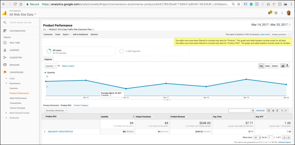
When you begin evaluating your pages the first step is to look at how the page is performing. Your analytics platform can easily tell you the status of a page by pulling a quick report in your goals or ecommerce section:
You can also do this using funnel visualization tools:
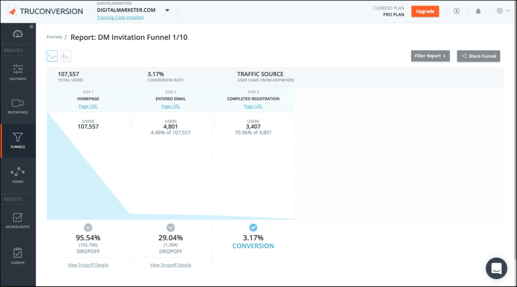
Now this information is 100% crucial, but it only tells you a part of the story…
…the what…
This is why we use heatmaps and other customer behavior analytics tools. We want to get the full story! We want the why.
Unfortunately, we see these reports filled with bright colors and click percentages and are left with the most frustrating question:
NOW WHAT?!
Today, I’m going to tell you 7 ways to read your heatmaps so you can actually leverage this data to boost leads and sales on your site.
Contents
#1. How much of your content your average visitors are actually seeing
Report to use:
Scrollmap
Top pages to test on:
This can work on all pages but is great for homepages, long form sales letters, product pages, and blog posts.
What to look for:
This is a straightforward report. You’ll want to start by looking at the average viewer drop off rate. You’ll notice we break the scroll map down into different view percentages.
Look at the 75%, the 50%, and the 25% then look at the associated content.
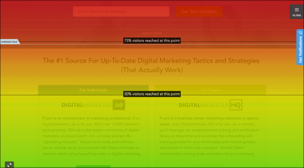
From here you can try to see if there is any correlation between the content on the page, the location of the content, and the dropoff percentage.
In most cases you’ll see a loss of 25% of your viewers at the average fold area. I’ll discuss more about the fold in a later tip!
However, if you see a big drop in scroll percentage over a small period of scroll space you might have a content issue.

In the image above DigitalMarkter lost another 25% of people who scroll down the page at this headline. Likely this headline gave no incentive to scroll further down the page. This is an assumption that can be tested, but would have been ignored had they not looked at their scroll report.
Why this matters:
You spend a lot of time developing content and if your customer isn’t seeing this content then you are wasting your time!
Say you post 5000 word blog posts and realize that only 10% of your audience is making it halfway down the page? In this case you’d want to break these posts up to ease consumption. Business owners and marketers likely don’t have the time to consume this all in one sitting so you should meet them on their schedule.
DigitalMarketer spends a lot of time and resources developing high-end customer stories for their DigitalMarketer HQ product. However, only 6% of people who viewed the HQ homepage actually saw this content.
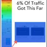
This is the most persuasive, compelling, and expensive content by far and nobody saw it!
DigitalMarketer realized that they needed to move this content up in a section that got more eyeballs and still made sense in terms of the page narrative.
#2. Whether or not they actually see your call to action (or find it compelling)
Report to use:
Click Report (Secondarily: Move Map)
Top pages to test on:
Landing pages, product pages, or any page with a main CTA
What to look for:
On this report you’re going to want to scroll to your main page CTAs.
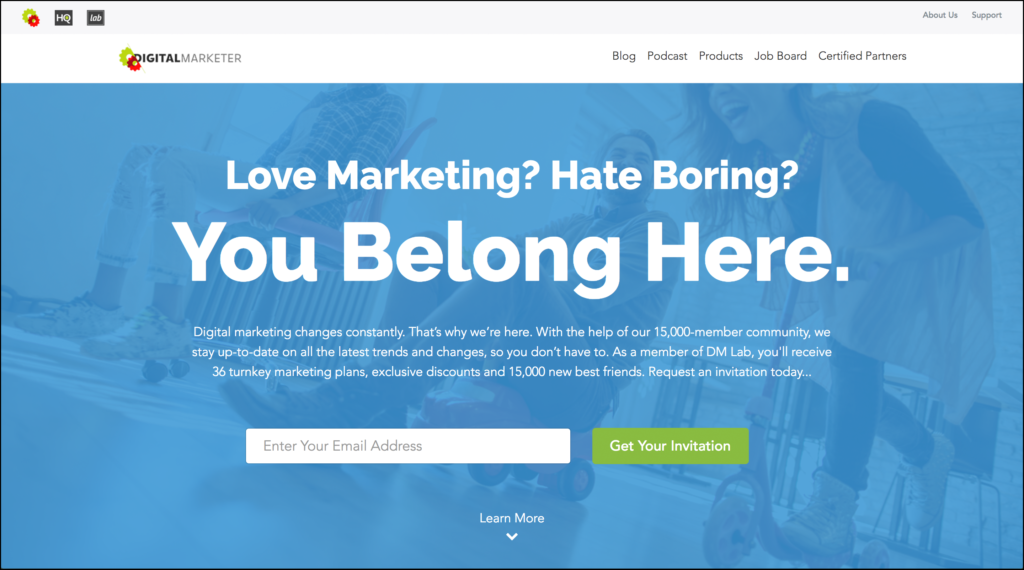
From here you’re going to want to see if there is a high level of click density.
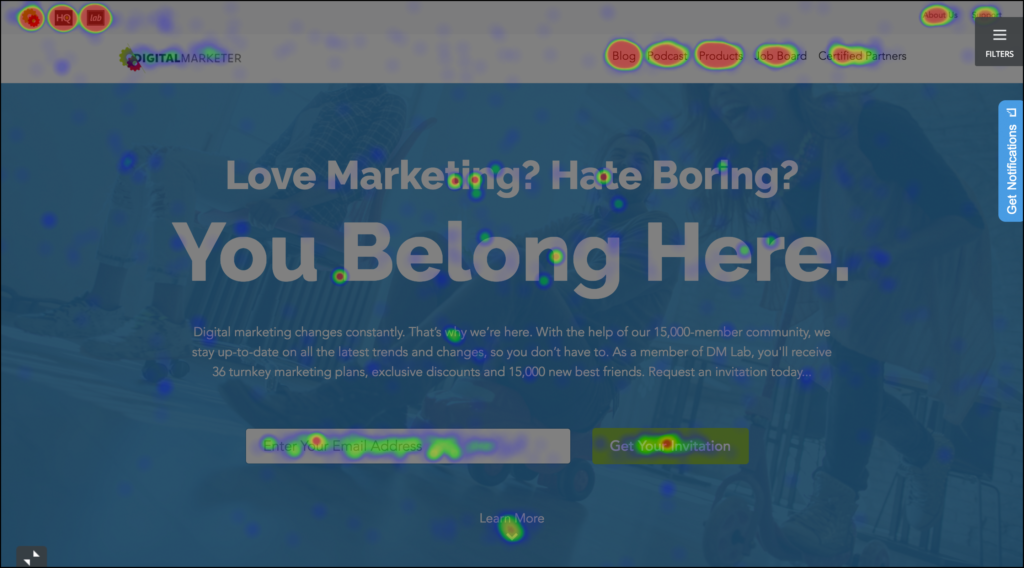
If click density is low, then the user either 1) didn’t see the CTA or 2) didn’t find the page compelling enough to click.
In most cases it’s super easy to see if your CTA stands out so your low click rate is likely due to the page message!
Why this matters:
If you can’t convince your visitors to click, then you’re just wasting their time (and likely your paid media budget). Optimization is about doing more with the traffic you’re already getting and if you aren’t getting people to click your CTA then you know EXACTLY what needs some work!
#3 Where they THINK they should be clicking…
Report to use:
Click Report (Secondarily: Move Map)
Top pages to test on:
Landing pages, product pages, or any page with a main CTA
What to look for:
Look for content on your page that does not have an associated link or isn’t a section that was designed to be clicked by the visitor.

Next look at the corresponding heatmap for that section.
If you are seeing high click density, then you are in some trouble. If a visitor clicks somewhere and it does nothing, this causes frustration. This frustration will quickly turn into a bounce (or exit) so you need to improve this user experience. Find out how DigitalMarketer did it in this case study!
There is an upshot! If this is a highly clicked area and you can actually direct visitors who click here to a compelling offer or to some compelling associated content then your page has done its job.
In short, you main goal is to identify if people are clicking areas that weren’t designed to be clicked and to then make a decision about removing content or turning it into a primary or secondary call to action.
Why this matters:
Your call to action is the lifeblood of your page, it’s the next step in your customer’s journey and you have to keep them moving.
If they are distracted by other content or by other less desirable calls to action then you’ve lost them. Evaluating your page in this way will help come up with concepts to keep them on track.
#4 Which Offers Are More Compelling
Report to use:
Click Map
Top pages to test on:
Pages with multiple offers on them, category pages, & blog content pages
What to look for:
First you’ll want to scroll to the section of the page with competing offers.
Next, look for the click density visualization to see if there is a visible difference between.
Finally, hover over each section to get the click percentages and raw click rates.
Why this matters:
We are always competing for space when we add offers or content to top funnel pages. Whether this is an extension to your core offering, a cool cross-sell, or just a list of your best content, you need to see if any of these things actually resonate with your audience.
Further down the fold on DigitalMarketer’s homepage they offer to learn more about both DigitalMarketer Lab and DigitalMarketer HQ. In this case you can see there is a design mechanism in place to put the focus on Lab and that seems to be working since it is getting more than 2x the number of clicks as HQ.
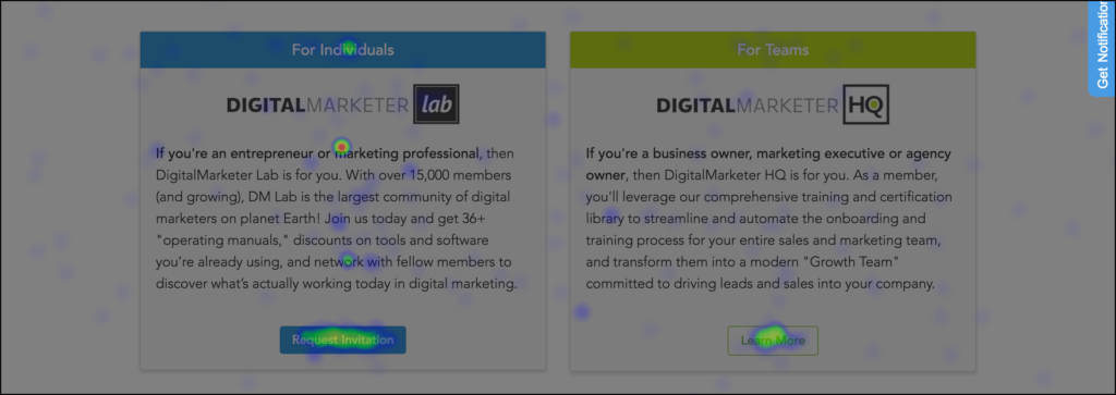
If you don’t differentiate with design like in the above example but are purely merchandising, then you can see if which offer, product, or piece of content is the most compelling.
Another example is with blog posts
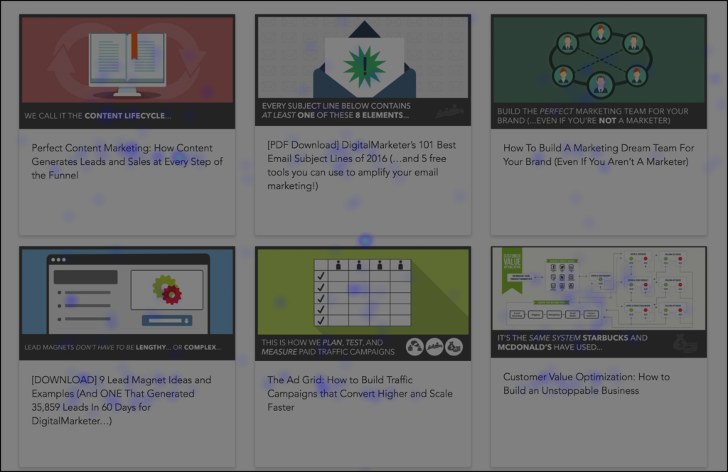
Here you can see content listed here has a low click density. This isn’t surprising since they are at the bottom of the page. However, each piece of content is clicked differently.
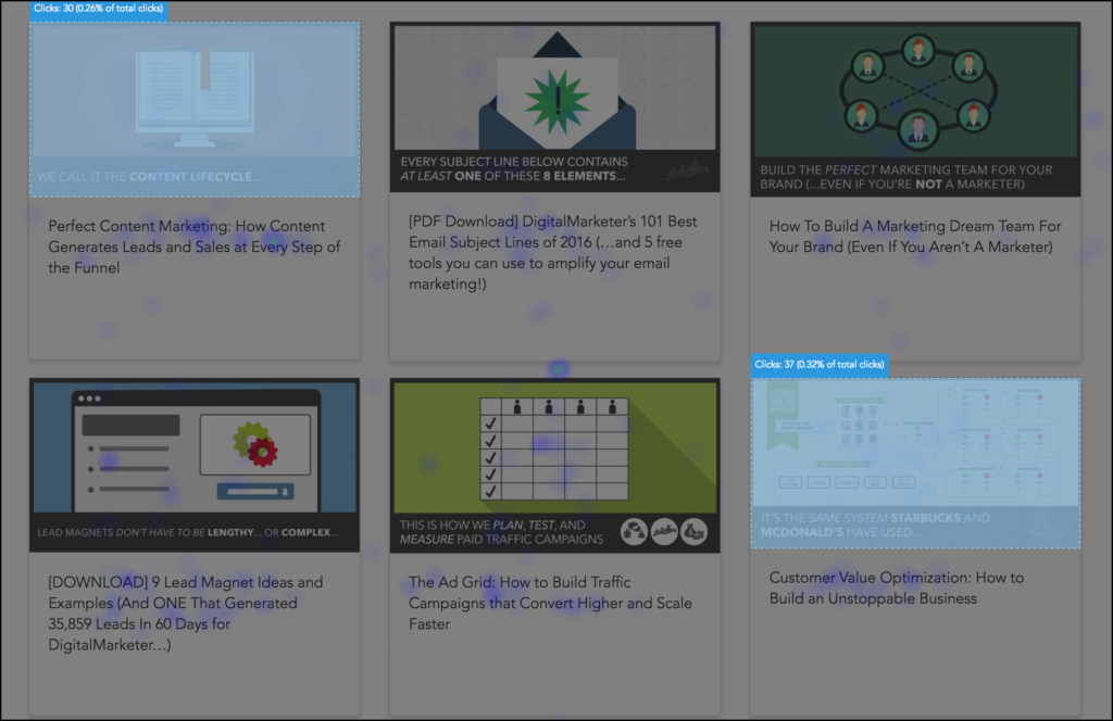
The most clicks are actually on the top left hand corner and bottom right hand corner. Since the clicks are spread out and not just on the left hand side, we can surmise that the content topic is actually making an impact here.
Furthermore, we see that what gets more click density, even this far down the fold, is the invitation to read more on the blog.

So from a merchandising position, DigitalMarketer may need to rethink which posts they put front and center (and in what order).
#5 Your compelling mobile site content
Report to use:
Click Map (Mobile View)
Top pages to test on:
Mobile landing pages, mobile homepages, mobile product pages, & mobile sales pages
What to look for:
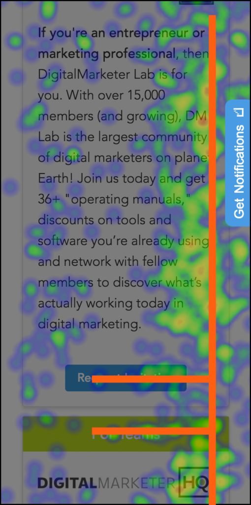
The backwards L
The backwards what? Here let me show you!

Clicks on the right hand side clutter mobile tap maps because people tap when they scroll! However, due to most mobile site designs the main CTA is a larger button that is center oriented.
Because of this you will see a notable change in click behavior when they want to actually interact with a call to action. In other words, you’ll see a higher click density that breaks from that right aligned tap fest that creates a backwards ‘L’ shape.
Why this matters:
Mobile is the future of digital marketing and if you have a sub par experience you’re going to lose that customer to your competition. This report is a good way to see how they behave on mobile devices!
There are three main takeaways from the mobile click report that any marketer can use to improve the page.
The first is if your CTA is noticeable enough to actually be clicked.
The second is if your content is compelling people to scroll and interact with the mobile site and consume the content
The third is whether people are actually clicking the right thing!
DigitalMarketer ran into a bit of an issue with headlines looking like buttons

Look at that backwards L click pattern that is most definitely causing user frustration AND taking away from the main CTA’s click through rate…double bummer!
#6 The content people click in the first 5 seconds
Report to use:
Detailed Report -> Time To Click
Top pages to test on:
Any page!
What to look for:
First you’ll want to look at the actual breakdown of click timing.
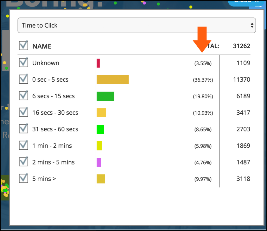
If you have a high percentage in the first few seconds you are looking good. If you don’t…well you need to work on your messaging.
Next you’re going to want to look at click behavior, so toggle different click cohorts and see where they’re clicking on the page to see if there are any behavioral differences.
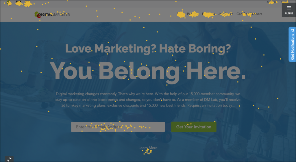
Protip: Use advanced filters to redraw the heatmap so you can see how long certain traffic sources take to click!
Why this matters:
If a visitor doesn’t know what you’re all about and what to do next within the first five seconds, you’re sunk. If you are working on a new site concept that hasn’t launched yet I recommend checking out the 5 second test to sort out any usability and messaging issues.
However, if you have a site launched already you can just run this report to see if people know what to do when they land on your page.
#7 If you’ve created a false bottom
Report to use:
Scroll Map
Top pages to test on:
All page
What to look for:
Look at the ‘Average Fold’ line and then the corresponding percentage of viewers that see the content at the fold.

Now look at the content there, is your above the fold content nicely hugging that average fold? If so then you created a false bottom and are absolutely losing visitors because they don’t know there is anything else there!
Why this matters:
Whenever a new page is designed you’ll run into the false bottom. Designers like pretty pages that take up the screen and have clearly defined sections.
While you do need a good looking page (it definitely helps build rapport) hugging the fold is just going to make people think that what’s above the fold is all you have for them.
Any easy solution is to tease content at the fold line that shows them there is more content down there for them to consume. If they have more questions, there are answers! If they want to see the product or service in action, it’s all down there…
They just need to scroll.
Without a visual prompt that teases more content a large number of visitors are just going to leave. So stop hugging the fold!
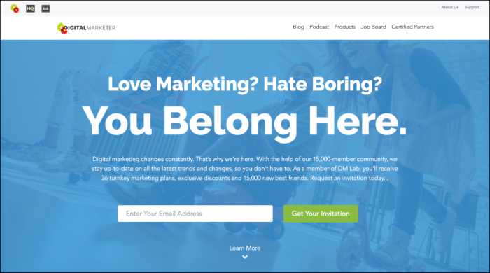
Protip: If you think adding and arrow is enough…it’s not. Take a look at the drop off on DigitalMarketer’s homepage.

So these are seven specific lessons you can learn about your customer behavior! Once you identify these types of behavior you can begin to come up with new ways to improve the customer experience and your conversion rate.
Happy Testing!


4 Responses
Thanks for a detailed explanation of how to use heat maps. I’ve used them in the past but just used common sense to see what users were or weren’t clicking on. I really found the scroll map and the backwards L on mobile heat maps helpful.
Really looking forward to the launch of the software!
Glad you enjoyed the post Ryan! I think the majority of people using heatmaps use them EXACTLY like you did, the thing is there is just so much more you can do with them.
The software has launched, well we’re in Beta but exiting beta next week! If you want to give it a try, I’d jump on now before we launch into the post beta release because there will be some significant changes from a feature and price perspective.
Thanks again for reading and taking the time to reply!
Nice article Justin! We’ve dabbled with Hotjar but you’re on our radar as a tool to compare. Anything you can share about why TruConversion could be a better alternative?
Great Question Marc!
Really it just comes down to power and product focus. We truly believe we’ve built one of the most powerful customer behavior analytics tools with a focus on passive user testing, e.g., testing when a visitor is unaware they are in a testing atmosphere. Simply put: we want to know how people act not on how they report to act.
That said here are a few things that make us different and worth checking out:
– We include more detailed Heatmap features including time to click and campaign parameters. We also load up your heatmap on your current live page and let you filter out and redraw your heatmap based on parameters such as location, campaign, device, source traffic and more.
-You can select individual elements to use as your recording trigger instead, e.g., a button click, instead of wasting time recording sessions that don’t include that action.
-We include more powerful filters to give you more details to your funnel and form analytics rather than just providing you data with the average user information.
– We allow for funnel branching and javascript funnel triggers so you aren’t stuck with a 1-1 url relationship for step completion (or even stuck with the URL for that matter)
We also take 3rd party integrations very seriously and provide more integrations than HotJar so you can use this tool to push data to your CRM or ESP or make it much easier to install if you’re using Shopify, Magento, or WordPress.
Those are just a few of the differences between the application currently. As we grow and mature the features, we do plan on focusing on our ‘passive’ features such as adding more features to the heatmaps and session recordings.