Have you done all the preps to hold on your visitors?
Done with a compelling copy? Have added appealing images? And I know you must have spent thousands on putting up ads too!
Still not satisfied by the number of visitors who stay?
The question is:
Have you thought about the exact reason of why there is high bounce rate? Not able to find that ONE reason.. Right?
Because there is NOT only one reason, dear fellows!!
Instead there are gazillions of reasons which add up together and increase your bounce rate!
Another Shocking fact which adds up to the muddle:
“The 59 Seconds theory”
Nielsen Norman Group did a research in which it figured out that most of the users stay on a page and judge it just for 59 seconds. So if you do not attract the user in 1 minute then you have literally lost the user.
So now, you are a part of this insane trend…
What have you thought about? Are you just going to sit and wait for something to happen?
No you don’t..
I’m here to help!
But before I move on and help you I want to make sure you’ve got roads to your website packed with traffic. So here’s a great piece talking about 10 ways to boost traffic to your website by my friend Mike Dane.
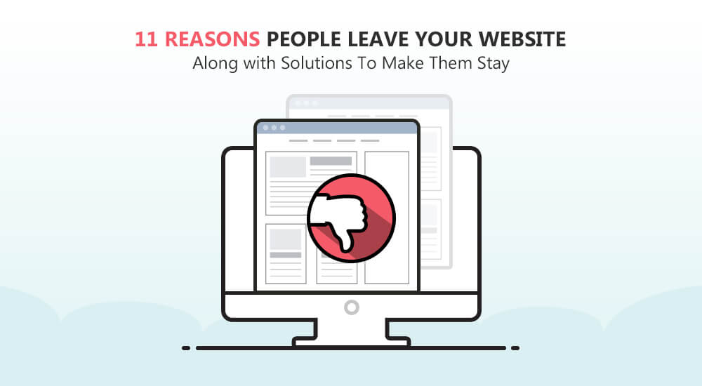
Now let’ talk about what you came for! Here are 11 Reasons why people are leaving your website along with Solutions to hold them:
Contents
Slow Page Loading means High Bounce Rate:
Page load speed is the first thing that drives away the visitors and it’s the first thing that shapes our first impression about any website.
Don’t trust me?
But trust these stats by KISSmetrics:
- 47% of the users on your page expect your page to open in about two or less than two seconds.
- While 40% of the users just bounce off if the site is taking more than 3 seconds.
If you are not paying attention on optimization of your site’s page load time then you’re definitely mistaken.
According to research by Akamai, if an e-commerce is making $100,000 per day, just one second delay in the page load time could result in $2.5 million loss in sales per year.

Check this fact packed infographic and find how much page load time is costing you money.
We today have become extremely impatient, as we have so many choices but so less time.
So yeah I don’t blame people for hating delays!
But don’t worry!
Here’s the solution to improve page load time:
- Reduce Image Size- There are many software like Cloudinary which help you make the image optimized.
- Use Cache- Use software like eTags to manage your caches.
Now have some great insights from this post on HOW TO SPEED UP YOUR PAGE LOAD TIME by Nora Flint.
Unappealing Call-to-action:
A study carried out by Small Business Trends states that 80% B2B websites didn’t have a strong call to action.
They lost a lot of customers just because of their CTA.
Solution?
Have an Attention-Grabbing Call-to-Action!
Remember:
Your visitors simply won’t take any action on your site if you don’t attract them in the first glance, so you have to make sure that you write a captivating and relevant call-to-action that’ll make your visitors to take some valuable action at that very spot.
Your CTA should be:
- Appealing
- Enticing
- Having Action Words
- Having a color that stands out
- Leading to a Specific Action-driven page

Here’s a wonderful post that talks about 10 POWERFUL TACTICS TO WRITE A HARD HITTING CALL TO ACTION.
There are still many sites which have confusing menus and link. Most of the navigators are difficult to recognize.
Some sites have duplicate page titles and other design flaws which makes it difficult for users to find what they are searching for.
The basic navigation rule is that you should always think through the customer’s perspective.
Imagine as if you are the customer, how would you want the site to look like, how would you want the navigators to be placed.
Solution?
Intuitive Navigation
Alway remember to use the ‘KISS- Keep It Simple Stupid’ model when it comes to navigation.
Your Navigation should be:
- Clear
- Familiar
- Interactive
- Structured
- Clickable
- Responsive
If you look at the navigation menu on Apple.com, it is supported by realistic images to help visitors find what they are searching for.

Tweak your site’s navigation with the help of the 22 Navigational Principles in order to retain your potential customers.
Site lacking Personality:
Remember:
Building a unique brand personality of your site is one of the most important factors in designing.
Millward Brown agency carried out a research on Brand Personality and they came up with a conclusion that brands express themselves differently in different countries
And this uniqueness is what builds their relationship with the customers!
So how do you think you can build it?
Looking for Solution?
Building a Brand Personality for your website is what you have to do.
Keep the genre of your business in mind while designing any website.
It should never look like anyone can build the website you have made.
Having a connection with your audience along with proper focus is essential to have.
There are different factors which build up a website’s personality such as:
- A captivating design
- A non-spammy headline
- Action-driven CTAs
- Social Proofs
- Credibility
Irrelevant Offers:
Crafting an engaging offer is very important, but have you checked if it is relevant to your audience or not?
If it is, then are you presenting it in a manner that’s captivating?
If you are observing fluctuating traffic patterns at your site which shows that you have a high website bounce rate, then i’m sure that you are not pitching your offer in a compelling manner.
In a research by Boxever, 40% of the audience stated that if they are given irrelevant offer, they won’t simply move further with the offer.
While 59% of respondents said they would unsubscribe from that company’s content if given irrelevant offers.
So what can you do to overcome these losses?
Any Solution?
Just make your Service a “Need”.
Effective landing pages need a strong copywriting. You have to describe your offer in such a way that it looks essential to have.
Never forget to perform A/B Testing on your web pages whenever you tweak the copy for the offer.
Remember:
You have to make your service a need which visitors cannot simply ignore!
When making your offer relevant, make sure you follow these factors also:
- Know your Audience Well
- Don’t stop your Market Research
- Make your Offer Nutritious
- Have an Appealing Product Description
- Lastly, pay a lot of Attention on your Content
Make a SMART Offer which your visitors would not be able to ignore.

Check this amazing post on Making your Offer Irresistible.
Irrelevant Content:
Having a blog full of posts? Almost all kind of posts you could have on it.. Right?
Here is the Kicker:
This isn’t the right way!
You need to have relevant content on your website only.
And remember, being a top-notch writer doesn’t make you relevant. The Real Solution is to:
Create a Quality Blog
You need to keep the foundation firmly in mind as you pursue relevance in your content marketing.
Only then you will be able to discover and create the content that meets your users’ needs.
Relevant content isn’t just about being a good content crafter.
It’s about the mechanics as well which include:
- SEO
- Keyword Research
- Meta Descriptions
- Objective Statement
- Timely Delivery

Get your content into circulation with the relevant audience.
Link internally in your posts to show off your previous blog posts.
Check this useful post on HOW TO OPTIMIZE YOUR BLOG CONTENT IN 10 SIMPLE STEPS.
Unreadable Content:
You must be thinking that design is just about the colors you use, images you put and graphics you create.
But this is not the case, my dear fellow!
Your design also includes your content creation and your content readability!
The kind of content you provide and the shape in which it is being presented. Both are important.
How do you think you make your content more readable?
Solution?
Use some techniques to make you content Legible
Besides the colors and images of your web page, your background also plays a vital role in building up the visibility of your content on your website.
There is no rule as to which font you should use, but keep in mind that it should legible. If it can’t be easily read, it’s simply not going to convert.
Basically, your content should:
- Have a legible Font
- Have a Suitable Font Color
- Have the right font size
- And a contrasting background.
Too many Sign up Requirements:
As you create the registration process, ask yourself if every field you are adding in your registration form is essential or not.
Extra fields or the gated content are great for driving leads into your website sales funnel but protecting everything with restrictive registration requirements will kill your conversion rate.
What can you do to lessen the requirements?
Solution?
Just focus on important requirements only
Do not add unnecessary or extra fields in your sign up forms because that is simply wastage of time and energy.
If you ever feel like that, just recall the case where Expedia earned an extra $12 million by removing one single data field.
Check if the fields is:
- Relevant
- Essential
- Making a Difference
Have a short and precise Sign Up form. See how simple and to-the-point form TruConversion has.

For more details check this amazing post on Web Form Conversions by Mike Dane.
Unbearable Ads/ Videos:
You think excessive advertisement would do the trick?
It isn’t like that buddy!
Few ads with high impact is the ideal solution!
You do not need to have ads all over website.
A study Trust in Advertising report carried out in 2014 by Nielsen showed that visitors have a sense of trust on almost all types of traditional advertising like newspaper advertisements, magazine advertisements, billboards and radio advertisements.
But there is less trust on online ads.
Secondly, nothing makes the user run away from a site more than a video that is set on auto-play.
Throwing your content and offers at visitors in this manner is a really bad idea.
Know that your visitors are smart enough to choose what they want.
What exactly is the solution?
Few Relevant Ads/Videos Only
Removing all the ads from your website is not a right thing especially when your website is has an ad-driven kind of model.
But…
There should be a certain sort of balance on your site and your website should never be over-crowded with ads.
Another thing which you shouldn’t forget is that ads shouldn’t be the first thing that visitors notice on your site.
Ads shouldn’t take a lot of your site’s space.
Add relevant and interesting videos and never put the videos on auto-play.
Not Offering Live Chat:
Some people state that offering live chats is a little awkward and irritating because you are intervening in somebody’s online experience.
But a total absence of live chat also leave the users unattended and clueless at times.
Have to maintain a balance…right?
Use Live Chat Trigger
The real thing is that live chat provides comfort and ease for the visitor.
You do not have to poke them unnecessarily but you have to there in case the user needs assistance.
There could be any issue at hand which the user wants to be answered right there and then and if he doesn’t have any help, he’ll simply checkout without making any purchase or even subscription.
There is less chance of missing order on ecommerce when you provide the customer with live assistance options.
Do not ask too many questions and set a pre-chat survey to give your customers an idea.

Check this amazing detailed post on How Live Chat can be the Best Retention Tool.
Non-Mobile-Responsive Site:
In case you are thinking that you would pass by without having an mobile responsive website, then it’s a big No!
According to research gathered by Mobify, 30% mobile users abandon a cart when the site is not mobile responsive.
Trust me, you cannot simply afford to lose out a big chunk of customers just because of your laziness of not shifting to a mobile responsive site.
Solutions?
Mobile- Friendly Sites
When you’re not having a mobile friendly site, you’ll end up losing a significant audience in the organic search rankings.
While designing a site for Mobile Site, keep in mind the following:
- Keep it Simple
- Keep it Fast
- Do Not Clutter
- Design Large Buttons
- Put a Search Box
- Resize Images and Content
- Lastly, test your mobile site on multiple browsers & screen sizes
Check this amazing post on 10 INSANE WAYS TO SKYROCKET CONVERSIONS FOR MOBILE COMMERCE.
Conclusion
These 11 reasons along with actionable solutions, will guide you to build a high converting website which will lessen your exit rate for sure.
Now you need to dig down the real reason behind your high exit rate. See what is going wrong and fix your mistakes as soon as you can.
Because you cannot simply afford to let go your visitors just like that.
Good Luck for your Visitor Retention!