Quick question: Which do you prefer?
100 clicks and 10 conversions?
Or 100 clicks and 20 conversions?
It doesn’t take a rocket scientist to understand that more conversions for the same number of clicks means a better conversion rate.
For a long time, I was scared about conversions and optimization in general.
I always thought that it’s too complicated.
Or it’s something that only experts do.
Is that you as well?
Do you find yourself in that same position?
Lucky for you, I’ve compiled this comprehensive build High Converting Landing Page Guide for you, so you won’t have to live in fear any more.
By the end you’ll feel confident you know what you’re doing with your Landing Pages.
You’ll also feel empowered and make choices faster.
You will become more efficient and focus on delivering a great user experience, not on tweaking and comparing data.
Stick with me and you’ll learn:
- The importance of starting with your users’ needs and desires
- What conversions you can set on your own website or blog.
- Why some pages just convert better than others.
- How you can analyze, test and improve your Landing pages.
- What tools to use to create high converting Landing Pages
…and much more about Landing Pages, conversions and optimization.
Since this is a hefty guide, you can easily browse through sections/chapters using the Table of Contents below:
1. How to Create the perfect landing page
2. The Customer Journey And User Experience
3. Set Your Objectives to build High Converting Landing Pages: Why MORE Conversions Isn’t A Real Number
4. Landing Page Copy Matters: Talk To Your Customers
5. Images That Are Worth 1.000 Words: Find Them, Use Them, Don’t Abuse Them
6. Form Fields Are Your Friends: Should You Really Get Rid Of Them?
8. The Finishing Touches: Don’t Let Them Doubt You
9. High converting Landing Pages Examples
10.The C-T-O Framework and Landing Page Strategy
11. What To Measure: Metrics, Reports And Analytics for Landing Page Optimization
12. Seven Hacks To Increase your Landing Page Conversions
13. Landing Pages And SEO: Should You Worry?
14. Tools Of The Trade: Which Tools To Use To build High Converting Landing Pages
15. Further Reading: Recommended Blogs, Guides And Courses
So let’s jump right in with our first chapter.
Download my Cheat Sheet and start creating High Converting Landing Pages
Almost there! Please complete this form and click the button below to gain instant access.
Contents
Enter your details to learn building High Converting Landing Pages!
We hate SPAM and promise to keep your email safe.
Getting Started With Landing Pages
The great thing about Landing Pages is that nothing is written in stone. There are guidelines (we’ll discuss a bunch of them in this article), but there isn’t a Google or Facebook created and approved book on Landing Pages.
If something works for you – cool. If it doesn’t, you’re free to optimize it until it does work. And then make it even better.
The challenging part about Landing Pages? The world is always changing. I wish I could tell you long Landing Pages convert best. Unfortunately, the data isn’t there.
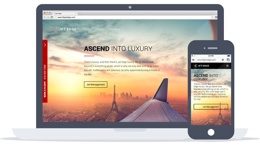
I wish I could tell you mobile is where it’s at and you should think mobile-first. But what is mobile these days? Is Google Glass mobile? Is the Apple Watch mobile? Is the 18.4 inch Galaxy View mobile? Trends come and go, but this guide will lay the foundation for an efficient Landing Page, regardless of what’s hot tomorrow or 5 years from now.
The secret? We won’t be focusing on technical jargon (although that is present here). Instead, we’ll help you see landing pages through the eyes of your customers. That means you’ll start from the customer’s point of view and you won’t make decisions based on hunches or feelings.
You’ll use hard data you collect and create high converting landing pages that feel natural to your customers.
They won’t feel your Landing Page as a burden, but a passage towards fixing their problems. If you get this right from the start, you’ll understand why some pages convert and others don’t. And hopefully you’ll be able to make the changes need to make yours more successful.
The Customer Journey And User Experience
1. The Customer Journey
If you’ve run any sort of online marketing campaign, you’ll have come across the term R.A.C.E.. Introduced first in Summer of 2010 (and updated in early 2015) by SmartInsights, R.A.C.E. stands for:
-Reach
-Act
-Convert
-Engage
It’s a set of 4 digital marketing goals, meant to help you see an abbreviated version of the Customer Journey. That is: what steps does a stranger take to become a visitor, a lead, a customer and then a brand advocate?
Another version of that graphic is below:
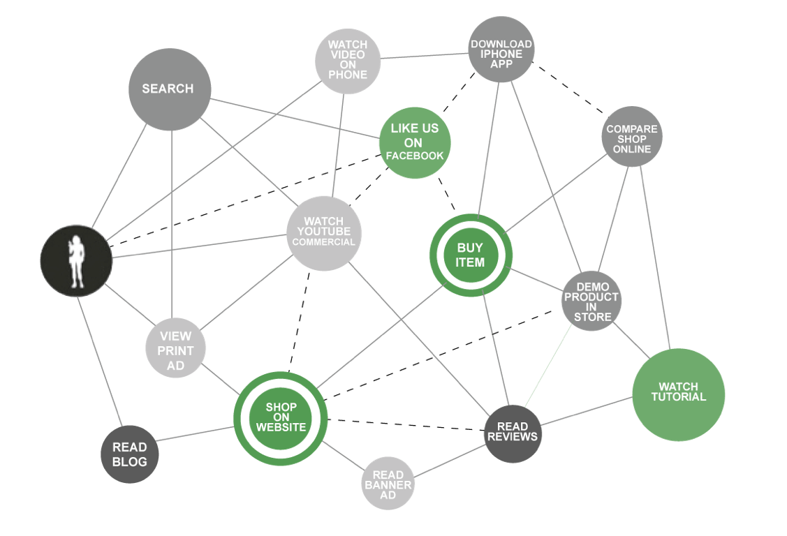
This one adds multiple layers on top of the original image – actions, touchpoints and KPIs. Since there are separate chapters on all of those, let’s go on with the R.A.C.E. methodology.
In terms of location, Landing Pages help you in all steps. Let me explain.
A. REACH
Let’s say you want to run an AdWords campaign. That means you need ads, a working URL and a Landing Page. Since AdWords takes a few cues from SEO, you’ll want your Landing Page to be fast, user-friendly and contain keywords from your campaigns.
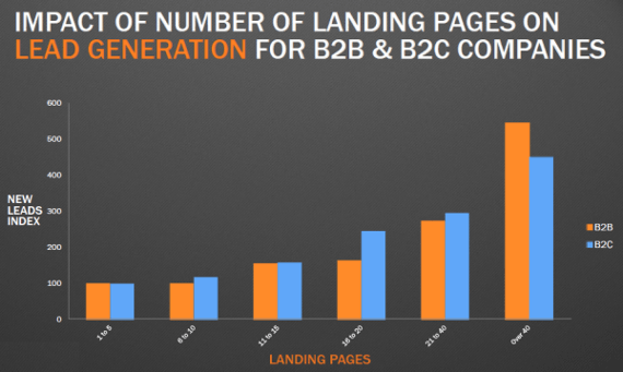
Studies by HubSpot have shown that companies that use multiple Landing Pages tend to have a great impact on conversion and the number of generated leads.
Sending paid visitors to your homepage is a big no-no. They might lose interest, leave immediately or avoid the page you were hoping they would convert on. Sending traffic to your dedicated Landing Page means targeted users, coupled with similar value proposition from your ad and overall a much better experience for them.
B. ACT
Once users are on your Landing Page, it’s up to all the elements to work together to convince them to take a micro-action. According to Unbounce, you should have a Unique Selling Proposition, a hero short, offering benefits, social proof and a Call To Action.
Micro-actions simply mean small things that users do on your website, that don’t involve a monetary value. For example: subscribing to an email newsletter, answering a survey or filling in a form.
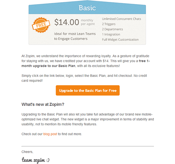
Having a single CTA is crucial to achieving your goals, as your users’ attention is guided towards only one element. No distractions, no confusion, no comparisons – one single CTA.
C. CONVERT
You might not associate a Checkout Page with a Landing Page. But after all, you click a “Buy” or “Complete Order” button and you land on a checkout page.
Since cart abandonments rates are close to a staggering 70%, you’ll want to optimize all the pages right after a user presses the initial “Add To Cart” button. A good way to do this is to use Consumer Psychology.
Imagine making a few simple tweaks (different words or colors) and increasing your online shop’s revenue by 25% in a day!
D. ENGAGE
Once a user has made a purchase on your website, the relationship shouldn’t end there. The most reliable source of online bookings is Word Of Mouth. That means friends telling friends about a great experience or users reading testimonials online.
Create and promote specific user referral pages. Landing Pages where users invite their friends (via email or social-media) to perform an action (join the website, subscribe to the newsletter or make a small purchase).
If a customer brings 2 more customers, isn’t it worth the trouble to optimize your Referral Page to bring in more additional customers?
BOTTOM LINE: Be aware of what your customers are trying to achieve and try to make your Landing Page fit that mold.
User Experience and Landing Page Design
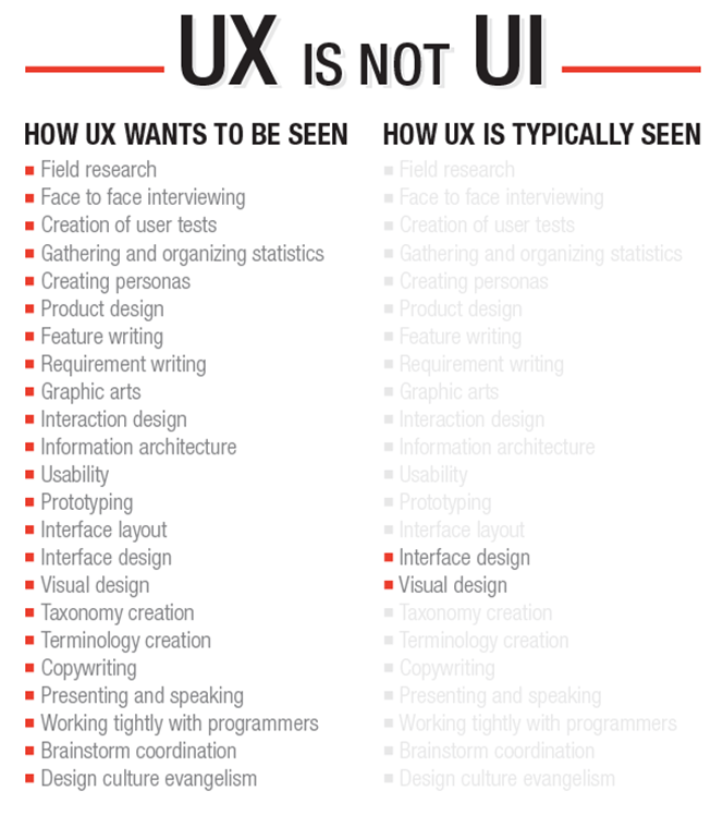
User Interface is similar to a Heads Up Display in video games. The UI is the collection of elements on a page, designed to help you navigate. From small things like headers and footers to important elements like Sign In/Sign Up buttons and specific scroll sections.
User Experience takes those elements and gives them a meaning and a purpose. It’s less about color coordination and more about how those elements make the user feel.
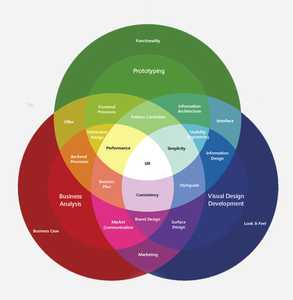
Have you ever landed on a page you just trusted? Or that just one you over? Or that just felt right and familiar? That’s User Experience at work, based on studies, tests and insights. And with a little bit of training, you’ll be able to train your eye to create great User Experiences on your Landing Pages.
First – work towards learning as much as you can about customers. Use tools like FaqFox, browse websites like Quora, create surveys using GetSiteControl and see how users browse your pages using Visitor Recordings in Mouseflow.
Second – make a habit of visiting your competitors’ Landing Pages and making notes about what you like, what you don’t like and what you can apply on your own Landing Pages.
Third – continue on this path and use email marketing or further surveys to understand people’s interaction with your pages. See what issues they had or what elements they thought were confusing or missing.
User Experience is much wider field than this, but starting from these basic building blocks, you’ll always be in contact with users and competitors. That means you’ll not optimize based on your thoughts, but based on real data gathered in the field, which more valuable than anything.
BOTTOM LINE: Do your research and plan before you build your Landing Page strategy. And once you’re done with it, continue to work on it, using data from visitors and competitors. Always look for opportunities to optimize.
Set Your Objectives to build High Converting Landing Pages: Why MORE Conversions Isn’t A Real Number
If you’ve ever worked with a client who wanted conversions, you know that you should be using specific numbers. “More” conversions is not a real number.
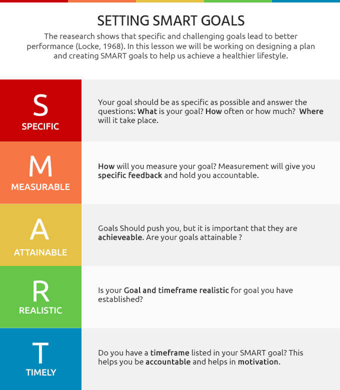
To help you set your objectives, let’s deploy another acronym I’m sure you’ll enjoy remembering: S.M.A.R.T.
Your objectives should be:
Specific
30 conversions sounds great. Much better than “more”. It should also answer the question: WHY do I want these many conversions? HOW does it help me?
Measurable
Your objectives should not only be measurable, but also quantifiable using tools. It’s great if you can count 30 conversions by hand, but what happens if that number is 100 times larger?
Achievable
We all want thousands and thousands of subscribers, but is that and achievable goal? If we’ve barely launched a Landing Page, without sending traffic to it, can we expect 1.000 newsletter subscribers within a day?
Relevant
There’s no point in having very specific objectives if they’re not relevant to your Landing Page.
- Timed
When will you achieve the objective? How long will it realistically take you to get to that number of sales or subscribers?
I’ve decided to write 20 content related blog posts within a month.
It’s 20 because that will allow me to have 2 pages of 10 posts per page on the blog. It’s achievable because writing comes easy and I’ve already written 5 posts in 5 days. It’s relevant because growing a blog means pushing lots of content fast. It’s timed because a month is enough time to publish these posts. It’s measurable by simply looking at the number of Published Posts section in WordPress.
Let’s take this and apply it to a Landing Page:
I want 30 new email subscribers within a week on the Free Content Marketing Framework Landing Page.
I’ve promoted the original post and I’ve already gotten 15 subscribers in just 2 days. I want to achieve this in a week because I’m promoting the page hard only for those 7 days. It’s relevant and achievable because the target users enjoy my content. Also, the content is valuable. It’s measurable because Google Analytics provides me with Unique Visitors on the download success page.
BOTTOM LINE: If you lay down the S.M.A.R.T. objectives foundation, coupled with Google Analytics, you’ll always be in control. You’ll understand what is happening and what your realistic expectations should be.
Landing Page Copy Matters: Talk To Your Customers
Are you “Optimizing people’s expectations to deliver value and quality in a sports environment” or are “selling performance sports shoes”? There are definitely words that make people click and make them take notice. And others that just fall flat.
In the next paragraphs we’ll learn 3 basic copywriting concepts: Power Words, Friction Words and the A.I.D.A. formula.
If that is true for real life words, in face-to-face situations, you can be sure it’s even truer in a digital context. A face means expressions, it conveys feelings, it sends hidden messages and delivers trust. It’s hard to have that impact with words alone.
Enter Power Words.

Power Words are here to help you influence the reader. Inspire the visitor. Make him feel something and, ultimately, take action.
To get you started with Power Words, this massive list compiled by Jon Morrow over at BoostBlogTraffic is a great. Not only that, but it manages to organize them into categories, depending on how you want the readers to feel and react after reading your copy.
Joanna Wiebe also knows how words affect people. In this article, she insists on the idea that your text should be memorable. Some Power Words might sound crazy on paper, but if they’re not boring and if they hold the reader’s attention, you’re doing a good job.
Furthermore, some Power Words conjure up an image in the reader’s mind, so you’ll essentially be writing fewer words and actually saying more (i.e. American flag, freedom, slavery, 9/11, etc.).
But just using Power Words won’t get you very far. You can’t just cram in all these wonderful words one after another. First, you’ll sound pretentious. Second, you’ll make your writing (and your Landing Page) sound too good to be true. Too “As seen on TV”, Too “market-y”. So you need to use these sparingly, you need to let the text breathe and flow naturally.
One exercise that always helps me decide whether I want to replace a word or a sentence is to simply read the text aloud. If something sounds fabricated, I try to take it out or replace it with something more natural.
And here’s where most people get it wrong: you shouldn’t focus on you and your product. Instead, focus on your users’ needs, desires and problems. Fix their problems by conveying a sense of excitement for the impact your product or service will have on your target customers.
So that’s why when Elon Musk talks about Tesla or Space X, you can feel his excitement. Not because he’s in love with his products. But because he’s enthusiastic about the impact of those products and companies.
Just to recap, Power Words are there to shine a light on your great product. Remember: marketing can’t save a bad product, as explained by this study from 2006.
Now that you’ve mastered the first element of high converting Landing Page Copywriting, time to move on the second one: Friction Words.
- Buy/Purchase/Add To Cart
- Subscribe/Join The Newsletter
- Submit/Send
If you’ve ever given your address to get an ebook, you know what friction feels like. You’re giving them something in order to get something yourself. But what if we went back and played with those words. What if we made it about the users, not ourselves?
- Buycould become Get or I Want This (these new versions express desire and the actual feelings; the first words feels like an action, a chore, an obstacle to having the product in your hands).
- Subscribemight turn into Send Me The Free PDF To The Above Email Address or Give
- Submitcould transform into Send Me The Goodies or I Want To Know More (we no longer provide robot-speak, but instead personalize the Call To Action buttons to actually mean something).
We’re removing obstacles, providing value and focusing on the benefits.
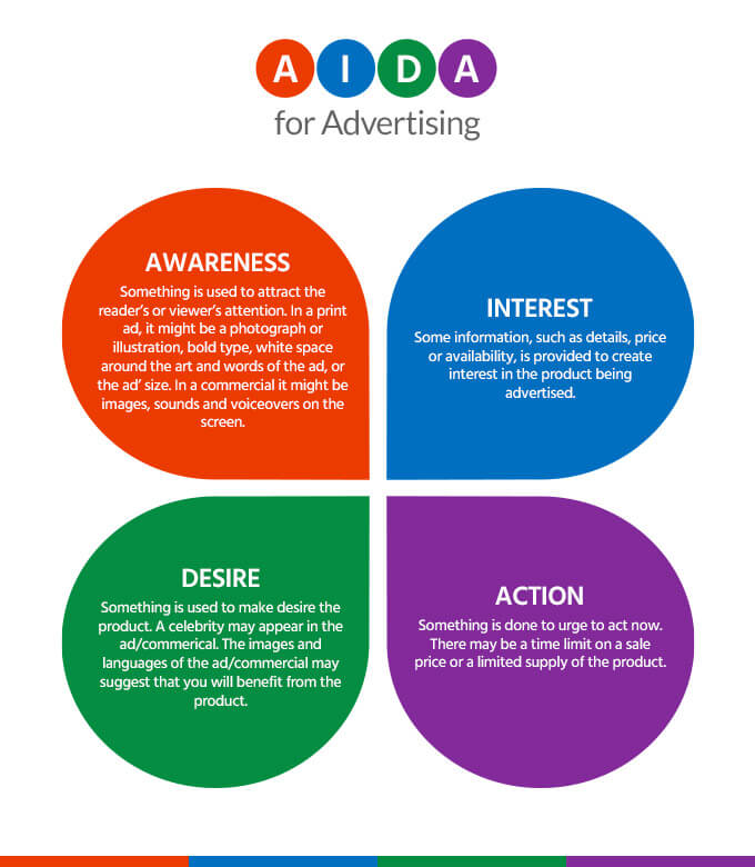
The last element of a great Landing Page Copywriting is the A.I.D.A. formula. It’s one of the best copywriting formulas out there. It stands for Attention – Interest – Desire – Action.
Your headline/title is the one that gets the Attention. It can be something shocking (“The average reader won’t finish the end of this headline”), a question (“Are you financially stable for the future?”) or even a single word (“Freedom”).
As people tend to have lower attention spans online (8 seconds in 2013 vs 12 seconds in 2000), text is scanned, not read in its entirety. For these reasons, body text should also act as an Attention point.
Interest arises when you’re speaking the customer’s language and you’re focused on his issues.
When you clearly explain how you plan to fix those issues, the customer starts to Desire a solution.
Action is taken if all the previous steps were convincing enough for the customer. It usually takes the shape of a Call To Action button (more on this topic in Section 8).
BOTTOM LINE: Words are crucial, even in an increasingly visual world. Take good care of your copy and it will serve you well.
You’re now ready to take out pencil or keyboard and write a first text draft. Since Landing Pages are a highly visual medium, text alone rarely persuades a lead to convert. That’s why we need images.
Images That Are Worth 1.000 Words: Find Them, Use Them, Don’t Abuse Them
Images play three roles on a Landing Page:
- They convey a mood.
- They support the text.
- They act as trust signals

As mood conveyers, images are usually the first thing a user notices when he first sees a Landing Page. We’re hardwired to see and recognize images first. Mostly because that’s how it’s always been. Cavemen didn’t have ads that they needed to read. Egyptians relied on symbols to quickly tell a story. Babies see shapes and colors naturally. We develop reading skills along the way, but our primordial instincts are still with us after all this time.
The questions you should be asking here are:
- Do all the images convey the same mood?
- Will women interpret these differently than men?
- How are colors perceived across the world?
As text supporters, images will guide the user, will strengthen what’s written and will provide another pillar of explanation. Some people learn visually, others focus on words and sounds – having a Landing Page that speaks to all of them means higher conversion rates.
The questions you should be asking here are:
- Is the image crop/angle appropriate?
- Do the images carry the same tone as the text?
- Do the images guide you back to the text?
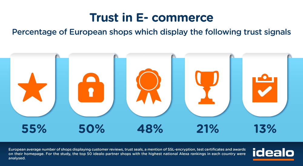
As trust signals, images should be clear, clean and out of the way. Testimonials, reviews and payment badges/trust certifications are usually positioned after the headline and benefits sections. Adding the correct links on elements like the TRUSTe Certification Badge signals attention to detail and focus minimizing user doubt.
The questions you should be asking here are:
- Are these images visible after the first scroll?
- Are the links on these images working?
- Am I using 100% original/non-stock images?
We can’t go into images without mentioning moving pictures – videos. Since mobile usage has increased up to 81% compared to last year, it’s no wonder that view consumption has more than doubled – from an average of 13 to 27 minutes a day. You might dismiss this by saying it’s all YouTube and Netflix, not product explainer videos and webinars. And you might be right.
But what this increase in video consumption do is that it changes people’s behaviors and expectations. Remember – our attention spans are now lower than those of a goldfish, a Microsoft study found. And it’s not just attention that’s the issue. Since we’re more connected than ever, with access to the internet on smart watches, mobile phones, tablets, laptops, computers, smart devices, fitness trackers and much more, we tend to use it more.
A CISCO study found that broadband speeds will double by the year 2019, allowing us to watch more content (including 4k/8k, 3D+VR), faster and on more devices.
What this all means is that our Landing Page visitors will expect us to respect their time and include a video. They will also prefer to watch a video than scan or try to read a block of text.
BOTTOM LINE: if you can afford an explainer video, go ahead and include one in your Landing Page. And in the age of Gig Marketplaces like Fiverr, everything is affordable.
Form Fields Are Your Friends: Should You Really Get Rid Of Them?
Have you ever looked at a Landing Page and wondered “Why are there so many form fields”? That is a good question but it tends to simplify the issue.

There isn’t a magic number of form fields out there that will guarantee a high conversion rate (although this study points towards the number 4). Even the industry and time of day have an impact on that, according to Crazy Egg.
Quick tips for form fields creation and optimization:
- Help the user by showing tooltips.
These are words and phrases that are inside the fields as gray text or appear next to them as you hover your mouse pointer. Tooltips are examples and helpful elements for the user to feel safe filling in the form fields; they remove doubt.
- Optimize for mobile.
It’s almost not worth mentioning since it should be a given. But mobile traffic in the U.S. has surpassed desktop for the first time, in 2014. That means you need to cater to your users’ browsing habits and provide a great experience overall. Typeform is a wonderful example of mobile-first mentality.
- Use inline alerts.
These are pieces of text that appear as warnings or errors as soon as you enter your text in a field. If you’ve entered a wrong character or forgotten to fill in an obligatory field, the alert should notify you right away. Not appear AFTER the user has tried to submit the form.
- Play around with the email field.
You can automatically exclude free email addresses (like gmail.com and yahoo.com, etc.), if you’re looking for high-quality leads. You can also ask for users’ “Business Email”, so you’ll increase the odds of getting a really good email address, instead of disposable one (maildu.de, harakirimail.com, etc.)
- Make all the form fields viewable within the first screen.
Mobile or desktop – the user should see how long the form is. That way, he won’t feel like a chore to fill in fields, scroll down, fill some more fields, etc. You can hack your way to a first screen form by having your fields on two columns, instead of just the classic one.
BOTTOM LINE: It’s less about reducing the number of form fields, but rather having the right ones in place.
Call To Action and Landing Page Optimization: How To Maximize CTA’s Impact By Minimizing Its Importance
No one wants MORE email. No one is really excited about filling in ANOTHER form. What people care about are the results after the action they’ve taken. That means they don’t necessarily want an ebook about facebook ads, they just want to be successful in using them.
So if people are interested in the end result, why are most businesses still focused inward and towards the journey, not the objective? Why are the Calls To Action “Sign up”/”Submit” (on GQ) and “Download Ebook Now” (on HubSpot), instead of “Be In The Know”/”Be Stylish Every Day” and “Learn About CTAs”/”Master CTAs In 15 Minutes”?
A great rule of thumb is this:
Create your Call To Action so it follows the words “I Want To…”. You’re thereby continuing the user’s thoughts.
BOTTOM LINE: Make it all about the users and focus on their end goal. Also offer opt-out choices and try to persuade them to go your way.
The Finishing Touches: Don’t Let Them Doubt You
We’re nearly done with all the basic elements of a great Landing Page. As we’ve mentioned throughout this guide, it’s not enough to just slap these things together and hope people convert and bend to your will. You need to inject some heart into your text and images.
And what better way to instill a sense of trust in your users than using previous customers’ words?
8.1 Testimonials
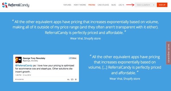
Done right, they work wonders because:
- It’s not you who’s doing the talking, so it’s like getting advice from a friend, not reading product features.
- You get to have (somewhat) non-polished, not market-y text on your Landing Page.
- It’s a great opportunity to strengthen the benefits you’ve mentioned, but using other words.
8.2 Security and trust badges

They’re a must-have if your Landing Page has a monetary value attached to it (i.e. sells a product or a service). Make sure to include methods of payment (PayPal, MasterCard, Visa, etc.), as well as TRUSTe and VeriSign badges.
8.3 Social proof

People tend to trust other people, even if they’ve never met them before. That’s why social proof lends trust. Add TripAdvisor star ratings, social media follower counts and boost your landing page credibility. Give you visitors different types of reasons to trust you (functional, emotional, etc.).
BOTTOM LINE: As the world becomes more complex and there is massive competition in any industry and niche, you want to stand out by appealing to more than just one type of trust signal.
High Converting Landing Pages Examples
Image Gallery with a short caption for each:
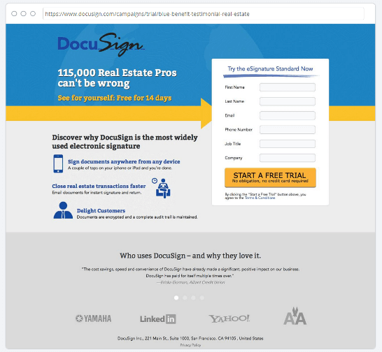
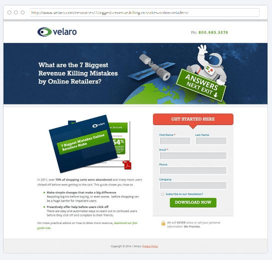
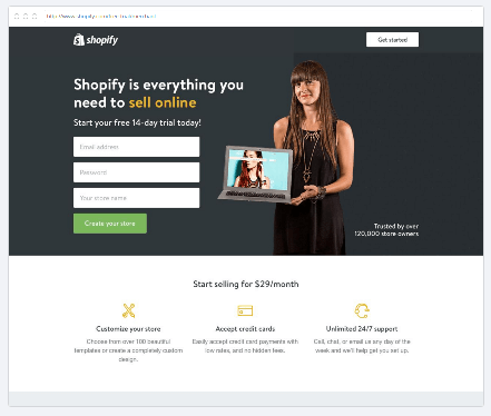
The C-T-O Framework and Landing Page Strategy
The C-T-O Framework stands for CREATE-TEST-OPTIMIZE. It boils down everything about Landing Pages into 3 basic steps:
- Knowing what you know about users’ needs and desires, use the Landing Page anatomy to CREATE pages that speak the proper language, use attractive visuals and offer enticing benefits.
- The optimization process begins the moment you start to TEST the Landing Page, looking at things like Call To Action, Number of form fields, Page1 vs Page2, etc.
- Once you’ve gathered data, it’s time to move on to the final step –OPTIMIZE. You’ve settled on one-page iteration and you’ll start making tweaks – create additional pages, ask survey questions, etc.
It’s easy to get caught up in the magic of testing and the continuous desire to optimize and increase conversions. Unfortunately, we’re always working against the clock. A competitor might come up with a better Selling Proposition, making ours not as Unique as we first thought.
Another Google update might roll out and suddenly our minimalist Landing Page might be seen as “thin content”, losing rankings and making users lose faith and what we’re selling.
The simple C-T-O Framework acts as a reminder to continuously work towards providing value for your users. To continue to search for answers and better ways to serve your customers. To focus on what matters and create a great user experience overall.
BOTTOM LINE: You can never know for sure what will work before you try it out on real people. And then even when you’ve got your first results, that can change in an instant. Create-Test-Optimize!
What To Measure: Metrics, Reports And Analytics for Landing Page Optimization
If we’ve learned anything from the C-T-O Framework is that it’s important to keep it simple (at least at first).
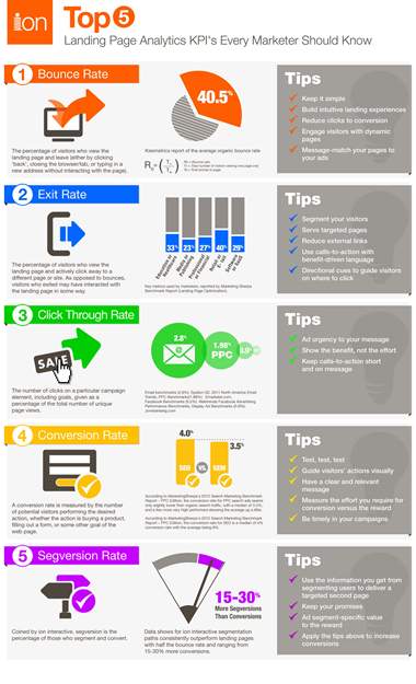
The most basic metrics we should be tracking for our Landing Pages are:
- Time On Site/Page
How much time are users spending on our Landing Page? Is there enough time to read or at least scan everything on the page? Are the users waiting for the page to load?
- Bounce Rate
Are users taking a quick look at the landing page and leaving the website? Or are they completing the form and get redirected to a success page?
- Form Field Abandonment
If you’ve got 10 fields to fill in a form, are users abandoning it by field 5? Is there a problem with the number of type of fields?
- Conversion Rate
Whatever you’ve set your objective as, how many people are converting? Are the costs associated with driving traffic to the Landing Page low enough to guarantee profitability overall?
- Leads vs Customers
If your Landing Page is only there to gather newsletter subscribers, as a micro-action, are they converting to a customer further down the line? Or were they just interested in the newsletter?
For further information, a great tool is TruConversion. It allows you to see if people abandon a form and what field was their last one. You simply install one code across your website and it automatically detects all your forms. Select the one you want and let it gather data. Couple that with heatmaps (also a TruConversion feature) and you’ve got yourself a mighty Landing Page analysis package.
BOTTOM LINE: You shouldn’t go crazy with measurement. Even if you only get a few leads/subscribers each day, you can start interacting with them via email or twitter. Find out what they like or hated about your Landing Page and start optimizing.
Seven Hacks To Increase your Landing Page Conversions
- Use an exit intent popup for another newsletter subscription ask.
- Add social-media sharing buttons after a successful newsletter subscription.
- Create single-field forms.
- Switch the images for one kick-ass video.
- Offer a free sample (i.e. a few book chapters) in exchange for just the email address.
- Implement social login on forms.
- Offer a guarantee (i.e. 110% Money Back If You’re Not Satisfied With The Results!)
Landing Pages And SEO: Should You Worry?
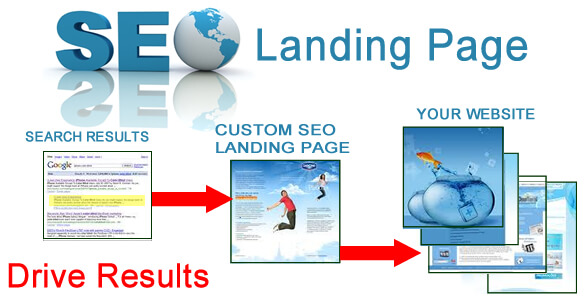
While Landing Pages tend to feel like smaller versions of a homepage, Search Engine Optimization tends to work in the same way.
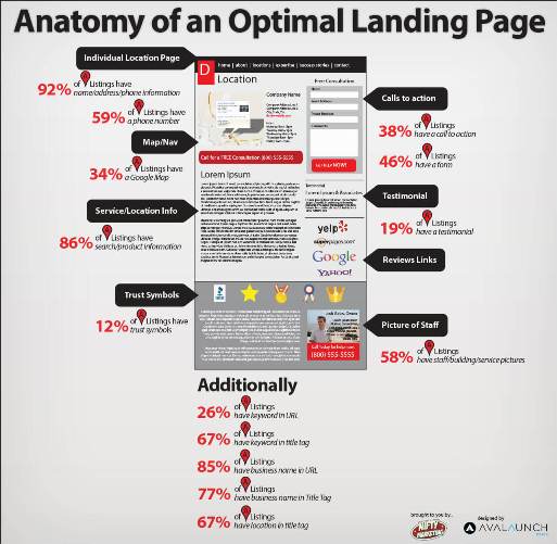
According to SearchEngineLand, there are 5 important elements to take into consideration when doing SEO for Landing Pages:
- Create A Keyword Focused Title Tag+Headline
- Have A Well-Written Description
- Generate Scannable Content With Properly Coded Hierarchy
- Attract Inbound Links
- Add Social Options
Unbounce adds a few more:
- Write Pure Optimized HTML
- Make Your Landing Pages Evergreen
- Match Your PPC Keywords To Your Landing Page
BOTTOM LINE: As Landing Pages evolve, Search Engine Optimization should be right there with it. Stay up to date with the latest Google Updates and try to adapt your SEO website strategy to your Landing Page.
Tools Of The Trade: Which Tools To Use To build High Converting Landing Pages
14.1. Landing Page Builders
14.2. Survey Creators
14.3. Heatmaps
14.4. All-In-Ones
14.5. A/B Testing
14.6. WordPress
14.7. Landing Page Testing
15. Further Reading: Recommended Blogs, Guides And Courses
15.1 Blogs
15.2 Guides
How To Write & Design Compelling Calls-To-Action by Hubspot
The Smart Marketer’s Landing Page Conversion Course by Unbounce
The Definitive Guide To Landing Page Optimization by Quicksprout
15.3 Courses
The Perfect Landing Page: Boost Your Conversions
Remember: focus on the user, testing is never over and conversion optimization means more leads for the same traffic.


