Your business relies on customers to thrive.
But customers come and go.
Wouldn’t it be amazing if you could tweak your checkout flow to get more customers from the same traffic?
Lucky for you, this is the guide you’re looking for. Full of actionable tips, explanations and a FREE downloadable checklist. To help you improve your checkout and get more customers in the process.
The guide is organized into the following sections. Feel free to skip through these or use them for easy navigation.
Contents
The Problem With Ecommerce Checkout Flows – Is Your Website Suffering From This?
Real life checkouts are much easier than digital ones. With all the technology, metrics and experts behind them, digital checkout flows just seem to be much more complicated. There is more choice, but there is also more complexity. There are a much larger number of devices and customers’ desires are ever evolving.
Go into any store and buy a pair of jeans. The process is pretty basic:
- STEP 1: Find some jeans you like (either ask an employee or browse the store yourself).
- STEP 2: Try on the jeans (this step is optional if you know your size or if you’ve bought from that store before).
- STEP 3: Go to the checkout area and pay (use cash or credit cards, since these are universally accepted methods).
- STEP 4: Get your pair of jeans and leave the store (with usually very little friction and little to no cross-selling or up-selling involved; also no personal details are exchanged, even though sometimes you get a free club membership).
That rarely happens as fast and as clean in a digital medium. The problem stems from all the complexity. Do you want to pay using cash or credit card?
Do you have a PayPal account or do you want to register one now?
Do you want your billing address to be the same as your shipping address?
VISA provides an example of a basic checkout flow: once you’ve selected your items, you click the VISA Checkout button. A popup appears (so you’re still on that cart page) and you sign in with your details. You review the order, shipping and payment info and click Confirm.
The final screen is a thank-you page, letting you know you’ve successfully completed the order.
Most of these questions are resolved once the customer does place an actual order. If he’s decided to save all the data within a user account, next time he’ll make a purchase, all he’ll have to do is pick the product, add it to the cart and click Next or Continue a few times.
That solves the problem starting from his second purchase.
But not all customers are repeat buyers (who are 9X more likely to convert than regular buyers). And that means, you’ll have to solve the customers’ problem starting with purchase #1.
This guide is here to show you how to navigate the dangerous waters of choice and safely end up on the shores of high conversions.
Download this Checklist to design the perfect checkout process you need to boost sales!
Almost there! Please complete this form and click the button below to gain instant access.
Enter your details and download the checklist to build the Ultimate Checkout Process.
We hate SPAM and promise to keep your email safe.
Thank you for downloading.
SEO And The 1 Minute Checkout – Does Your Website Fit The Bill?
As Search Engine Optimization grows more and more complex, it starts to lose meaning in its name. It will no longer be about optimizing your website for the sake of search engines. It’s morphing into something new, akin to Content Optimization for the User.
What this means for e-commerce checkout flows, is that you’ll want to follow the same guidelines you normally follow for SEO purposes, for example:
- Improve page load time.
- Make your pages accessible on all mobile devices.
- Don’t get people to bounce off/exit your checkout page.
- Provide a clean user interface.
- Implement a simple and properly formatted URL structure.
- Adopt the HTTPs protocol.
- Use linear steps in your ecommerce checkout flow.
In doing a great SEO job, you’ll also be providing your customers with a great checkout flow experience. That means you’ll start with a powerful base from Search Engine Optimization and automatically do fantastic in moving your users towards the thank-you page.
Adding all these elements together is not a simple task. Depending on the platform you’re using (WordPress, Drupal, Magento, OpenCart or a custom implementation), it might be easier or hard to keep track of. Because some of these are built specifically for e-commerce, you might find yourself in need of switching to a better one.
The goal with all of these improvements is to be able to provide customers with a 1 minute checkout process.
As our attention span online keeps dropping (it’s now at a record low 8.25 seconds), it is your duty to understand the world around you and make it easier for your customers to make a purchase on the internet.
The next chapter deals with this very subject – help your users get to the thank-you page faster by increasing website load speed.
Speed – The 2 Types of Speed in the Ecommerce Checkout Flow You Should Optimize
There are 2 types of speed involved with Ecommerce Checkout Flows:
- The “website load” speed
- The “get to the thank-you page” speed
They’re both equally important, as they provide the foundation for a speedy secure checkout process.
The “website load” speed
You check and improve this speed by using 2 tools: GTMetrix and Google’s PageSpeed Insights.
The great thing about both these tools is that they’re free and they provide specific optimization tips you can implement right away.
Take GTMetrix for example. It shows if images need to be optimized, if the HTML could use a minification for faster load times and if there is unnecessary code loading in the background. Usual culprits here include:
- A livechat tool you have activated across your entire website (but you might not want it)
- Social media sharing buttons (which are activated and load, but are not used on these pages)
- WordPress plugins you’ve activated (that are running, but you don’t need them)
You’re aiming for A or B+ in terms of grades – they’re top scores meaning you’re properly optimized all your websites resources.
You should also keep an eye on the page size and page load time. This final element is crucial, you want to get it down to as low a number as you can. Faster websites help SEO and create a better experience for the user.
Something to keep in mind with GTMetrix is to test your website checkout pages using servers nearest your customers. That assures you get an accurate image of what they will go through. You get to choose testing servers and a few other useful options by creating a free account.
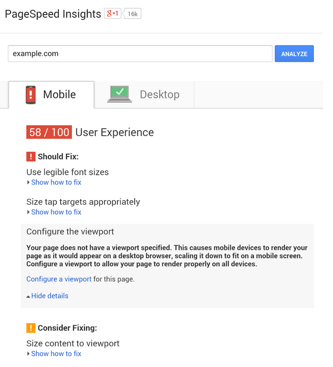
In Google PageSpeed Insight’s case, it provides suggestions not just for the desktop version, but also for the mobile instance. This makes it great to use, since you’ll want to have a fast checkout flow on any device.
In the example above, the font sizes are too small to be readable on mobile devices. They should be increased for a much better overall experience.
“Tap targets” means the size of buttons and elements you interact with, on phones. Since your finger is much bigger than a mouse pointer, it only makes sense to properly adjust those tap targets so the design doesn’t feel crowded and small.
Check out this guide on website speed optimization and improve page load time.
The “get to the thank-you page” speed
Your ecommerce checkout process should take the customer from product page to thank-you page in less than a minute. If he’s already decided on a product, the checkout process should feel like a formality, not a chore.
That means that your designers and developers should have this 1 minute objective in their heads, when they create the best checkout experience. Here are a series of helpful questions:
- Does forcing users to sign up make sense?
- Is asking them their billing address more important than showing shipping costs first?
- Should we constantly be showing the product they’re purchasing?
- Can we allow customers to skip certain optional forms?
- Does adding urgency elements help with the checkout process or does it intimidate customers?
Answering them will provide you with unique solutions, customized to your customers’ needs and your website’s functionality.
Form Fields – Are Your Really Putting Labels THERE?
As with form fields in landing pages, the number does count. But what’s even more important is relevance. You want to reduce your number of form fields, but think about which are the most important ones for your customers.
In terms of design and development, provide real-time inline validation. This makes it easy for the customer to understand whether there is something wrong with the data he’s entered.
Also:
Add a success sign (checkmark or something similarly encouraging) each time a field has been filled in correctly.
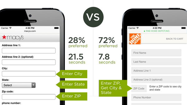
Compare Macy’s checkout page with The Home Depot’s. Since you only have to fill in your Zip Code to get the City and State, it takes less time to fill in and more responders prefer it.
Implement labels for each field, helping your customers understand what you want from them. Add an example response in the box to give them even more information into what they should write down.
Too many times there was a password field next to an email field and people were confused about what password they should write down.
Simply improving those words to say “Choose a password” or “Enter a password for this account” makes it that much easier and faster for customers to move on to the next step in the checkout flow.
Some forms have optional fields, like when they ask you if you want to create an account (and enter an email and password). Clearly explain to your customers which fields are required by using an asterisk and having a little text at the end that says ” *Marked fields are required”
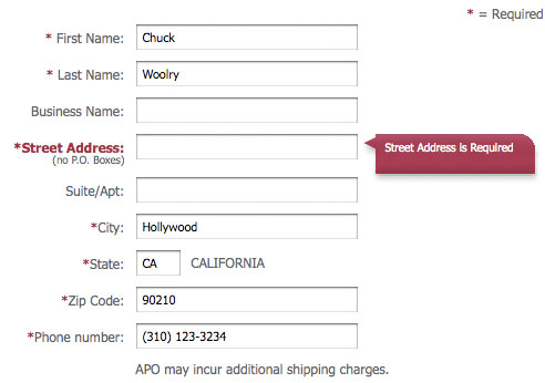
This is easily done using a few lines of code. Since it helps the user, why not implement it?
If you’re feeling playful, you can change that to “These are the form fields you’re looking for”. That’ll probably work great on a Star Wars-themed website, since you’re tapping into the customers’ brain and providing a personalized experience.
And if you’re wondering about the cash value of form fields? It’s $12 Million. This is how much Expedia made more because they’ve removed a single form field.
Check out this infographic for 10 easy tips to learn Web Form Optimization.
Trust Signs – You Need These or Your Customers Will Avoid You
Anytime someone pulls out their credit card to pay for something online, you want to make them feel as safe as possible. At the same time, crowding elements in the footer of a page is not the best idea. So keep it simple and official.
Credit Card Symbols to optimize checkout process
By visually enforcing your credit card area and adding the correct (and updated) credit card symbols, you’re making another step towards helping your customers.
Try to only use the official logos provided by your credit card processing solution. Here are PayPal’s examples and here is a large selection of helpful logos.
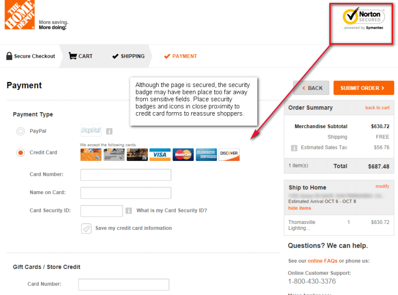
Not only is there a trust seal at the top, but the checkout page makes it clear what credit cards you can use to pay.
Use Trust Badges to Optimize Checkout process
A trust seal is a seal granted by a security entity to websites/businesses. The purpose is demonstrate to customers that this business is concerned with security and their business identity.

Note that not all trust badges are created equal. According to this article from MonetizePros, you’re far better off using Symantec than Authorize.net for example.
Adding one or two custom badges could also boost your conversion rate, if you don’t make them large and spammy to be obviously fake and untrustworthy.
Money Back Guarantee help to Optimize your Checkout Page
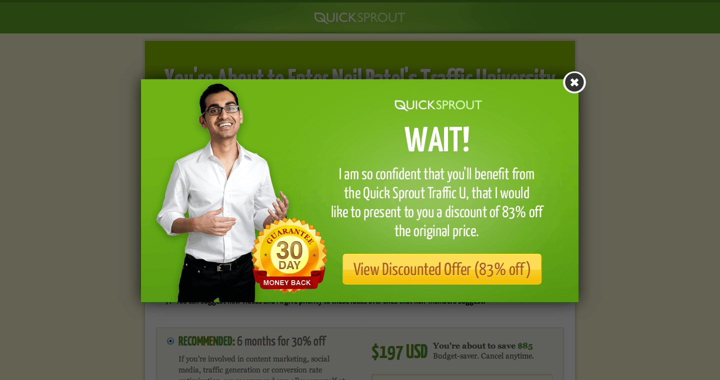
If the customer gets to the credit card info section and something feels off, everything is over. If just a tiny element feels out of place, you might lose that customer forever. Neil Patel adds a 30 Day Money Back Guarantee to alleviate the tension and add even more trust to the page.
Another great example is OrientalFurniture.com. Adding a buy guarantee trust seal drove conversions up by 7.6%. Clicking on the seal explained to customers that their products were guaranteed for shipping up to $500. It also offered up to $10.000 of protection if the buyer’s identity was stolen through the website.
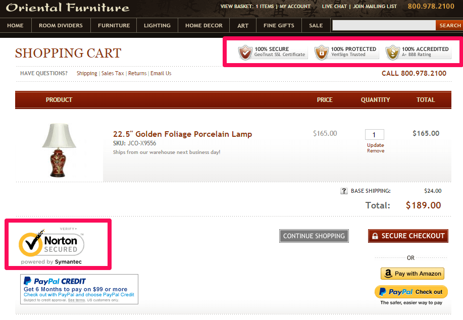
Adding trust signs to your ecommerce checkout flow is key to gaining your customers’ trust. But just adding a few elements won’t make you a trustworthy partner. Go over the next chapter to get inspired by great checkout experiences.
Great Ecommerce Checkout Examples #1
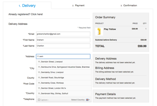
Sodastream does a lot of things well in this checkout flow:
- The 3 checkout steps are clearly marked at the top of the screen. No website menu interferes with this flow.
- You always know what your card contains, since it sits in the right sidebar.
- The address field uses auto-suggestions to help you write down your details.
- The asterisk lets the customer know which fields are required.
- The term “Secure Checkout” and the VISA+MasterCard logos at the top reinforce the idea that this is a safe checkout flow.
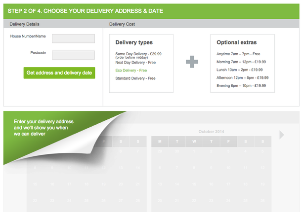
AO.com uses a colourful ecommerce checkout flow and entices you in Step 2 to enter your address to show you delivery times. You also get a picture of what the entire Delivery Cost will be with helpful boxes, with a “+” sign between them.
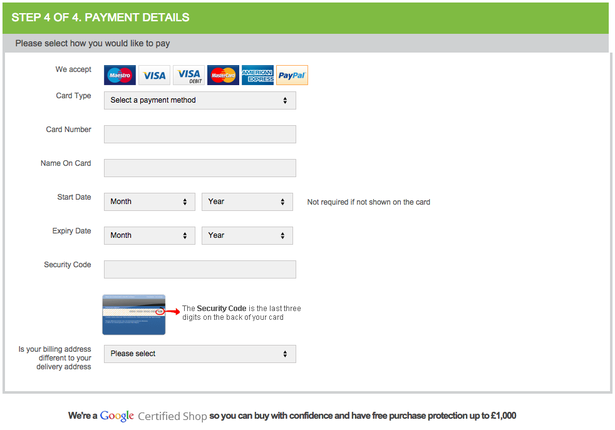
Step 4 is neatly organized. The text at the bottom makes it clear that your deliveries are protected, so everything should work great.
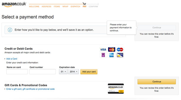
It’s no surprise that Amazon is on this list. It’s one of the top ecommerce websites on the planet.
At the top you can see the steps you have to go through to finish a purchase. Even though they might seem like a lot, think about this way: each step is tiny, requires minimal effort, therefore will not take a lot of time to complete.
You can also add a giftcard and everything is clearly delimited, with plenty of whitespace to go around.
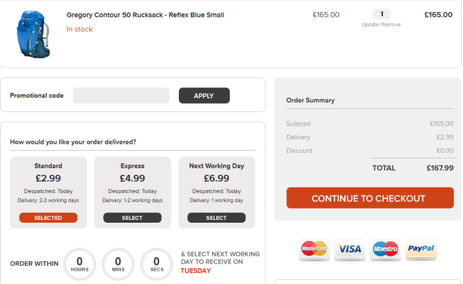
Simply Hike takes a more visual approach, with big spacious areas and a distinctive dark orange contrast color.
Shipping costs can be easily selected, depending on when you want the product to arrive.
Text is also large, which means it should look great on a mobile device, without the need to zoom in or out.
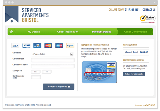
Serviced Apartments Bristol adds another layer of trust: you can us the number at the top of checkout flow to call them, in case you’re having trouble using the online form.
Progress is clearly indicated via a green bar.
The right side of the screen does a good job of explaining what you should fill out in the left side, so you don’t get confused, as a customer.
Single Page Checkout VS Multi-Page Checkout – Which One Is Better?
Between seeing your cart, selecting a shipping option, adding your address and reviewing your entire order, there is a lot happening in the ecommerce checkout flow. It’s not easy to simply select a single page or multi-page process.
A single page checkout might be preferred for your mobile users, as it’s easier to scroll and swipe and you’re dealing with vertical forms. What you’re missing with most mobile checkout process is the constant reminder of your product in the top of the page.
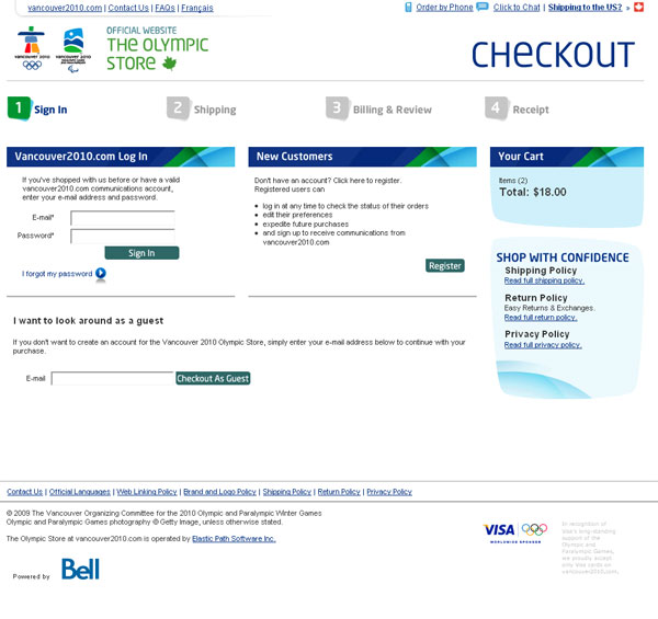
This takes a bit of space and if the customer has multiple products in their basket, you end up sacrificing a lot of screen real estate as show below:
A multi-page checkout experience provides your customers with a sense of progress. Ideally, each time they finish a step, they get a green checkmark and they’re told there are only a few more steps until checkout.
This type of flow also makes it easier for you, as a website owner, to know where users typically drop off and what you can do about it.
Enter the no-page checkout era. Amazon owns the “1-Click” trademark since 1999. If you’re logged into your Amazon account you can purchase items with just 1 click. In the case of digital items (like Kindle ebooks), this type of behaviour tends to trivialize the shopping experience itself. Making some people purchase items that they will forget about.
And perhaps it’s exactly Amazon’s plans: buy more, think less.
This strategy has been taken a step further in March of 2015, with the introduction of Amazon Dash, a device that’s configured to do just one thing.
You press a button for a specific product, approve the purchase on your device and the product arrives at your home, using your personalized shipping information.
Now instead of making a list for what’s missing, you can simply order it using Amazon Dash.
A good example is BetaBrand’s checkout flow on their mobile version.
They keep everything simple and clean. A nice feature is adding a persistent button at the bottom of their forms that allows you to continue your process, if you feel you’ve filled in all the necessary information. That means no more scrolling up and down for that elusive button.
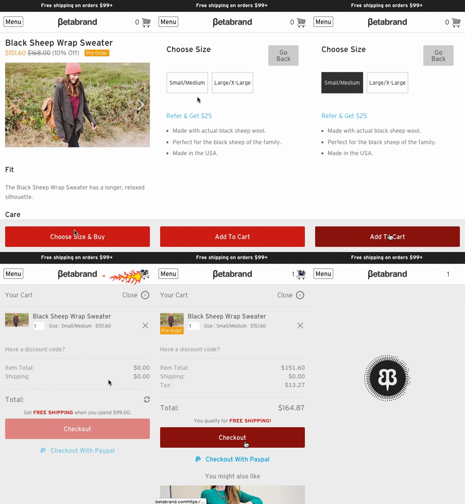
If you do plan to go this route, make sure the button is the whole size of the screen and that it uses a contrasting color from the form background.
The British online fashion and beauty store ASOS has a great multi-page checkout flow. It consists of 5 steps, which is one more than the preferred 4 we’ve talked about earlier. But since the final step is actually an Order Summary, it lowers the number of steps where the customer has to enter information.
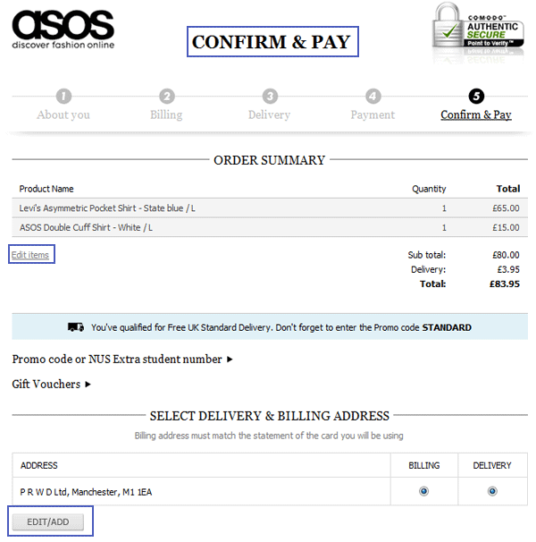
No matter if you decide to go for a single page or a multi-page checkout flow implementation, make your steps visible. And make that step number no longer than 4.
There is data that supports the idea that adding steps to a checkout flow actually increases the conversion rate.
The easiest to understand answer to the question “Should I use a single page or a multi-page checkout flow?” is: “Reduce the amount of steps to least amount possible”. Also, there is nothing preventing you to from testing that.
You can use tools and services like Peek to see and hear what people think of your checkout flow. I would recommend using TruConversion which gives you access to Heatmaps (where customers click and scroll), Visitor Recordings (how customers interact with your forms), Form Analytics (where customers give up and fail to move on to the next form field) and Feedback Polls and Surveys (what people thought about your checkout flow and what improvements they might have).
Shipping – What Do Users Expect To See Here?
If you can offer free shipping, do it. If you offer free shipping in exchange for a user account, test it out to see if customers use it.
Customers are concerned with 3 main questions when entering a new e-commerce website:
- Can I trust this website?
- Is this the lowest price around?
- When will this product arrive at my home?
Address this last issue by adding a postal code/city selector right within your product page. That will show customers the estimated time when their order will arrive.
This will remove another point of friction – your customers will stop wondering about product arrival date. Especially since this might be a gift for someone’s birthday or a special occasion, the date is important.
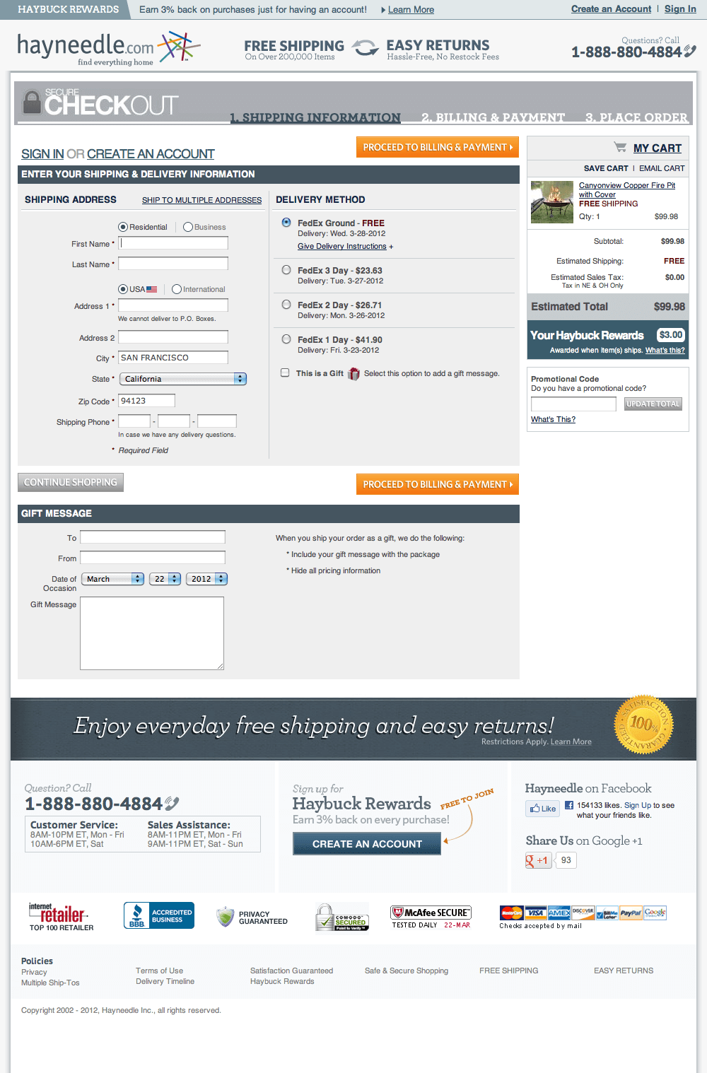
For larger international e-commerce websites it makes sense to have a multiple shipping options: different delivery services and shipping options.
From the regular mail service to express, overnight or same-day options. These should be clearly marked with pricing for each. The customer must know the total price of his order, before he’ll push that final button.
Urgency and Scarcity – How to Use Them to Get More Conversions
Getting your customers to perform an action faster is not hard when you understand these 3 powerful elements of marketing.
Time-Limited Offer
You’ve seen these warning signs not just on e-commerce sites, but also within emails or blog posts. Text that tells you that the price goes up within a few hours.
Or
You can get free shipping but you have to order within the next 15 minutes.
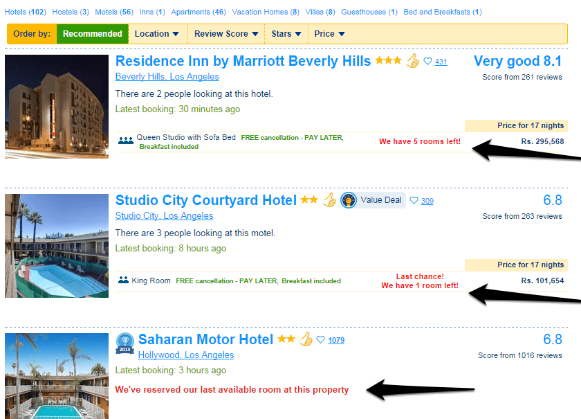
As in the case of Booking.com, not all urgency is meant to make the customer take out his credit card. In the example above the text at the bottom reads “Book now, pay when you stay”.
It’s a way of reassuring the customer that just making a booking right now doesn’t cost him anything.
It minimizes the apparent impact of booking a room. But make no mistake, this type of reassurance is tied to a payment. Just further away down the line.
Product Scarcity
This technique is most common for businesses that sell clothes and shoes, along with the tourism industry. It’s less common with digital products. It’s hard to believe a digital. PDF file runs out of stock or can no longer be offered for free.
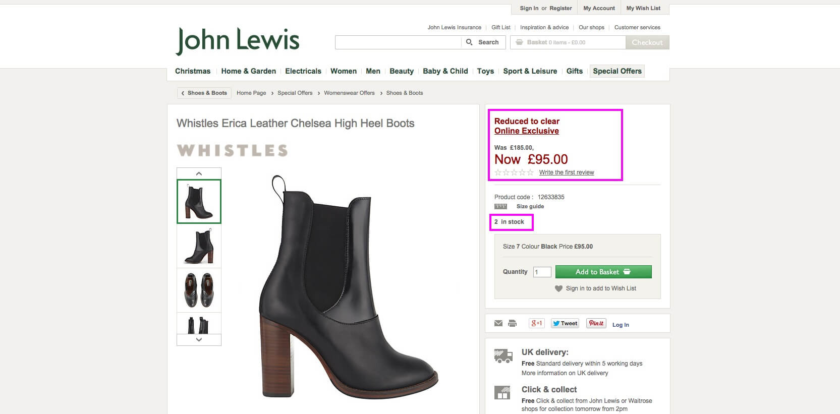
John Lewis used this tactic to emphasize there are only 2 products in stock. Since there is also a price drop, there’s an urgency to act now and purchase the shoes.
Tourism in particular offers a very interesting combination – the customer wants a specific type of room that might not be available. At the same time, the timing has to be right to get a good price.
The hotel industry uses this combination frequently. In the case of Booking.com, there is the added element of other tourists. They can be seen as virtual competitors in a ruthless game of grabbing the best prices for the perfect type of room. All that to ensure the dream vacation they’ve been planning for months.
Offer Expiration
This is similar to product scarcity, only it refers to a product or an offer that will never be offered again. Think in terms of a webinar that won’t be recorded, limited edition handmade shoes that won’t be made again. Offering a free item with that order, for a specific time, is also an option.
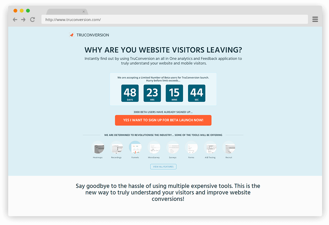
TruConversion used this tactic to get users to sign up for their special offer. It sent subscribers emails a few days before the offer expired.
Not only that, but the homepage used a timer to reinforce the idea of a time-limited offer.
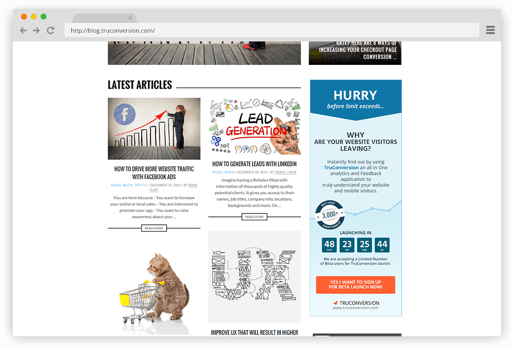
The blog had a similar tactic. While users browsed the articles, a timer could be seen in the sidebar. It was big and distinct enough to act as a contrast from the white background, encouraging users to sign up for the beta while there was still time.
There are even more psychological methods of nudging the customer to take an action faster. The thing to remember here is that you can force these methods. Since you’re the one in control, like a Wizard of Oz of Digital Marketing and E-commerce, you’re behind the scenes pulling the strings.
If adding a little bit of urgency helps your business, go ahead and use it wisely and ethically.
Download this Checklist to design the perfect checkout process you need to Skyrocket Sales!
Almost there! Please complete this form and click the button below to gain instant access.
Enter your details and download the checklist to build the Ultimate Checkout Process.
We hate SPAM and promise to keep your email safe.
Thank you for downloading.
User Accounts – Is Guest Login Your Best Option?
No one wants ANOTHER user account. It’s probably in Shoppable’s DNA. Don’t force your customer to create an account – as it’s clear from other websites that this isn’t a requirement. And you can be sure that your customers are smarter than you think. They shop around, compare prices, look for coupons, wait for that exit-intent popup with a special offer.
At the same time, having an email on file is lead generation 101. If you’ve got a business, the money is in the list. So knowing this, you have to find ways to persuade your customers to register an account for you. Here are a few options:
Social login
Make it easy for the customer to create an account. Don’t even call it “registering”, call it “logging it”. That way the customer knows that an account is already present, there are no new passwords to create and remember. Have at least facebook, twitter and google+
If you’re using Magento as an Ecommerce solution, think about implementing a social login plugin (such as Apptha – shown above). It makes it easy for customers to register/login, without having to think about usernames or passwords.
Special discounts
This is one of the most powerful benefits that e-commerce shops can implement to get email addresses: offer a special discount if the customer creates an account on your website. It can be in the 5%-10% range, but make it visible enough so the customer sees across the site and feels the need to register.
Save details for later use
It doesn’t hurt to nudge your customers to leave their email address, in case they’d like to save their information for later. It doesn’t provide a clear benefit for the customer, but the text might be enough to jump the gun and provide the required info.
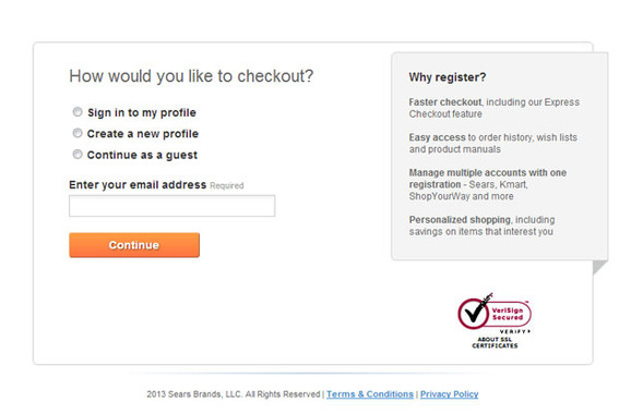
Caption: Inform the visitor of the benefits he’s getting for registering on your website. Things like faster checkout, shopping history and personalized shopping options help drive the message home.
Looking for even more benefits why you should fight for that email address? Here are a few more:
- Email Marketing. Once you have your customer’s email, you can provide educational and marketing materials.
- Remarketing. Use that email address to create highly-targeted ads on twitter, facebook and google adwords.
- Customer referrals. You can ask your current customers to refer friends, in exchange for discounts or bonuses.
Payment Methods – How Many Are Too Many?
The customer must feel like he’s in control. If he wants to use PayPal, he should be able to. Cash on arrival? Sure. Gift cards? No problem!
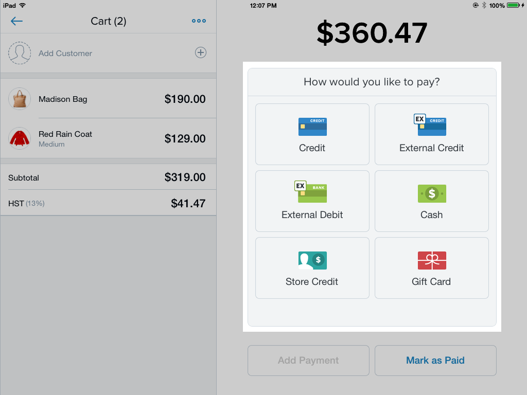
Caption: Let your customers choose how they want to pay. Shopify provides multiple templates and layouts to match your website’s theme.
Choice is definitely a good thing. You don’t want the customer to feel he’s boxed in. That he can only choose one option. Too many choices, however, are not always a good thing. In theory, yes, it does make sense to offer as many logical and rational choices you see fit.
In reality, though, lots of choices might emotionally cripple a person. Forcing him not to make a choice at all. That is – abandon the cart. And that happens a lot, about 68% of cases actually.
So research your competitors, poll some early customers and start off with 4-6 payment options. Then as months go by, see which ones are used more than others. You don’t have to eliminate the lesser used ones, just make them less visible at first. Eliminate them in time.
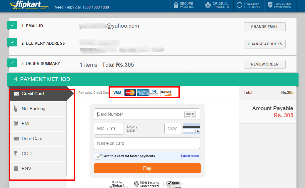
The ecommerce checkout flow is all one screen. The steps are clearly marked 1-2-3-4. Once you fill in the first 3, the final one is to select your payment method and complete the purchase. You should analyse what payment options customers prefer and only leave the most common 2-3 ones. It helps so you don’t over complicate your ecommerce checkout screen.
Depending on the type of platform that powers your website, your checkout flow will have some predefined options. It’s up to you and your team of designers and developers to create a unique and useful experience for your customers.
For example, comparing US and Brazil checkout flows, Tech In Brazil found some interesting differences. One was the option to use multiple credit cards to pay for one order. Another was that the support section was much more prominent in Brazil. This is because digital e-commerce is not as widely used and trusted.
Great Ecommerce Checkout Examples #2
Macy’s keeps it classy with a number of 5 total steps for the checkout process.
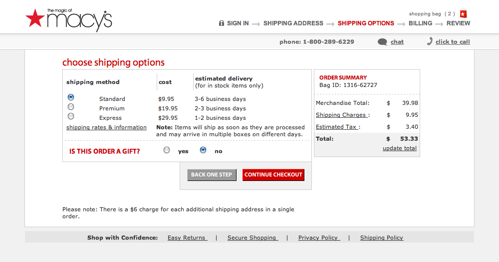
The experience is focused on the purchasing process – the only links are helpful for the customer (Easy Returns, Secure Shopping, Privacy Policy, Shipping Policy).
On top of the main screen there are the phone, chat and click to call options, helping customers who are stuck somewhere in the checkout flow.
Red is the color to go “forward”, while grey means “back”. This design language is kept throughout the entire checkout process.
Your order summary is always visible on the right side of the screen, with all the charges, taxes and costs. The final price is marked as “Total”, letting you know exactly how much you’ll need to pay.
The masters of ecommerce are using email remarketing and personalized product recommendations to get you back on their website.
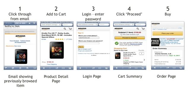
Once you click on a product, on your mobile, you’re taken to a highly stripped down view of Amazon.com. Menus and other distracting elements have been minimized, hidden or removed.
Once you login, you’re ready to purchase. The big yellow button called “Proceed to checkout” stands at the top of the page, letting you know exactly how you should proceed to the next step.
Once you have your product in your cart, another big yellow button (Amazon gets bonus points for consistency) stands at the top, marked “Place your order”. You see your entire order summary and all you have to do is tap once to complete your purchase.
The process is shorter in this case, since the customer already has a credit card on file, reducing the number of fields he has to fill in.
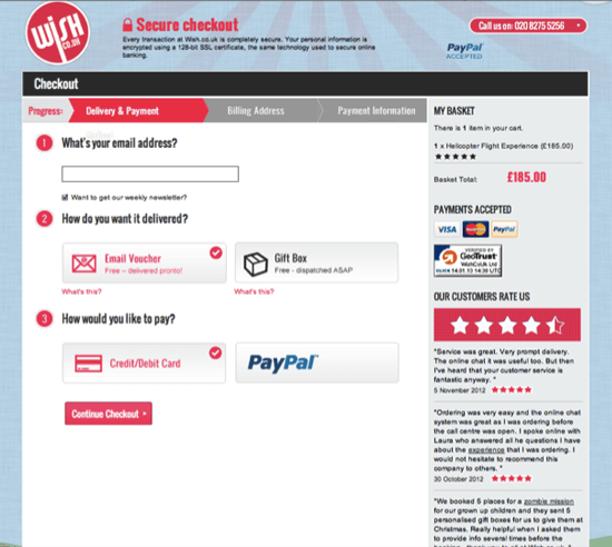
Wish.co.uk highlights safety, customer ratings and testimonials. If you had any more doubts about the ecommerce checkout process, there is also the GeoTrust safety badge.
The 3 steps of the flow are clearly marked with good contrast at the top of the screen.
Big bold buttons and check boxes make going through the steps a breeze. You don’t have to squint or use dropboxes to select the option you want.
Furthermore, the phone number is in the top left. If you need support during this entire process, you know what to do.
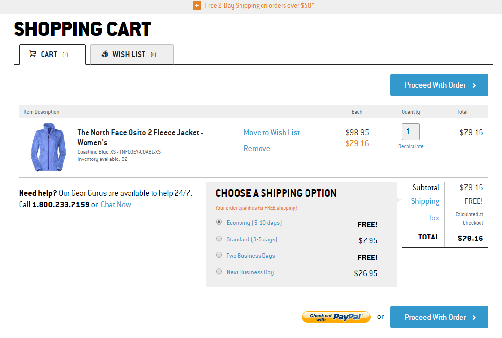
Back Country crams a lot of information into one screen, but they all help the customer feel safe and move on and proceed with the order.
First, there’s the “Free 2-Day Shipping” text at the top of the screen. That makes it easy for the customer to add more products, if he wants to take advantage of that offer.
Second, if you’re stuck somewhere, there’s a section dedicated to help – via telephone and even live chat.
You can clearly see all the costs (product, shipping), so you don’t get any surprises about increased prices.
Choosing a shipping option is done via radio buttons and there are not one, but two FREE ones.
Lastly, there are 2 dedicated “Proceed With Order” buttons, but also a “Check out with PayPal” for those who would like to use this payment option.
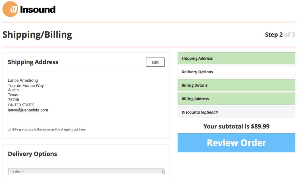
Insound has a focus on big buttons and a lot of white space.
Only 3 total checkout steps means going through them should take no time, increasing customer satisfaction along the way.
The big Review Order button makes it clear (through size and constrast) what you should click to move on to the next step.
Ecommerce Checkout Simplicity – The Key To Helping Users Navigate To The Next Step
A lot can be said about the idea of simplicity in ecommerce checkout flows. First off, from a design standpoint, it’s great if you can isolate your entire process. This is what a Shopify integration does well.
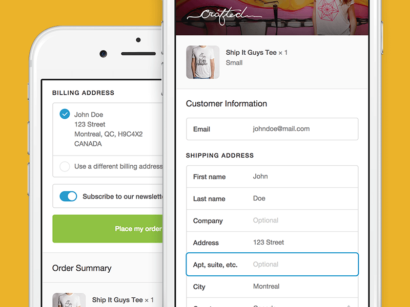
Caption: Shopify’s responsive checkout strips the website menu and focuses on helping users complete a purchase.
You have to remember to keep your branding intact on these pages. Otherwise it’s creating incongruence with the previous website experience. Customers pick up on that rather quickly.
Simplicity here also means a clean background (white or calm, reassuring colors) and a lack of animations or moving parts. It has to feel static in a way that says “This is here to stay, this feels strong”, not in a way that says “This is stuck back in the dial-up ages”.
On a technical standpoint, give your URLs a scrub. No one wants to see “http://www.your-website.com/checkout/#sfds34&gfsf41″. Make it easy to read, like “http://www.your-website.com/checkout/step-1“. Also ditch the “.html”, “.aspx” or “.html” extensions. Make everything as tight and user-friendly as you can.
Say no to credit card processing services that offer low fees, but a horrible experience for the customer. Use developer- and designer-friendly options like Stripe or Braintree.
Don’t try to reinvent the wheel by adopting a different type of ecommerce checkout flow. If it’s not broken, don’t fix it. Swipes and taps on mobile are great in apps and games, but you can’t expect a regular user to understand how to use these to navigate within your website, in order to make a purchase.
Offer as many visual clues as you can. For example, there’s no need to ask someone what kind of card they’ll be paying with. That’s an unnecessary obstacle for the customer. Modern systems identify your credit card type and also show its associated symbol.
If you run an international website, you should let the customer know if you ship to his country. This can be a popup when he enters, a little flag in the footer or an entire section at the top. This makes the user know that the won’t have to think about currency conversions or high shipping costs.
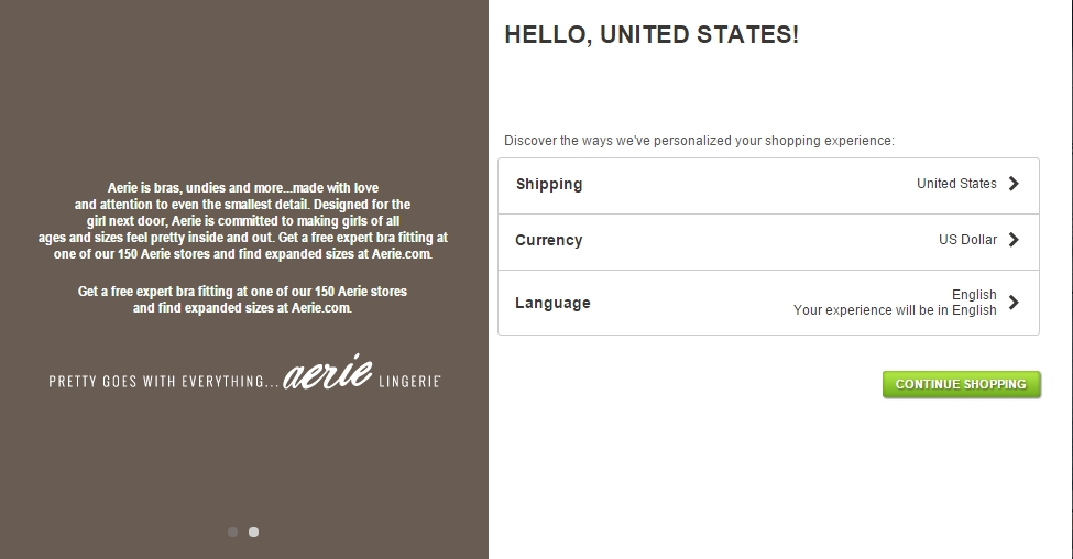
American Eagle Outfitters makes selecting your country, language and currency a breeze.
The thank-you page is there for a reason. Offer information about what’s happening next. Remind the user when the item will be shipped and arrive at his door.
Provide more things for the customer to do, if he chooses to – social sharing, newsletter subscribe, etc. This information can also be included on a first Order Complete email.
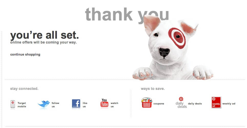
Target’s thank-you page is simple and offers more options to interact with the brand – social media accounts and promo details.
Mobile Adaptability – Are You Doing It As Good As Uber?
Mobile responsiveness is not the same as mobile adaptability. Couple that with mobile friendliness and you’ve got yourself a bit of confusion on your hands.
Delivering a great mobile checkout experience means starting from the customer, not from the limitations of speed, technology, code or browsers. It means understanding how the customer uses mobile devices and interacts with the world around him.
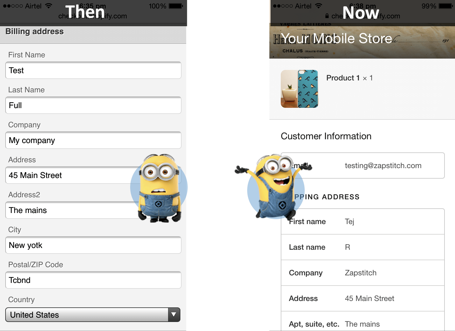
Caption: A better, more organized mobile checkout experience leads to more conversions.
You have to consider things like:
- Is this item being hidden once the customer uses his fingers to tap on this other item, that’s in the vicinity?
- Should this app only use Apple Pay, since there are also Android and Windows devices being used by our customers?
- Will accidentally hitting the physical back button on the device erase all the checkout progress the customer has made?
Checkouts on desktops and laptops tend to feel sturdier, because the experience is entirely different. Mobile phones are dropped. Notifications come up. And guess what – phone calls arrive. And they all interrupt the checkout flow.
So why not investigate how real life customers use their mobile phones and tailor these experiences for them?
What’s the point in having a credit card in one hand and a mobile phone camera in the other, if the customer can’t simply combine one with the other and speed up the whole process for everybody?
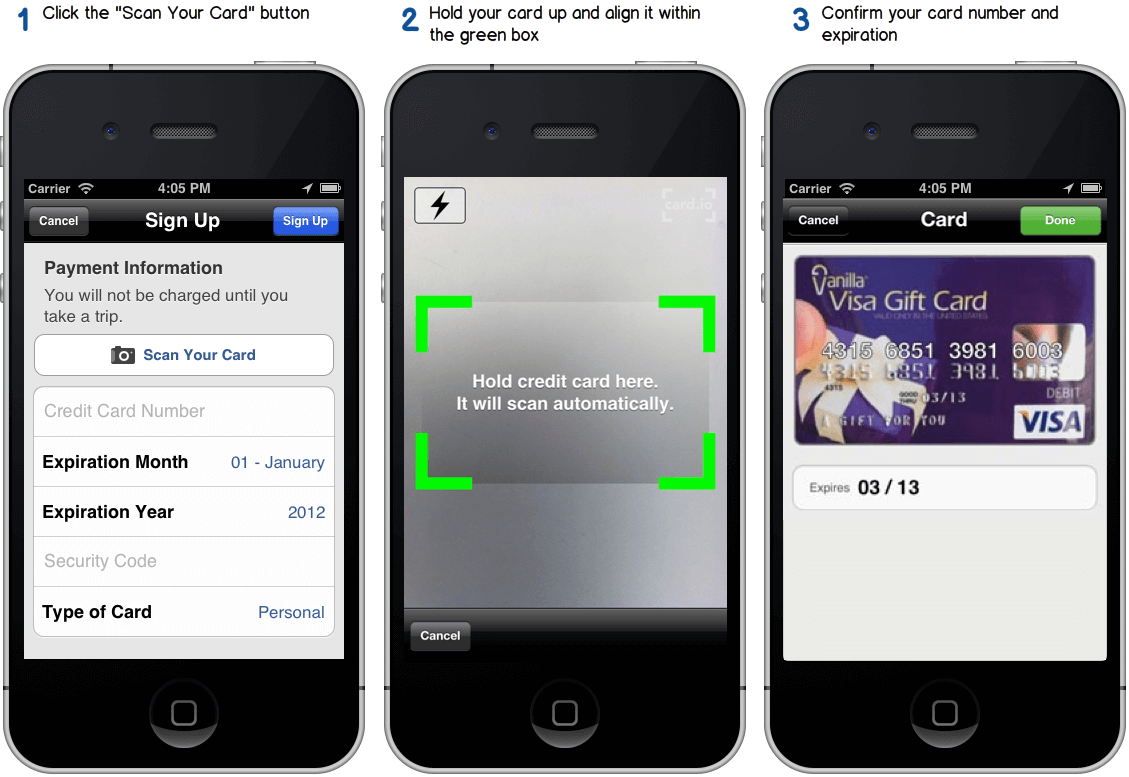
Uber integrated Card.io for their signup process back in 2012. This allowed users to save a credit card on file a lot easier, by just scanning the actual credit card with the phone’s camera.
It’s a great example of software and technology coming together to help the user have a great experience.
In terms of dedicated apps, it’s pretty much the same as with user accounts. No one wants ANOTHER app on their homescreen or in their app drawer. Especially not an app that makes the customer spend more. If there were incentives to download such an app (free shipping from mobile app purchases, large one-time discount on install, etc.), the customer might reconsider.
But never force it upon the customer!
Speed is even more important on mobile than it is on desktops. After all, have you ever seen a phone connected via an Ethernet cable? Even with fast WiFi and great 4G speeds, it’s not the same for everybody.
You have to take into account the fact that most people, for example, use an Android version that’s 2 generations old.
Don’t just copy the form fields from the “regular” checkout. Enhance them using elements from regular mobile experiences (colors, icons, animations, etc.). This helps the customer know that someone really paid attention to his experience.
It will also make it easier for him to understand what each field represents.
But since mobile phones come with different operating systems and versions, try not to fall into the trap of designing using only elements from one type of device.
We assume all of this helps the user navigate the checkout flow on mobile. But what if it doesn’t? What if all he needs is a livechat operator or a toll-free, 24/7 available, support phone number?
Provide those as a backup as well, just don’t let them overcrowd the overall design.
And lastly, AutoDetect as many information as you can (location, language, currency, etc.). If you can subtly put yourself into your customer’s shoes and eliminate all information that’s harder to fill in, but fairly obvious, he’ll be thankful. He’ll also be relieved that someone is taking good care of him.
Final Tips And Tricks
From expert advice to specific hacks, here are the final tips and tricks for a high-converting e-commerce checkout flow:
- Adapt your payment options to your customers’ region. Take the time to understand your customers’ situation. For example, M-Pesa and Verve prepaid cards are a must in Africa, but not that common anywhere else.
- Add HTTPS to the checkout pages. Ideally, you’d have that enabled across your entire website, since this is a ranking signal for SEO. A secure connection makes the user feel safe. Plus, it doesn’t hurt to have a bit more green (as in go, proceed) in your checkout flow.
- Words matter in ecommerce checkout flows as well. Removing hurdles from your customers is essential to getting more conversions. And using very friendly and specific language allows you to eliminate confusion.
- Don’t be afraid of animations. While ecommerce checkout flows work better when they’re isolated from the website (in terms of menus and crowded graphics), adding a little Add To Cart animation doesn’t hurt. It’s also a great visual cue for the customer to know his actions are working.
- Spend time on your credit card info screen. You can use design skeuomorphism to ease the pain of understanding what info to put in. Security signs are crucial to helping your customers proceed to the next/final step.
- Add more trust using your Thank-you page. Often under-utilized, this final confirmation page can be designed so that it instills (or keeps) a sense of trust in the customer. Furthermore, if he’s feeling good about his purchase, he could possibly tell his friends and/or purchase again soon.
- Clearly mark checkout progress. This little invention makes it feel like a race. Step 1 finished? Mark it green, done or add a nice checkmark next to it. Progress indicators are important, since we want to know our checkout efforts amount to something.
- Cross-selling and up-selling can make you more money. Remember “Do you want fries with that?” from McDonald’s? Even if it’s a last-minute decision, suggesting more items to add to the cart can lead to larger conversions. Make these elements discrete enough so they don’t interfere with the actual checkout flow, but visible and smart enough so they matter to the customer.
- Free shipping beats % off. Here’s another one for the testing block. 93% of people surveyed said that free shipping would encourage them to shop more online. Better to include it in the final prices and tell customers they’re getting something for free than having smaller prices up front but asking them to pay extra for shipping.
Recommended Reading
5 Examples Of Inspired Checkout Processes That Bring Results B
10 Insane Ways To Skyrocket Conversions For Mobile Commerce
9 Tips To Reduce Page Load Time And Speed Up Your Website (Infographic)
100 Crazy Conversion Rate Optimization Tips To Boost Conversion Rate Right Now!

