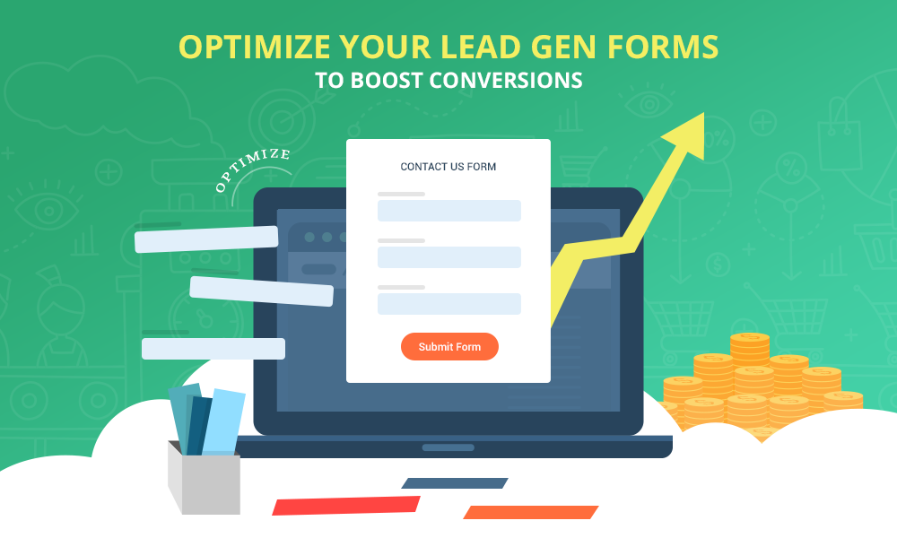
At the core of every conversion rate optimization strategy is the lead generation form.
You might be wondering:
Why it’s so important to make it easy for visitors to spot the form and complete it as quickly and painlessly as possible?
This is because:
Your lead form is the first gateway that your leads get through in order to complete their journey into your conversion funnel.
What’s the bottom line?
Optimizing the challenges of lead generation forms can make or break your conversion efforts.
But Wait:
What are these challenges?
Think about it:
How many lead capture forms do you come across every day that try to capture your emails and contact details?
Probably dozens.
Do you subscribe to all of them?
I know your answer is a resounding NO!
In fact, statistics reveal that only 1-3% of visitors to most sites actually subscribe.
WHY?
It’s because most lead gen forms don’t do a justifiable job when it comes to tempting you into voluntarily filling out your details.
Let’s check out some of the major lead gen form challenges:
- Okay, you’ve built the perfect form.
Now:
Where to place it? Will more people see it if it’s above the fold? Should you keep it below the fold?
Here’s the deal:
A study by Jakob Nielsen reveals that most users spend 80.3% time scrolling above the fold, and only 19.7% users’ scroll below the fold.

So, this means you must place your lead capture forms above the fold.
Right?
Wait, here’s the shocker:
A company was able to increase its form submissions by 20% after shifting the form below the fold.
It gets worse:
An incorrect placement of your lead form may dramatically affect your conversions.
- The next — and probably biggest — question marketers are faced with is….
…how many fields should you have in your lead generation form?
Did you know?
Conversion rate can be improved by 50% by eliminating just one form field

But here’s the shocker:
Most marketers add too many fields creating bottlenecks that make users abandon the form rather than completing it.
- Did you know:
According to Google’s Mobile Playbook, 57% users won’t recommend a site that isn’t mobile-optimized.
Well, that goes for lead capture forms, too.
Here’s the deal:
Considering that more than 50% of Internet activity occurs on mobile devices, it remains a cumbersome job for prospects to fill out a non-mobile optimized lead capture forms.
Surprisingly:
A research report by Forrester reveals that about 71% business websites aren’t still mobile-friendly and that surely goes for their lead capture forms too.

You might be wondering:
“Am I really losing out on conversions with non-mobile optimized lead gen forms?”
The answer:
A big loud, YES!
With non-mobile optimized lead gen forms, you’re losing out on the chances to increase your conversion rates by as much as 67%.
- The next big challenge that we’re going to discuss up is ‘Lead Form Validation’.
Wait, what’s ‘Form Validation’?
Here’s your answer:
Simply put: it is the process of validating the details that a prospect is filling in your lead gen form. Think about lead form questions such as – Is this a valid email? Is this a valid phone number?
But did you know?
Though this feature saves you from the risk of receiving invalid submissions, form data validation may negatively affect your form conversion, especially if it’s not inline.

- Look:
Not many visitors to your site would want people calling them up.
You’ll really need to think if you actually need people’s daytime phone numbers for it may affect your form conversions.
You’ll be shocked:
Dan Zarrella reveals in a study that asking for a phone number is one of three fields that kill conversion rates.

Here’s another shocker:
Business that include a phone number field in their lead generation forms end up facing an average of 5% dip in their conversion rates.

But here’s the shocker:
Most marketers struggle with their lead form headlines. They remain aware of how does a great lead form headline looks like.
- Okay, here’s what you need to know:
Your prospects wouldn’t fill out your lead gen forms, if they don’t trust you.
Sure you may have created a great, user-friendly lead gen form, but it doesn’t count if your form fails to evoke trust amongst your prospects.
Here’s the deal:
Privacy policy can drastically impact lead form conversions, from 18.70% drop to 19.47% increases in sign-ups.
- A large number of marketers use ‘Submit’ buttons at their lead gen forms.
Here’s what you need to know about ‘Submit’ buttons:
The word “submit” is a negative word, according to Marvin Russell.
After all, who would want to “submit” to anything?
This will be a shocker:
According to research conducted by Dan Zarrella, forms with buttons labelled “Submit” tended to have lower conversion rates than those with other wording.

- Radio buttons or Dropdown List?
This is a common question that most smart marketers are faced with.
But here’s what happens:
Most marketers really do not understand the difference between the form conversion impact of the two and end up making a wrong choice.
Needless to say:
They skew their form conversion rate.
- Yet another confusion that makes it difficult for marketers to maximize their form conversions is the choice between traditional forms and Mad lib style forms.
Wait, what’s a Mad LIB style form?
Created by Jeremy Keith, Mad LIB style is a concept where you have the normal form input field for entry, however the form is laid out and presented as a narrative.
An A/B test experiment by Vast.com found that mad lib style forms increase conversions 25-40%,
- Using Captchas on your lead form?
Here’s the deal:
If CAPTCHA is turned off a company’s conversion rate would increase by up to 3.2%.
Captcha can frustrate your users!
You’ll be surprised:
A study reveals that with CAPTCHA’s on, SPAM and failed conversions accounted for 7.3% of all the conversions for the 3 month period.

- 2,134 total conversions were entered while the CAPTCHA was off.
- 91 total SPAM conversions while the CAPTCHA was off.
- 0 total failed conversions while the CAPTCHA was off.
With CAPTCHA’s off, SPAM conversions accounted for 4.1% of all the conversions for the 3 month period.

- 2,156 total conversions were entered while the CAPTCHA was on.
- 11 total SPAM conversions while the CAPTCHA was on.
- 159 total failed conversions while the CAPTCHA was on.
- Yet another challenge:
What form layout to choose?
Vertical or Horizontal?
Here’s the deal:
46% marketers consider optimizing their form layout to have a very significant impact.

- You probably know:
Most website visitors are impatient, especially when it comes to completing those unduly long lead capture forms.
This means:
You must reduce the form fields in order to make it easy for your visitors to complete the form without having to spend too much time on it.
But here’s a shocker:
Reducing form fields doesn’t necessarily increases conversions.
In fact, a study conducted by Michael Aggard found that reducing the number of form fields from nine to six decreased conversions

So, what are your options?
Maybe you can use a one-column or multi-column form layout!
But which one of these could offer a better conversion?
This is a tricky question and a fair share of marketers, fall prey to this question and end up ruining their conversions.
- Take a few steps back:
Now, ask yourself:
“Why should a visitor fill out my form?”
Sure, you’re offering a range of benefits, but how they know about it?
These questions are relevant and can affect your conversion rates too.
But here’s the shocker:
Most marketers struggle with letting their visitors know the benefits of filling out lead forms without being too pushy and boring.
Now that you already know all the major lead generation form challenges, it’s time for the Big Question:
How to optimize lead forms for positive results?
Here’s the answer:
Analyze and learn from companies who have successfully optimized their forms and put this learning into practice.
But you’re probably wondering:
“How do I find such examples and case studies to turn my lead forms into conversion heavyweights?”
Well today I’m going to make it easy for you.
All you need to do is spare out a few minutes of your time and check out these 16 crazy lead form case studies that will help you optimize your lead forms right now by beating the biggest lead gen form challenges.
Here’s what you’re going to learn:
Contents
1.Lead Generation Form Placement
You probably already believe that:
Keeping essential landing page elements such as….
…form, call-to-action and content, Above the Fold is significant.
Supposedly, visitors wouldn’t scroll down to complete your lead generation form or click your Call to action buttons.
Here’s a case study that proves it:
Web based project planning software, Tom’s Planner was able to increase conversions by adding a sign-up form, above the fold, on the home page.
The sample size for this A/B test was about 3000 visitors.
The Original Homepage:
The original version of the page featured two different CTA buttons above the fold. One to sign up for an account and the other to watch a demo of the software.
Here’s how the original home page looked:

The Test Homepage:
The test version of Tom’s Planner Homepage featured a sign-up form, above the fold, on the homepage.
The lead generation form featured just 4 fields.
Here’s how the new homepage

Result:
The test homepage with the sign-up form placed above the fold improved the conversion rate by 43.85%.
Here’s what you learnt from this case studies:
Adding the form above the fold increases the likelihood of visitors completing it as they can easily spot it.
Okay, now check out this case study:
Florida Tix experimented by shifting its lead form below and they were able to increase their lead gen form submissions by 20%!
Here’s an image to help you understand how they did it:

Shocking? Isn’t It?
In this case, visitors were motivated to scroll all the way down and submit the form as they were able to check out the offer details first.
Key Learning
The fold doesn’t really affect conversion rate.
In fact, a study by KISSmetrics found that if your prospects are ready to convert, they will convert…
….irrespective of whether your lead generation form is placed above the fold or below the fold.
The Bottom Line?
Users will scroll if they you’re able to interest them above the fold to keep reading further.
Here are some best practices for lead gen form placement:
- First things first, stop worrying about the fold. Be creative with your lead generation forms and don’t forget to leave some visual breathing space for your prospects.
- Remember, if your copy is compelling and motivational, your prospects will fill out your lead generation form, no matter whether it’s placed above the fold or below the fold.
- Keep your sing-up form short and to the point and only ask questions that are absolutely necessary.
- No matter where you’re placing your lead generation form, above the fold or below the fold, ensure that your form is easily locatable.
- Use a progress bar to help prospects understand how much of the form is still left to be completed. Don’t forget to let your prospects know the benefits of filling out your form.
2.Mobile Optimization For Effective Lead Generation Process
Look:
More than 1.2 billion people access the web from their smartphone and mobile devices and every 4 out of 5 consumers use their mobile and smartphone devices to shop.
This means:
It is important than ever to optimize website for mobile to provide your users with a more enjoyable user experience that will results in an increased conversion rate for you.
A case study published at 33sticks.com proves that optimizing your lead gen form can have a huge impact on whether a visitor converts on your site or not.
Let’s check out the case study:
33sticks.com A/B tested an optimized lead gen form against an unoptimized lead gen form anticipating to increase conversion rates.
This test was served to 8,000 mobile visitors, from the United States, over a 14 day period.
Here’s a screenshot of the control version:

The company optimized the font size and reduced the form fields.
They even eliminated clicks and utilized specialized keywords to help users easily fill out fields like zip codes, email addresses, and telephone numbers.
Here’s how the test version, optimized lead form looked like:

Results:
The mobile optimized form was able to increase conversion rate by 67% as compared to the original unoptimized form.
Key Learning
Designing a lead form that is optimized for mobile devices can spell the difference between a better conversion rate and a conversion drop-off.
Remember:
Visitors are 51% more likely to do spend with retailers and businesses who have mobile responsive sites.
Ensuring a better mobile experience for your visitors can bring you endless opportunities to convert even the most discerning of visitors into actual consumers.
The Bottom line?
Visitors who are provided with better mobile experiences are the easiest to convert.
Here’s what you should optimize your lead gen forms for mobile:
- Optimize the size of each form element and form field labels to make your lead gen form more readable.
- Keep your lead form design simple to reduce friction point. Reduce your form’s complexity by eliminating fields that aren’t absolutely necessary.
- Decrease the points of friction by cutting down on the number of clicks required to fill out your lead generation form.
- Reduce friction by swapping out the default mobile keyboard for a specialized keyboard to help users easily fill out fields like zip codes, email addresses, and telephone numbers.
- Remember, visitors usually abandon a site if it takes more than 3 seconds to load. So, ensure that your lead gen form doesn’t take too long to come up.
3.Optimize Lead Capture Form Fields
Less is more!
And it’s nowhere truer than in the case of lead generation forms!
The lesser number of questions you ask, the lesser will be the chances of people abandoning your lead gen forms.
You’ll agree:
Asking people for too much information increases friction and quickly decrease your conversion rate.
In fact, a study by Dan Zarrella reveals that reducing form fields from four fields to three increases conversion rates by 50%.
But is it really true?
Does reducing form fields always increase conversions?
Here’s an example:
Popular travel company, Expedia was able to increase its profits by 12 million by reducing just one field from its lead generation form.
Here’s the detailed case study:
Analysts at Expedia noticed that an optional field, ‘Company’, on its lead generation form was creating friction and adding to conversion drop-off.
Here’s how their original form looked like:

This field actually confused prospects. Some went about filling in their bank details in the field, while others abandoned the form due to sheer confusion.
Expedia quickly realized the issue and deleted the field to remove all frictions from its form.
Here’s how their revised form looked like:

Results:
The results of this change were rather shocking.
Expedia immediately saw an increase in revenue of $12 million a year!
Key Learning
Let’s face it:
Long web forms are intimidating.
Too many form fields don’t help you collect more quantitative data about your prospects….
…rather they deter many potential customers increasing friction.
The Bottom Line?
There’s limited friction if your lead form is easy to understand and complete.
Here’s what you should do optimize lead capture form fields:
- Keep your form simple and leave no room for errors.
- Ask the most relevant and higher value questions. Focus information that is absolutely necessary to get the visitor started.
- Analyze each form field carefully to identify points of friction and do your best to eliminate them.
- Pre-populate as many fields as you can and offering a tickbox wherever necessary.
- Consider doing an A/B test to see determine see which form fields are your visitors are engaging with and which they are not.
4. Lead Gen Form validation
You wouldn’t disagree:
There’s nothing more frustrating than hunting down an error after you’ve tried to submit your information.
It gets worse:
When all the error messages are grouped at the top of the page and you’re required to scroll all the way to rectify those errors.
Without doubt:
Lead forms not optimized with proper form data validation features negatively affect your conversion rates.
Remember:
It’s one of the easiest ways to improve the usability of your forms and eliminate the points of frictions.
Here’s a case study to show you how form validation helps you increase conversions:
London-based usability firm, Etre.com was able to score a 22% increase in success rates by ensuring an in-line form validation.
The company tested six variations of their lead form.
The control version showed errors only when a user clicked on “Create Account” button.
Here’s a video that shows how control version looked like:
<iframe width=”854″ height=”480″ src=”https://www.youtube.com/embed/FWDDRG93puY” frameborder=”0″ allowfullscreen></iframe>
Based on its findings, the company introduced an inline validation in its lead forms next to the form input fields.
Check out the video below to see how the test versions looked like:
<iframe width=”854″ height=”480″ src=”https://www.youtube.com/embed/hlU74LIPauo” frameborder=”0″ allowfullscreen></iframe>
Results:
- 22% increase in success rates,
- 22% decrease in errors made,
- 31% increase in satisfaction rating,
- 42% decrease in completion times, and
- 47% decrease in the number of eye fixations.
Key Learnings
Making your prospects submit and resubmit forms may lead to a form conversion drop-off.
This is where in-line form validation comes to your rescue!
In-line validation reduces friction by helping people complete web forms more quickly and with less effort, fewer errors, and more satisfaction.
Here’s what you should do lead gen form validation:
- Make sure that the validation error is shown after your prospect completes each section of the form.
- Ensure that error or confirmation messages are clearly visible. Fading away these messages based on time may confuse users.
- Place a success and error messages next to the input fields and provide inline messages or markers next to every invalid field.
- Constantly measure your success rates, error rates, completion times, and satisfaction ratings.
5.Optimize Contact Number Field in Your Sign Up Forms
Did you know?
Including a phone number field in your lead generation form can decrease your conversions by as much as 5%.
But why?
Because of those persistent and dreadful sales calls.
Let’s face it:
Most people don’t want to share their phone numbers, especially on lead generation forms.
There are a number of case studies that reveal that adding a phone number field to the lead generation form drastically hurts conversions.
Let’s check out one such case study:
The University of Wisconsin-Extension wanted to generate leads for student recruitment.
Chris Hofmann, Director of Marketing at the university conducted a research and found that requesting a phone number on its lead generation form decreased conversion rates.
Here’s how their lead form looked like:

Results:
Making the phone number field mandatory on the form decreased the conversions by 52% within just 24 hours.
Basis their findings, The University of Wisconsin-Extension made the phone number on their lead form optional.
This helped them generate more high-quality leads.
Key Learning:
Asking for phone number can dramatically decrease your conversions.
In fact, a study by Dan Zarrella shows that asking for a phone number is one of top three form fields that kill conversion rates for businesses.
The Bottom Line?
Don’t make the mistake of asking for a phone number on your lead generation form, until it’s absolutely necessary.
It may seriously hurt your conversion rates.
Here’s what you should do to optimize contact number field in your sign up forms:
- Avoid asking for phone numbers, unless your business is based on post-click sales calls.
- Don’t make the phone number field mandatory. Let your users decide if they wish to share their phone numbers or not.
- Is you’re using a multi-page form, move the phone number field to page 2 or 3.
- Don’t forget to test how your customers reach to the phone number field and basis your findings, keep or remove the phone number field from your form.
6.Optimize Headlines for Web Form Optimization
Now:
Ask anyone and they will tell you that headlines are perhaps the most important part of a landing page, the landing page copy and even the landing page form.
Why?
Because headlines are perhaps the first thing that capture the attention and interest of your prospects.
In most cases, 8 out of 10 people read your headline copy and decide whether they want to continue or not.
Here’s the kicker:
A compelling and persuasive headline that yields enough power to nudge people to take some action can impact your conversions in a big way.
For example:
CityCliq was able to improve its conversion rate dramatically by making a strong and persuasive headline that told the users what they’ll get.
The webpage builder ran A/B tests with the conversion goal to get higher click-through rates on its pricing plan.
They tested these headlines:
- Businesses grow faster online!
- Online advertising that works!
- Get found faster!
- Create a webpage for your business
Results:

Here’s how the test version of their homepage looks:

The Bottom Line?
Your headlines can make or break the success of your lead form conversion aspirations.
Remember:
A great, compelling headline can position your business strongly amongst your audiences and take your conversion rates from zero to hero in just seconds.
All you need to do is to be a little creative with your headline endeavors.
Here’s What You Should Do to Optimize Your Web Forms Headline:
- Remember, the objective of your headline is not to sell, but to connect with your reader. So, don’t forget to explain the value proposition clearly in your headline.
- eep your headlines simple and direct. AnEyetracking Study of Web Readers by NN Group found that most users prefer clear, straightforward headlines.
- Ensure offering a time-specific benefit in your headlines. Remember, having a timeline at the center of your value proposition can drive both traffic and conversions.
- Don’t go overboard with your statement and promises in your headlines. Aim to offer a believable and realistic benefit in your headlines.
- Use right keywords and make your headlines search engine friendly to drive more organic traffic.
7.Lead Gen Forms and Privacy Policy
Answer this:
“Why would a prospect fill out my form?”
If your answer is:
Because my lead form looks great, it’s short and simple or it’s well optimized….
…you’re incorrect!
Here’s the deal:
You’ll need to earn the trust of your prospects to make them fill your lead forms and boost your conversions.
But how?
By using privacy policy on your lead generation forms!
In fact, there are enough proofs that show that adding privacy policy on your lead form can help you increase your conversions drastically.
Here’s an example:
Popular betting forum, BettingExpert.com was able to increase its conversions by adding a solid privacy policy statement.
BettingExpert.com ran A/B tests with the goal of increasing the number of signups/new members to free betting community.
Here’s how their original lead form looked like:

The original lead form lacked privacy policy.
It didn’t provide any value what so ever and does nothing to let visitors know why they must fill out the form.
Here’s how the test version of their lead form looked like:

This form featured more authoritative and solid policy.
The test was run for 12 days and on 20257 visitors.
Results:
Adding an authoritative and solid privacy policy on the lead form helped BettingExperts.com increase sign-ups by 19.47%.
Key Learning
Adding a solid privacy statement on your forms can help you motivate your prospects to fill up your lead forms.
But don’t forget:
You’ll need to ensure credibility, clarity, and authority to make your privacy statements concrete and tempting.
The Bottom Line?
A privacy policy attached to your lead generation form can lead to a serious lift in conversions!
Here’s what you should do to optimize lead capture forms with Privacy Policy:
- Be very careful when writing your privacy policy. Ensure that your privacy policy sounds credible, clear and authoritative.
- A straightforward privacy guarantee works best when it comes to motivating prospects to fill out the lead generation form.
- 3. Don’t use the word ‘Spam’ in your privacy policy. Reports suggest that the usage of ‘Spam’ actually decreases conversions, substantially.
8.CTA Best Practices for Lead Gen Forms
Okay! Here’s the deal:
‘Submit’ remains the most popular call to action button used by a large majority of companies on their lead generation forms.
But did you know?
Forms with buttons labelled “Submit” tended to have lower conversion rates than those with other wording, according to research conducted by Dan Zarrella.
There are many case studies that suggest that usage of word ‘Submit’ negatively impacts conversions.
What should you do?
Pair the dull “Submit” button with an actionable word to give it a new meaning and lease a new life into it.
For example:
Use “Submit Application”.

This may result in in 2 X the conversions!
Let’s checkout an example to understand how CTA impacts lead form conversions and CTR:
Friendbuy.com was able to increase its CTR by 211% by testing 2 variants of different CTA buttons on its sign up page.
The original banner featured a simple ‘Start my Free Trial’ call to action.
Here’s how it look

This signup page generated just 1.44% CTR.
The original banner was replaced with a 50/50 rotation of two new versions.
Variant 1 Button: “Test it out.”
![]()
Variant 1 Button: “Test it out.”

Results
- Baseline (original) CTR: 1.44%
- Variant 1 CTR: 2.47% (71% improvement over baseline)
- Variant 2 CTR: 4.49% (82% improvement over variant 1, and 211% improvement over baseline)
Key Learning
Don’t use the word “submit” for your lead form CTA.
Also:
Steer clear from vague, complicated, and unengaging CTA buttons for they would hurt your conversions more than they would benefit you.
The Bottom Line?
Your CTA is what guide your user to take that final conversion action. So, make sure that it’s compelling enough to persuade your visitors to click on it!
Here’s What You Should Do Optimize Your Lead Gen Form CTA:
- Be creative with your call to action copy. Don’t just stick with the stereotypical ‘Submit’, ‘Register’ and ‘Click Here’ options.
- Use action oriented call to action copy.
- Strategically place your CTA on your lead form. Make sure that your visitors are able to spot it without much efforts.
- Bigger call to action may increase your conversions by 10-25%. Test to see which CTA size works best with your audience.
- Choose CTA colors that are consistent with your brand and make it stand out on the lead generation form.
9.Radio Buttons Vs. Dropdown list
What should you choose?
This is perhaps one question that boggles the minds of many marketers from across the globe.
Here’s the deal:
Radio Button fields make for a great choice when you wish to provide a choice to your users, but want them to select only one option.
It works well on lead generation forms since it makes options clearly visible for the prospects.
On the other hand:
Dropdown Lists allows you to provide a multiple choices to your users without essentially taking up large space on the form.
It works best when you have immensely large number of choices but don’t have that kind of space to accommodate all choices on your form.
Let’s take up an example to understand which one of these two converts better:
In this case study, Marketing Experiments A/B tested radio buttons against dropdown lists to understand which one of these converts better.
The test was conducted on a hypothesis that dropdown list could convert better than radio buttons as it made the form shorter and reduced friction.
Here’s the screenshot of test variation with radio buttons:

Here’s the screenshot of test variation with dropdown list:

Result:
The results of this test were rather surprising!
Radio buttons converted better than dropdown lists by a relative difference of almost 15% more conversions.
Key Learnings:
Remember, field types hugely impact your users’ experience of your lead generation form.
You need to make the process easier for your prospects.
You need to know that:
Dropdown Lists require an additional click and mouse movements, which can add up to the users’ time spent in filling up the form.
This is where Radio Buttons provide you an optimal solution.
The Bottom Line?
Radio Buttons are simpler to process than Dropdown Lists.
This is mainly because the choices remain visible in radio buttons and it’s requires no additional clicks to make the selection.
Here’s what you should do:
- Make your selection wisely depending upon the number of options that you may need for a specific question.
- Determine which of the two are taking up more real estate on lead forms as the number of options increases.
- Don’t forget to take into account how much room you want to dedicate to displaying your options.
- Before you go ahead and jump into action, analyze to see if your customers’ actually more than one option set.
- 5. Run A/B tests to see which of the two resonate well with your audiences
10.Traditional form Vs. Mad lib Style
This is another question that may boggle your mind!
You’ll be surprised:
Mad Lib style forms convert better than traditional forms.
Why?
Because sometimes it’s not just number of fields or the length that can deter your prospects from filling out your lead capture forms…
…sometimes it’s the format that can dissuade your prospects.
Perhaps your target audience would be more interested to fill out the Mad Lib Style forms that are more narrative-based.
There are a lot of case studies that clearly reveal that your prospects more likely to fill out a Mad Lib style forms over a traditional ones.
For example:
Vast.com A/B tested Mad Lib Style forms against a traditional lead form and noticed a substantial increase in traffic.
Here’s how the traditional form looked like:

Here’s a screenshot of the Vast.com’s mad lib style form.

Result:
The mad lib style form increased conversions 25-40%.
But if mad lib forms result in more form submissions, every site must use them, right?
Mad lib forms don’t necessarily work well for everyone, with decreased conversion in many instances.
Here’s one case study that reveals how mad lib style lead forms actually decreased conversions:
In this case study, Kalzumeus saw a significant drop in conversions with their mad lib style lead form.
Let’s check out the traditional form for the company.

Let’s check out the mad lib style lead form for the company.

Result:
The traditional form converted better than the Mad Libs style form. The conversions for traditional form was 27.5%, while that for Mad Libs style form was 21.73%.
Key Learning:
Before you jump guns:
Run an A/B test experiment to see which form style do your users like the most.
You’ll need to make sure that your form resonates well with your target audiences.
The Bottom Line?
Prospects don’t just fill out your lead generation forms without a reason. They do it to get some information, sign up for a service, or buy a product and they look for fast and convenient results.
So, you need to test what your audiences want exactly.
Here’s what you should do:
- If you’re using a Mad LIB style form, make sure that your narrative is interesting and attention-grabbing.
- No matter what format you’re using for your lead form, do well to keep your form short, to-the-point and crisp.
Keep your lead generation forms as interactive as possible.
11.Using Captchas in Lead Gen Forms
Look:
Catchas are frustrating.
They really are!
In fact, Tim Allen reveals in a blog posted at Moz.com that act as a barrier between you and your customers.
But here’s the deal:
They’re also used extensively across the globe and around 200 million CAPTCHAs are completed every day.
You might be wondering:
Whether you need to use Catcha code on your lead forms or not.
You’ll be shocked:
There have been a number of case studies that clearly reveal that Catchas hurt conversion rates.
Here’s one such case study:
Animoto.com, app to create videos, ran A/B tests on its lead gen form to analyze if captchas actually worked for them or not.
Here’s their original lead form with the Captcha field tucked right below the form:

Result:
The form with a captcha converted at 48%, while the one without it converted at 64%.
It is safe to say that removing Captcha helped Animoto.com increases conversions by 33%!
Key Learnings:
Casey Henry reveals in a blog post that with CAPTCHA turned off, a company’s conversion rate would increase by up to 3.2%.
The basic problem with Captchas is that they aren’t user-friendly and act as nothing but a frustrating technological barrier in your road to conversions.
The Bottom Line?
Don’t use Captchas!
Remember, you want your prospects to fill up your lead generation forms.
Here’s How to Optimize Lead Gen Forms with Captchas:
- Refrain from using Captchas. If you’re looking to avoid spammers, do well to use a good alternative of Captcha such as PlayThru and Sweet Captcha.
- Use a text CAPTCHA. This way you’ll ask simple questions that your prospects will be able to answer easily using logic or intuition.
- The best option is to offer a verified login through their social media accounts.
- Vertical vs. Horizontal Form Layout
Time for some Stats:
46% marketers consider optimizing their form layout to have a very significant impact.
Layout of the form can also dramatically affect lead form conversions.
This means:
A well-designed form should have the right alignment of form fields and buttons.
But the big question here is…
…What should you use – vertical or horizontal form layout?
Here’s a case study that will help you understand which form layout converts better:
Arenaturist.com redesigned its website and tested the layout of its lead form to see how the layout affected conversions.
The Original Form

The Test Form

The company ensured using canonical tags in order to make sure that Google did not index duplicate content and penalize the website.
Result:
The test form was able to increase conversion rate by 52% higher as compared to the original version.

The Bottom Line?
The test reveals that Vertical Layout converts better than the horizontal layout.
Here Are Web Form Layout Best Practices:
- The correlation between form logic and form layout hugely impact website performance.
- Ensure that your form fields are perfectly aligned.
- Make sure that your CTA button is placed distinctly away from the alignment of the form fields.
- Place field labels above the corresponding input fields in order for your users to fill up the form easily and quickly.
- Don’t forget to match the size of your input fields to the length of answer.
13. One-Column Form vs. Multi- Column Form
Yet another confusing question:
What should you use – One-Column Form or Multi- Column Form?
Here’s the deal:
While a large number of businesses use One-Page Form, reports reveal that Multi-Page Form convert better.
But the question is…
…do multi-step forms actually convert better?
Let’s check out this case study to understand it better:
One of the world’s premiere training companies, Dale Carnegie split test One-Column Form against Multi- Column Form to analyze which one converted better.
")
The company tested the original version of the form against a 2-column design.
Here’s how our test variation looked like:
Here’s how their original form looked like:

The test was conducted for 14 days and the test variation increased downloads by 17.1%.
You’ll be shocked to know:
In 12 months, the test variation attracted over 1,000 new leads for Dale Carnegie.
The Bottom Line?
Breaking up your long lead generation form into a multi-column form can help you achieve conversion goals rather easily.
Here’s What You Should Do to Create Best Designed Web Forms:
- Break the steps of your conversion process into the most reasonable slices as you can.
- Ensure small number of form fields per column.
- Ask only for relevant details and keep your form as short as possible.
14.Optimize Lead Capture Forms with Social Proof
Here’s the deal:
A large number of businesses and marketers fail to evoke trust in their visitors.
As a result:
Visitors part ways and choose not fill out their lead generation forms.
Remember:
68% trust online opinions from other consumers and 88% consumers trust online reviews written by other consumers.
So, if you’re actually looking to make people visit your site and spend, you’ll need to show them social proof to prove that you’re trustworthy.
Here’s how this will help:
It will help you establish credibility for your business, eventually increasing your overall form conversions.
Here’s an example that shows how social proof can help you increase conversions:
comScore was struggling to generate more leads. Though they already had social proof on their site, they decided to add visual cues for the social proof alongside their lead conversion form in anticipation of increasing conversions.
They decided to run a multivariate test to increase their leads.
Here’s how their original version looked like:

Here’s how their test variations looked like:

Result:
Variation 1 was the winner, outperforming all other variations and beating the control by a wide margin.
Using a vertical layout with the client logo displayed prominently on top of the testimonial increased the conversion rate by 69% compared to the original.
Key Learning:
Testimonials are the best and most persuasive form of social proof
But remember to be authentic….
…because social proof wouldn’t mean much if it appears to be fake.
The Bottom Line?
Social proof is extremely crucial to scoring higher conversion rates.
Here’s How to Optimize Lead Capture Forms with Social Proof:
- Add customer testimonials. Remember, short quotes from happy customers can do wonders for your conversion rate.
- Display total social shares for they may help you build your credibility in the eyes of customers.
- Embed social media posts alongside your lead forms to add to the trust factor of your lead form.
- Showing how many people use or have downloaded your offer is another great idea to present your social proof and build your brand as a credible one.
- Don’t forget adding trust seals alongside your lead generation forms as they will reassure site visitors that their sensitive information is secure with you.
Summary
- Keep your lead generation form above the fold.
- Reduce your form fields to increase your conversions.
- Optimize your lead generation forms for mobile.
- Ensure in-line form validation in your lead generation forms.
- Avoid asking for phone number in your lead generation forms.
- Make sure to add an actionable and benefit oriented form headline.
- Add privacy policy to improve lead form conversions.
- Don’t use ‘Submit’ buttons in your lead generation forms.
- Use Radio buttons in your lead generation forms to increase conversions. But do well to test it before applying it on your lead gen form.
- Mad Lib style forms can increase your conversion rates, but it doesn’t work well for everyone. Do well to test it before implementing it.
- Vertical layout converts better. Try to analyse which layout works better with your audiences.
- Choosing a multi-column forms could impact your conversions in a positive way. But it is ensure proper alignment and formatting of such multi-page forms.
- Add social proof alongside your lead generation forms to boost customer confidence and increase your form conversions.
Now it’s Your Turn!
You just saw 16 case studies with key takeaways and tips to increase your lead gen form conversions.
Now, it’s time for use the learning, optimize your lead generation forms and increase your conversions manifold.
Is there any other optimization strategy that you believe can help you optimize lead forms conveniently?
If yes, then leave a quick comment to let others know about it too.
We’ll love to hear from you!


