Registrations forms act as gateways to your lead generation. If you have failed to design your form in the right manner, then you have simply missed a lead. You need to improve Registration Form Usability.
There is a constant research going on how to design forms that convert and which form validations to apply while designing.
And the amazing thing is that…
When we talk about subscriptions, only 1-3% visitors actually subscribe. Rest of them just exit right there!
What do you think is the reason behind this low conversion rate and why are they not ready to fill in your form?
After a lot of research we came to a conclusion that most of the times high bounce rate on websites occurs because of failing to build a compelling registration form.
Visitors just turn away right from the point where they are asked to fill in a form which seems like a headache to them.
You must develop an urge in the visitors minds to be a part of your entity. And that is the most tricky part you have to deal with.
Want to know about the tricks that can optimize your registration forms?
Now:
Let’s move on to the actionable part and talk about some useful tips for optimization of your forms.
Contents
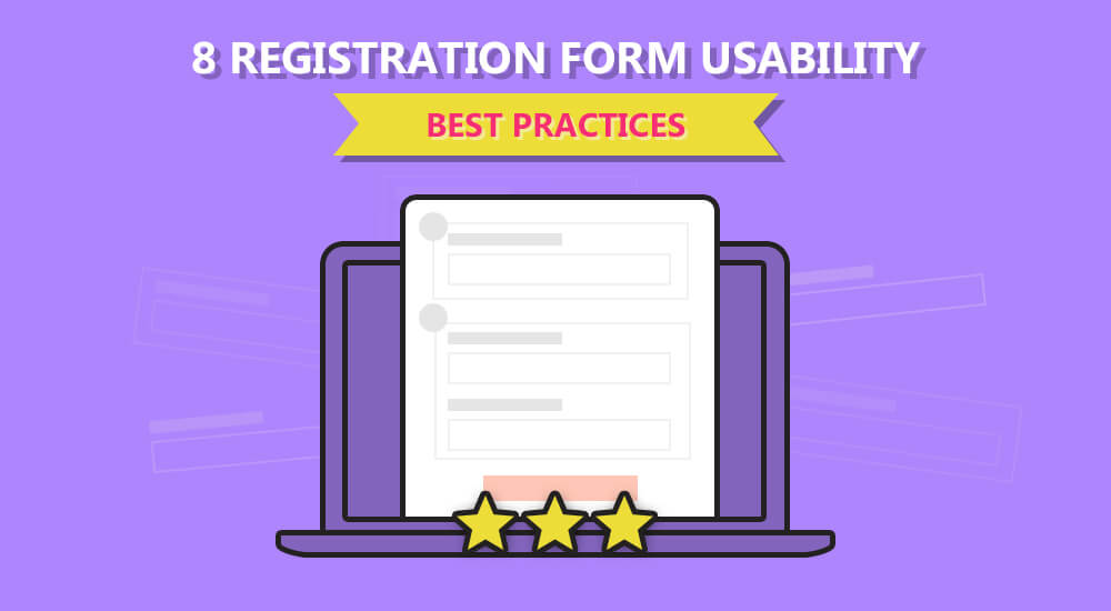
Here are 8 Registration Form Usability Best Practices:
Tips for Captivating Form Design:
What is the most vital factor which you should consider while designing your form?
There could be various factors to consider.
But the most important is the form design itself.
How does the form look like? Does it suit your brand image?
Is it designed in an optimized way?
Form’s structure and its formation are extremely important to look at.
There should be a proper connection between all the fields in your registration form and it should definitely be following a sequence without any abrupt fields or entries.
Here’s an example of asking related question together in a form. There are two forms in which one performed better because it had group related questions.

Hence, this is how we know that special attention should be given to the design- including structure, formation, sequence of questions and the overall impact.
Have a look at this amazing Infographic for more details about how to create registration form in the best manner.
Optimized Form Field Labels:
Label in a signup form is another important conversion optimization practice.
Not familiar with this?
Labels are basically the words which describe the function of fields that are present in a form.
Using short and to the point words as the label is the best strategy you could use in order to provide ease to the visitor by informing him the purpose of each field.
See how Amazon redesigned its form and placed labels to increase form usability.

Strong Call to Action for improving Form Usability:
You think you have used the right copy for your registeration forms?
If not, then please do not take this factor lightly because your copy for you call to action buttons and your labels is extremely significant in boosting up your conversions.
Here’s a great tip:
Write your copy by putting yourself in the shoes of the customer, always look for your benefit because your customer is always thinking about what’s their in the form for him and why should he register for the particular site.
Don’t believe it?
See how ContentVerve changed the copy of their form and raised the sign ups by 31%.

Thus, we can clearly see that it is the game of the words.
Check out these 5 CALL TO ACTION TIPS TO INCREASE YOUR CONVERSIONS (INFOGRAPHIC)
Optimize Forms Suggestion Lists:
You must be familiar with the drop down menus in the registration forms.
But there is a higher chance that your customer is looking for something else…
And your limited drop down menus don’t have that particular option.
Now you have to realize that the drop down menu in your registration form is nothing but just like some sort of irritation for the user because it is not helping him in anyway.
First of all, he do not need those option.
Secondly, let him write on his own.
For cases like these, here’s a Lifesaver!!
There is a technique called ‘Suggestion List’.
Let the user type the first word and you proposer related suggestions to him in the drop down menu so that he could easily choose among them.
Check how Ajax AutoComplete for jQuery put the Suggestion List in its forms.

Avoid Repetition:
Most registration forms ask the password twice which is a big reason users drift away from the particular signup form and just exit hence increasing the bounce rate.
Just make it a point while designing your registration forms to put one field once only and do not put off your customer by asking the one thing twice.

One of the most irritating double fields example is asking your password twice.
Let’s just trust your customer for once!
Highlight Essential Fields in your Registration Forms:
The users are not willing to fill all the fields you have given.
They just want to get done with the form as soon as they can.
Highlighting the important fields in your registration forms is a beneficial strategy in order to quickly get the form filled by your users.
Check how there is difference between highlighted form and an unhighlighted one.
The highlighted fields give the user far more ease than the other one.

Mobile Optimize Your Registration Forms:
Still using desktops and laptops?
I really doubt it!
The researches show that most of the users use internet with their mobile phones.
All the sites like e commerce, blogs and the social media are mostly used with mobile phone than any other device.
A study conducted in US in 2014 by SpeckyBoy showed that 90% of adults used mobile phones.
Also, another study by conversion.com stated that if your site is not mobile optimized than 40% of your visitors will simply exit from your site…
45% will go to competitor’s site…
While 57% would never recommend your site to any of their acquaintances.
This show how important it is to have Mobile responsive websites.
Allow Users to Signup through Other Accounts:
You think making a complicated form will make your user trust you more?
If this is what you are thinking then you are killing your conversions with your own hands, my fellow!
Make your sign ups friendly, easily accessible and less complicated.
Here’s a Kicker:
A simple tip which can boost your web form conversions is allowing users to sign up using their Facebook, Twitter and Gmail accounts.
The ease of signing up through other social media accounts make the users sign up instantly instead of just running away and avoiding the hassle.
You know sometimes people just don’t feel like filling in the fields and at that very point if they see this option of signing up through the accounts they already have…
The feeling is just so relieving!
That’s where you catch them friend!

See how this site has given various options to its users.
Conclusion:
These were the 8 best practices that will help you optimize your signup forms in the most effective manner.
Creating optimized forms is certainly not an easy task and one has to be really careful while designing one.
Factors like your product type, the kind of audience that appears on your site and the essential things which you really need to ask; are very important to consider while creating your sign up form.
Here’s the Best Part:
We have various tools in the online market which offer you to build optimized forms for your site.
TruConversion is one of those amazing applications which offers a set wonderful conversion tools.
One of its tools offer Form Optimization which helps in making your form convert much more than before by tweaking it according to your customer demands.
It gives you a chance to design and track your forms, both at a single platform.
Now with TruConversion:
You can see visitor’s clicks, backspaces, wrong entries, unfilled fields, dropoffs and the overall time he spends on your web form.
This kind of tracking makes you see what your visitor is liking and what is making him leave without signing up.
So using tools like these is the best option for your registration form optimization!