Do you know that on average 80% of visitors on your site will abandon without taking an action.
Do you know the reason behind it?
The real reason behind this is that people keep making conversion mistake without realizing the fact that they end up having lower conversions by making so many mistakes.
We really need to realize that whether we are passionate bloggers or emerging entrepreneurs, we need to adopt some effective strategies to convert our visitors into customers.
But how do you make that possible?
By streamlining our marketing arsenal and concentrating on optimizing the conversion rates for our website.
To help you figure out what kind of mistakes you are making while optimizing the conversion for website, in this post I have sidelined 10 common conversion mistakes along with their proposed solutions.
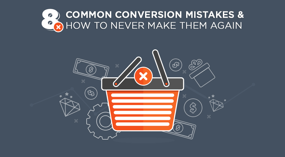
Here are 8 Common Conversion Mistake and their Solutions:
Contents
Slow Page Load Time:
When you log in to any site and the site takes too long to load and keeps showing a loading circle, for how long will you wait for it to get loaded?
Not too long, I suppose.
This is one of the most common reasons why people most of the site have high bounce rates.

Check how each minute’s delay affects your conversions in this Super Informative Infographic on Page Load Time by TruConversion.
Solution:
The first priority should be good hosting service which will give us high pagespeed.
You can find a variety of tools online for the optimization of all the media files present on your site,. Some commonly used tools are Compressor.io, CloudFare and WP Smush.
The compressed and optimized size will increase the speed of your loading process.
Here’s a Complete Guide to Reduce your Page Load Time and Increase your Conversions.

Vague Call to Action (CTA):
Your website is not a product itself but it is only a communication channel for your visitors.
Therefore, it is extremely important to create catchy and attention-grabbing Call-to-actions (CTA) on your website which will help you convert your visitors into customers.
If your Call to Action seems vague and not catchy at all, then there is a higher chance of losing a potential bunch of customers.
Solution:
The main purpose of a CTA is to make the visitor perform the desired task. The CTA strongly determines the conversions at your website.
Extra attention should be paid on the copy and the color selection of your CTA buttons in order to make them visible.
Secondly, you should always keep your CTA simple to avoid any kind of confusion or interruption.
CTAs play an amazing role on websites. Shopify raised the revenue 10 times in just 3 years just because it changed it’s CTA to “Start your free 14-day trial”.
It is noted that if you ask them to buy after their first encounter with your brand, 84% users will bounce off your site. But, if you offer them a free trial, there will be an increase in your conversions by 328%.
So it is best to choose your CTAs wisely.

Low Quality Images:
Images are the most appealing part of your website. The graphics and images play a huge role in your website design and they really shape up or influence the effect your site has on your visitors.
If you are relaxing and sitting, thinking that you would select an image from shutterstock and put it up as the feature image on your site, then you are highly mistaken.
Because real life images give a completely different and unique impression on the visitor which the other images are not able to give at all.
Solution:
Remember that using bright and high resolution images actually grabs your visitors and makes them take more interest in your site.
Conducting a special photoshoot for your product/service is the best thing you can do. Well, it does depend on site to site, but real life photos give away the best impressions.
Other than that, a variety of sites like Stock Photo and Unsplash offer quality images. These sites provide good quality and high resolution images which also helps you build your credibility.
Here is what an ecommerce site, Best Made Company, has to show. A variety of thumbnails is what makes their site a good one.

Low Quality Content:
The type of content you have on your site plays an extremely vital role in increasing traffic. Poor quality content will always effect your brand image and will make your visitors drift away from your site.
On the other hand, a case study showed that blogging increased website traffic by 481% in just 5 weeks.
Content with relevant data and links help you generate traffic which eventually help you in generating more leads. But if you take this factor lightly and produce low quality or irrelevant content in your site than you are basically losing your credibility.
Solution:
The best solution is to create quality content.
You don’t have to post the content everyday, the focus should be producing good quality and relevant content.
The web content, be it the general site content or the posts you write on the blog, every kind of content has to be Optimized and well researched.
Check this Useful Guide on how to Optimize your Content!
Lack of Responsive Designs:
Another mistake that most of the websites make is not being responsive to all the interfaces available today. Times have changed and people use internet from various different devices so the websites should be ready to be operated on any such medium.
This is where some sites lack today. If you are having a good site but it does not run on various browsers than you are definitely doing something wrong and losing out on a lot of potential subscribers.
It has been observed that from June to November 2015, desktop devices brought 52% traffic on Google while mobile devices brough 48%.
And through November 2015 mobile traffic kept increasing.
Another source shows that mobile phones are the most used medium for internet.

Solution:
The websites today have to be compatible with the smartphones interface, the developers need to consider mobiles as the main medium through which people will log in to their sites.
The mobile world has evolved with time, we have moved to laptops from desktops and further on to tablets now. And if you haven’t thought about updating then you need to hurry up!
Tips for Mobile Ecommerce that Must Be Followed:
- Test your site on mobile interface
- Do not Clutter
- Have Large Buttons
- More Scroll, less Clicking
- Avoid placing too many ads
- Keep it Simple
- Keep it Fast
Lack of A/B Testing:
Are you thinking to be an expert developer, then it;s a continuous process and you can’t just create a website and the leave it right there.
Builtvisible.com reveals that only 44% companies use A/B testing when trying to optimize conversion rates because people still do not know its importance.
On the other hand, some say that it is very important to constantly conduct at least one A/B test on your site.
For building up a successful website, constant upgrading is needed along with constant testing. Otherwise you wouldn’t know about the demands of the market. Thus you would lose on to conversions.
Solution:
Carrying out constant A/B tests helps you in optimizing your site in terms of its viewership and content. There are a lot of guides and articles which you keep you updated on how to compare and test your website.
Define your objectives and determine the purpose of your site’s existence. Make your business objectives the arms of your business; make them SMART! Here is what we mean by SMART:

Here is an Infographic giving an extremely useful Step by Step Guide to A/B testing.
Too many navigators or the confusing navigators often put off the potential customers.
Visitors when get confused and do not know how to move forward on your site, simple check out hence increasing your bounce rate and lowering your conversion rates.
See a long list of navigators shown in the picture below, these kind of navigations put off the visitors and makes them leave, thinking the site is too cluttered and not focused at all.

Solution:
Make it a point to must have proper navigation at your site.
You should have navigators/ indicators to guide the visitors where to go ahead and how to move around your site.
You navigation should be:
- Concise
- Descriptive
- In order
- Grouped
- Visible
- Accessible
- Not cluttered
- And shouldn’t be too much
Absence Of Social Proofs:
Some websites lack the presence of social proofs and existence. Your visitors want to know who else is visiting your site and how many people trust your site.
If you fail to provide them any kind of reference, then you are simply failing to make them convert.
Solution:
Give social proofs at every step. With your CTAs, in your forms or at the end in form of testimonials.
This will build up trust and boost your conversion eventually.
Social proofs or the testimonials like shown below influence the visitors to be apart of the customer base also.

Here is The Ultimate Guide to Social Proof Marketing!
Conversion Mistakes – Conclusion:
These were 8 common mistakes that most of the sites make and lose a great bunch of customers every day.
Following the solutions provided above and rectifying your mistakes as soon as you can is the best solution you can do!
Good Luck for your Conversions, Mates!