No matter what field you’re in, it’s important to get your point across and communicate with the person who lands on your website. This is the key to driving sales. So how do you get a person to do something when the land on your site (or blog, ad, internal page, social networks, etc)?
To do this, you need to write a strong call to action.

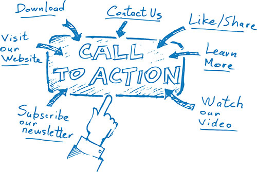
When a visitor clicks on your website, you want them to do something, right? Well this is known as your “call to action” (CTA). A call to action is a line that encourages the viewer to take action:
- Call Now
- Buy Now
- Learn More
- Click Here
- Sign up Now
There are many varieties of call to actions that you can explore to get your audience to do something on your website. CTA buttons are also included in website ads, blogs, and really anywhere you’re addressing an audience.
Typically you have one call to action as not to confuse the viewer. But there are cases where a secondary call to action is appropriate. We’ll get into those later in the blog. The basic point is:
Contents
If you have a Website, you should Have a Call to Action.
The great thing is a CTA can be put anywhere on your site: Homepage, end of blog posts, footer, etc. It’s up to you to figure out where is the most effective place to put it. You want to figure out where your reader is most likely to click.
In order to discover more about CTAs, we’ll walk you through everything you need to know:
- Why do I need a call to action?
- Recipe to create the Best Call to Action Buttons
- 10 strategies to creating magnetic call to actions
- Call to Action Mistakes to Avoid
- How to Test your Call to Action Button?
- When can I have two call to action buttons?
By the end of this blog, you’ll be able to lead your audience into whichever action most benefits your company.
Why Do I Need a Call to Action?
The biggest reason why you need a call to action is that it will increase your website conversions. In other words, you’ll get more customers. And isn’t that the end goal?
What the CTA does is directly shuffle the reader into the next step. It gives a clear route for them to get to the end goal. You’re making it easy on your customer — and they definitely appreciate that.
Think about it from the mind of a reader on your website:
If they are wandering around on your website without a call to action, they might be more likely to click off. However, if you have a “Get a free analysis” button or section, they will more likely click that to continue on the site.
You also eliminate the task of digging around for a contact form or email address, since you put it right in front of them.
And you also might want to think about it this way:
If you don’t have a call to action, your competitor probably does and who is the customer going to choose — a website that makes it incredibly easy to get to the sale or one that doesn’t?
Now that you know what a call to action is and why you need it, it’s time to talk about what makes a good CTA.
Recipe to create the Best Call to Action
There are a variety of call to actions you can include on your site, blog, or ad. But, all call to actions need to have certain qualities not matter what strategy you take. When writing and designing a call to action, here are points you need to keep in mind.
- The CTA Must Look Appealing: If your call to action is key or subdued, not only are people going to miss it, but they probably won’t want to click it. You want your CTA to stand out and look appealing to click.
- Use Action Words: A CTA is a call to ACTION, not a call for nothing, so you want to use action verbs that encourage the reader to do something. Call to action words like : Click, Read, Learn, Find Out are great for getting users to click.

- Make the CTA Enticing: A great way to get people to click your CTA is to use the word “free”. We all love free things, so if your CTA is “Click here for a free consultation”, you are probably more likely to get conversions than a CTA that says, “We offer consultations”.
- Lead to A Specific Page: Your CTA can be “Contact Us” and lead the viewer to your contact page, but to be even more effective, you can create a splash page where they only have to put in their email. Even better, you can create a landing page that contains the “Free eBook” they are getting.
- Color is Important: Just like design is a big element, the color of your button could make or break your CTA. Many companies put the call to action in red, which draws a lot of attention. It’s important that the color of the CTA button stands out from the rest of the page so people see it and then click it.
")
Any call to action you write should include all of those elements.
Now let’s get into 10 different strategies for creating a call to action.
10 Strategies for Creating a Dynamic Call to Action Button
It’s logical that different businesses use different calls to action for different reasons, right? So depending on what you want to lead your customer to do, you have to change your call to action to make it fit.
Not everyone will have the BUY NOW call to action – though that is very popular. Your company should think about your goals to figure out which tactic is best for you. To get you started, here are 10 strategies to create an awesomely effective call to action.
Free (Fill in the Blank) Call to Action Button
First and foremost, we all like free stuff. Giving away something free before people have to pay is a great idea to entice customers to buy your product.
How can companies use the word “free” in their calls to action:
- If you’re a software company, offer a free 15-day trial to people to get them hooked on your product.
- CTA Button Copy: Get Your Free 15-day Trial Now
- If you’re a blogger, offer a free eBook to people to get them to sign up for your mailing list.
- CTA Button Copy: Download My Free eBook on Blogging
- If you’re a big business, offer a free case study on how effective your product or service was.
- CTA Button Copy: Access Your Free Case Study
Of course you can’t always offer something free, but this is a great strategy to get people to click. Make sure it’s easy for them to get their free item.
Why?
If you offer a free eBook, but they have to put their mailing address in, you’ll end up losing a lot of people.

We want things made really easy, so simply ask for an email address and email the eBook. You’ll get more conversions this way.
Make the Customer Curious about your CTA
Are you tired all the time? We have the solution. If you read that CTA button and you were in fact tired all the time, you may be interested in clicking. Why? Because you’re curious to know if this company actually does have the solution.
This can be used in many different industries, just make sure to use words that incite curiosity. These magic words include:
- Discover
- Learn why
- We have the solution

The human mind is a curious one, so you’ll want to play on this by writing good copy. Examples of this include:
- Discover the best kept marketing secrets
- Learn why everyone is working harder than you
- We can solve your fatigue problems
The urge to find out just what your product is will make people click.
We all like to save. Offering a discount in your CTA is definitely a way to increase your clicks. If you are offering a discount in your ad, your CTA should change based on your sales funnel.
What do I mean by that?
Your sales funnel determines how likely the person is to buy, so if they are high up on the sales funnel they are less likely to buy than someone who is further down. This means your discounted offering needs to get more and more enticing, the further down in the funnel you go.
This is really only for ads that you run automatically (programmatically) so you can filter your funnel, but the basic idea is that the people who are about to buy get a bigger discount than someone who is probably not going to buy.

Many companies start by offering free shipping and then add an additional 5% discount the further down the funnel they go. The logic here is that the people that are about to buy are going to be really interested in a 15-20% discount and then will buy right away.
The CTA examples look like this:
- You have items in your shopping cart – take an additional 10% off!
- Still like that t-shirt? Get 15% off using code: XYZ.
Problem-Solution CTA
This is a pretty typical sales tactic. The company states the problem which you face and explain how they are the solution. Fortunately, it also works when it comes to CTAs. To think about crafting one of these, you want to ask yourself:
- What problem does my product solve?
- How can I state that succinctly that also expresses urgency?
- How can I show that my solution can solve this problem fast?
To make this sort of CTA, it’s best to start writing more content and then trim it down. Examples of these calls to action include:
- Working late hours? Cut your workload in half.
- Have a pool party coming up? Lose weight in one week.

The problem-solution call to action works well especially when used in a timely way. This brings us nicely to our next strategy.
Using Urgency in your CTA
Depicting a sense of urgency can really help increase your call to action conversions. There are two types of “urgency CTAs” you can run.
The first is offering a deal that expires. So someone gets to your landing page and they have 24 hours to perform an action or they lose their free trial.
For example: This offer ends in 24 hours; get your deal now!

The second is a “buy now deal”. This is when someone is close to buying and you offer them 10% off if they complete their transaction in the next 20 minutes. So if someone gets to your landing page, you’d have some sort of timer linked up to your CTA to get people to click faster.
For example: Book now and get 10% off!
These types of CTAs work because it makes the buyer feel like they are more of an individual and that they’re getting a great deal (and we all love a bargain). These make people click faster to get the deal, so they can be effective for increasing conversions.
You don’t want to offer these deals all the time or the users will catch on; instead, giving a “flash deal” every month or so will entice people to click your call to action.
Talking about Numbers in your CTA
Another great call to action strategy is discussing how many people have already bought or tried your product or service. Of course this only works if you have large numbers that you can backup, but this adds credibility to your company.
This also gives the FOMO effect that people fall prey to easily. They see that 100K users have already tried the software, and they why to jump on board.

Another way to give your CTA value is instead of numbers put in a big name (a celebrity in your field) and talk about why they tried your product or service — how they loved it essentially. The person needs to sign off on this ahead of time, but this can be really effective.
This type of call to action looks like this:
- See why 1 million people bought this shirt
- Why Bill Gates uses this product
This lets the viewer know that they’re not the only one that can benefit from your product or services and it encourages them to jump on board.
Use Emotion in your CTA
Even if your product is something technological that incites zero emotion, that doesn’t mean your call to action has to do the same. Including an emotional element in your CTA can really improve your clicks.
How so? Let’s take a difficult example – you are a project management software. Instead of a CTA that says, “We help teams stay connected”, you can try a stronger approach like these:
- Never miss out on a team update! Use X now.
- Keep your team together using X.

In this case you want to draw on a company’s desire to have a strong, connected team. You play on their emotions with CTAs like these ones, which encourage them to click and try your product — because they do in fact want their team to stay together and work well.
Relax your CTA’s Vocab
Now this one definitely depends on your audience – 100%. But, if your target is young, technologically inclined, and modern, then you don’t have to be formal at all in your CTAs. Take a look at these changes:
| Old CTA | Modern CTA |
| Try our new software today! | Make yourself smarter than your coworkers, learn our technology |
| Learn how to void mid-day drowsiness | WAKE UP – and stop falling asleep at your desk |
Being more relaxed can also help you relate more to your target audience.
Add Even More Value in your CTA
Adding value is a given in a call to action, and in the tactics above, I describe how to do just that. But, if you want to add more value, then you have to be a bit more creative.
Let’s say you’re an e-commerce site. Most of your competitors CTAs will include free shipping, so what if you did free shipping and a money-back guarantee?

That sort of thinking will get your product ahead of the competitors.
It’s important that you always add value, but try to take a look at your competition, see what kind of value they are offering and then assess whether or not you can add even more value.
Include a Personalized CTA
Typically, a call to action will be the same for everyone. But now, you can actually change them depending on the person visiting your website.
This links back to what we were talking about earlier in regard to the sales funnel – someone that is going to buy should get a different CTA than someone who is just visiting your website for the first time.
Also for a person that has already completed your CTA, you don’t want them to see the exact same CTA message again.

An example of this is if someone goes to your website and signs up for their free trial, does it make sense to then again offer them a free trial they already used? Nope. You want to offer them some other value.
This is a different type of call to action, often called “smart CTA” or “dynamic CTA”, it is a personalized way of getting a user to complete an action.
This type of call to action depends on the lifecycle or sales funnel of the customer, so you’ll need to segment your customers appropriately. Most likely you are already doing this, so you just need to decide who gets what call to action.
A great way to do this is to split users up between three segments: Education Level, Product Analysis Level, and Purchase Level. This is a very easy way to do this. Here is how you want to approach each level:

Education Level: These people need to know about the problem you solve. These are the people that just landed on your website.
Analysis Level: These people need to know why you’re better than your competition. These are the people that have been to your site before.
Purchase Level: These people need an extra push (discount, free shipping, etc.) to purchase. These are people that are ready to buy.
The great thing is there are more and more technologies popping up that help make this happen, so you don’t need to personalize yourself.
By now you should have thought about which strategy you want to move forward with, so it’s time to think about the dos and don’ts when it comes to CTAs. Let’s start with the top mistakes people make so you can be sure not to make them yourself.
Top Mistakes Made in Calls to Action
Sometimes figuring out how to write a great call to action is learning from mistakes that other people make. Here is a list of the top mistakes people make when utilizing a call to action.
Call to Action Design Mistakes
The CTA doesn’t stand out.
If your call to action button is the same color as the rest of your website, you’re not really asking people to take that action. The CTA button needs to be of a different color or tone and bold or designed in a way to make it pop. If people don’t see it, they can’t click it.
The CTA is hard to find.
If people are searching around for your call to action or where to put in their email address, then you’ve done something wrong. Your CTA should be the first thing they see when landing on your website.

Too Many CTA Options
There are times when you include more than one CTA, which we will explain below. However, if someone clicks on your site and there are 5 options, they will probably either get overwhelmed or frustrated and might leave your site. Make it clear to them the first option of what you want them to do. In this case, choice is not a good thing.
Image Overload
This is a common homepage mistake in general and has very negative implications on your call to action. If there are too many images, a user will get overwhelmed and most likely completely miss your CTA — keep the page simple and clean and guide the user directly to your call to action.

Call to Action Copy Mistakes
Not Delivering
It should be absolutely clear what happens when someone completes your call to action. If you tell them to enter their email and they get a free eBook, then that is what you send in a timely manner. If you then send them a whitepaper, you’ve confused the user and probably lost the sale. Deliver exactly what you say you’ll deliver.

Vague Language
If your call to action does not use an action word, then you can’t expect a user to take action. Using action verbs encourages people to act, so don’t use language that doesn’t have that impact.
Too Long or Wordy
Writing a call to action is really difficult! You need to give value and a reason to click in a short amount of time. Your goal should be to have your CTA between 90 and 150 characters – any longer and you may lose the effect. You don’t need flowery or descriptive language here – just get to the point!

Asking for too much too soon
Your call to action should offer a benefit or value to the user. If your CTA asks for too much — either too much information about the customer, too much money upfront, etc. — you are at risk of losing this potential buyer. Keep it simple and don’t make the user do too much in the beginning.
When working on your call to action, always have your target in mind. Some people get really focused on a specific call to action and don’t even think about whether or not their specific target market will click or not.
A lot of times what happens in that team members might disagree on which call to action is the best. Enter: TESTING.
Testing your calls to action is vital to making them work, so let’s talk about what you need to test and how to go about doing it.
How to Test your Call to Action Button?
The purpose of a call to action is to grab users’ attention and make them act. But what if you find out that no one is acting? In this scenario testing is incredibly important.
First things first, you need to know what to test in your call to action. You can actually test many different aspects of the CTA:
- Graphics
- Design
- Colors
- Location on your website
- Copy
You don’t need to test all of those items all the time, just try to narrow down what works and what doesn’t. For example, maybe you have strong copy, but you want to test different colors and locations on your homepage that you put your CTA.
You may already be using software that helps you measure your call to action, but if not, Google Analytics can help you with this. What you want to do is to set your call to action as a Goal on Google Analytics.
Here is how to set up a goal:
Click Admin (top right) → Goals (under Profile) → Create a Goal → Select the type of goal you want and fill out the information.
So let’s say your CTA is to get people fill out your contact form. You would make this your goal. Easy as that! You can make your goal whatever you’d like.
In order to view how many people have completed these goals, you just go to:
Conversions → Goals → Overview
And there you have it – you can easily see how many people converted or completed what you wanted them to complete.

Now that you know what makes a good CTA and how to test it, let’s discuss when it’s OK to have more than one call to action in the same place.
Two calls to action – this is a tricky concept for some. A second CTA button is called a “secondary call to action” – very aptly named. Usually it’s not as prominent on your website, since it’s the second action you want your users to take.
Why Have a Second CTA?
The purpose of the second call to action is to grab users that don’t find the first (main) call to action appealing. You are essentially giving them another option and hoping to convert them. It’s basically a second chance for you to get more customers.
Let’s say your primary call to action is having users fill out a contact form with:
- Name
- Address
- Phone Number
- Age

Well, believe it or not but that can be daunting for some people. They may not feel like it’s worth it to give you all of those facts. So, your secondary call to action may just ask for an email.
Now, people who do fill out the primary call to action get a bigger reward – maybe a free eBook. But those who take part in the secondary call to action just get put on your email list. The main point is that choice can end up getting you more conversions.
Secondary Calls To Action in the Sales Funnel
Let’s go back to the sales funnel for a moment. The sales funnel and secondary call to action can be much linked, because maybe your primary call to action is a product demo. However, some people might not want a product demo; they still want more information (education level).
Having a secondary call to action in this case as a just “Learn More” can help you secure more interest. Those who are ready for the product demo (and are further down in the sales funnel) can take their demo, and those who are not quite ready (they are at the top of the sales funnel) can learn more about your company.

Secondary Calls to Action and Social Media
A great secondary call to action is driving people to your social media pages. What’s nice about this is that it is really easy for people. Its a few clicks – that’s all.
The secondary call to action could be Liking a page or sharing a post, but either way it’s non-invasive and easy to do. This will help grow your overall reach and brand, so it’s a great way to get more followers.
What to Keep in Mind When Posting a Secondary Call to Action
If your company decides to have a secondary call to action, there are a few things you need to keep in mind.
Make sure the secondary call to action compliments the primary call to action.
The last thing you want is the two calls to action competing with one another – because your goal is that people click the first CTA and if they don’t want to do that, they click the second CTA instead. If you have competing CTAs, you may confuse your user, which will result in them leaving your page.

Make sure the design of the secondary CTA doesn’t overpower the first.
If you have two CTAs, the primary call to action needs to be brighter and bolder. You want the primary CTA to stand out more so that people click that. The secondary CTA can be a bit more muted — it needs to stand out from the page, just not from the primary call to action. Users are more likely to click the bigger, brighter option, which should be your primary CTA.
Think about the sales funnel
Your primary CTA most likely is pushing them down a level in the sales funnel, which means your secondary call to action can be a little less commitment for the user. Some people may not be ready or not have enough information to be led down the sales funnel, so make your secondary call to action helpful for this group.
Keep it Simple
Your secondary call to action should be relatively simple. Many companies use this to gather email addresses or get shares on social media. Remember that your primary CTA can be the one where you ask people to do something bigger, and your secondary CTA keeps them on your page but doesn’t make them do much.

Always keep in mind your overall goals when writing primary and secondary calls to action. It’s important that your number 1 goal become your primary CTA and you set your secondary CTA accordingly.
Conclusion
Calls to action are a great way to push users down the sales funnel and convert these people to buyers. As you probably have noticed, almost all websites have a call to action — and those that do not, most likely have high bounce rates as users are unclear on what to do next.
You always want to think about it from a user perspective and how you can make it as easy and simple for them to complete an action or get the information that they want. You want to essentially guide them through an action by writing dynamic copy, designing a creative call to action button, and placing it appropriately on your website.
One of the biggest elements of calls to action is testing. No matter what technology you are using or how you are testing (via a platform like Hubspot or through Google Analytics), it’s vital that you test and re-test so you know how to get your viewers to convert. While this can be time-consuming, it’s worth it in the long-run.
If you’re wondering how to even get started on creating a call to action for your website or blog, go back and look at websites where you completed the call to action. What eBooks have your downloaded or what newsletters have you signed up for?
You want to ask yourself: What made me click? Was it design, copy, a great tactic? You can mimic those elements that you yourself clicked to get started on creating a call to action for your website.
Have you created a dynamic call to action for your site? Share in the comments what worked and what didn’t!


2 Responses
Even, I have been a victim of using too many CTAs and few of them were long. Thanks for pointing out some of the obvious mistakes. In a long run, it is going to hurt for sure. Probably, it is a right time to rectify those mistakes.
I appreciate your detailed and systematic write-up. Makes it easy to understand your process. I learned something, thank you.
Comments are closed.