The combination of landing pages and customer behavior page data might confuse you, and you might be a little unsure how to apply the information!
It’s easy to get quantitative data that tells you whether a page is converting or not. It’s a lot more difficult to try to find out why.
The fact is, most of us just don’t have the traffic to run several split tests over a long period of time to prove an assumption based on a guess or theory.
This is where customer behavior analytics comes in. Looking at the page level behavior will tell you where to focus your efforts so you can make the foundational changes you need to boost conversions and run tests that will actually make a difference.
You’ll want to use tools like heatmaps, scroll maps, click data and session recordings when conducting your landing page optimization research. If you don’t…well…you’re just throwing spaghetti trying to see what sticks.
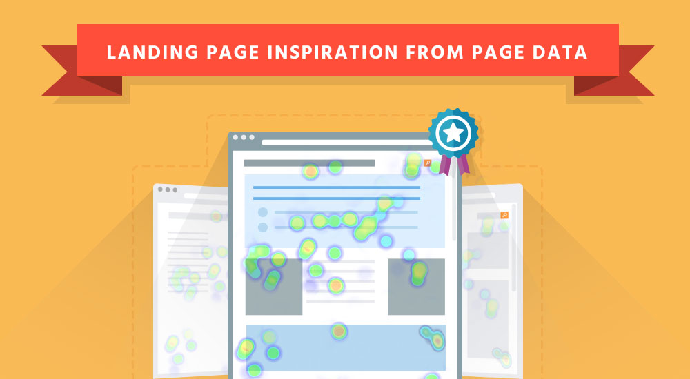
[Shamelss plug] TruConversion provides its users with various analytical tools and the heatmap report is one of the best tools you can use to get a general idea about how a group of visitors are behaving.
In the heatmap below you can see where people are clicking, what the click density looks like, and where they’re scrolling. This will tell you what your visitor finds compelling and if they’re seeing the most important content on your site.

With heatmaps, you can get a detailed picture of your visitor interaction behavior and can tell you in a simple report where you need to put more focus.
Landing page optimization is just the act of creating a page that both articulates the needs/wants of your visitor and meets their user expectations. That’s it! So a heatmap will help do the heavy lifting and tell you the aspects of your page that are useful to your visitor.
If you’ve created a heatmap already but just don’t know what to do with that fancy colored report. I’d recommend checking out this post for some analysis tips.
Contents
How Does Page Interaction Data Actually Helps with Landing Page optimization?
Tools like heatmaps, session recordings and scroll maps help us track and trace our visitors behavior.
Heatmaps allow us to monitor the visitor activity on our landing pages. It creates color-coded spots/images that reflect the most, and least, engaging parts of our page.
There are two popular kinds of heatmaps; eye tracking and mouse tracking. Most heatmapping technologies use mouse tracking, e.g., clicks, scrolls, and movement.
Eye tracking and Landing Page Optimization:
Eye tracking heatmaps are generated by tracking the eye movement of a sample group of visitors while they browse a website.
These studies can be extremely expensive as they require expensive tools and a sample group.
On top of being costly, eye tracking labs are reliant on the sample you choose. If you choose a weak sample, e.g., a sample that isn’t a representation of your total audience, then you’ve wasted time and money on data that could be harmful to your business.
One solution is a tool called EyeQuant. They use a programatic approach that simulates an eyetracking study. This will save time and money while giving you an idea about how your page’s visual hierarchy stacks up. I’d recommend using this service in addition to click and scroll heatmaps (as well as other customer behavior analytics data source).
Mouse tracking and Landing Page Optimization:
Mouse tracking analysis monitors mouse movement and the clicks by the visitor. Areas with the highest clicks represent the most engaging parts of your web page.
This kind of tracking is much cheaper than the eye tracking as it doesn’t require expensive tools and a sample group of people. Mouse tracking heatmaps also provide passive user data or data from a user who is unaware they are in an observed environment. In the case of eye tracking studies the user is well aware they are in an observed environment and because of this they might alter their behavior.
If you aren’t familiar with mouse tracking heatmaps here’s an example:

There are various kinds of heatmaps, namely:
- Hover maps
- Click maps
- Attention heatmaps
- Scroll maps
All of these tell you where your customers are engaging the most on your site. You have to observe what in attracting them and what is making them leave. You also have to make sure you don’t have competing visuals or CTAs. A heatmap will tell you right away if your next steps or images or competing with one another.
Design your landing pages based on these engagement points and use the information to fuel new design changes and split test. You’ll want to start your heatmap spot check by looking at your layout, accent colors, images, visual cues, and CTA buttons.
These tools give you insight into what information people are looking for. The most important part is to know how to test, track and see!
Here are Five Best Practice that need for Landing Page Optimization after Page Data Analysis:
1. Stay ‘Above the Fold’:
You may have heard the fold is dead. I’m here to tell you that the fold is very much alive. It’s just elastic.
Sure the concept of the fold has become more complex, but the reasoning behind keeping content above the fold remains the same:
A visitor needs to know who you are, what is in it for them, and what to do next within 5 seconds of landing on your site.
Putting your most compelling content and CTAs above the fold answers your visitors questions immediately. Most of the users do not want to scroll down and they judge the site with the very first glimpse.
Studies reveal that 80% of the time your visitors browse above the fold only and never scroll down especially when the upper part of the site doesn’t really appeal them.
2. Avoid putting your CTAs in Banners or Ads:
Make sure your CTA is not being shown in form of an advertisement or a banner. It should be properly focused and specified as a CTA button so that the visitor would give due importance to it and would really do the desired action.
3. Make your CTA stand out with some Eye-Catching Colors:
Color matters…to a point.
I’m not going to sit here and discuss color theory. As far as landing pages are concerned your CTA needs to do one thing:
STAND OUT.
The color of your CTA button needs to contrast with the whole landing page but also needs to stand out so that the visitors really see and get attracted to go and click it.
Studies show that colors exert a persuasive psychological influence on human brain. Since our brains have the ability to process images 60,000 times faster than text, colors play a vital role in transforming the conversion rate of our landing pages.
This grid is going to give you an idea on how visitors behave when shown certain colors. Click here to access the complete infogrpahic on how to use colors to increase conversions.

Remember:
Colors can dictate tone and have a lot of other subconscious effects. That said, when it comes to coloration and your CTA just follow the simple rule I mentioned above. However, color has been shown to help increase conversions but that is a much larger topic to cover.
4. Do not use Stock Photos:
Stock photos are awful and in an age where consumers are looking for transparency and authenticity nothing makes a page look cheesier than a stock photo.
Say you’re creating an ‘About Us’ page. Which image do you think would hold more weight? The professionally shot happy team

or the low-fi shot of the actual engineers?

If you’re adding photos to your site, make them genuine. You also might want to check out a post I wrote covering the types of image elements you should test on your pages. Make it natural and far more engaging instead. Stock photos lose the interest and trust on the site.
5. Sales Copy should always follow the expected reading patterns
Studies also reveal that 69% of their viewing time is spent looking at the left-hand side of your web page.
Positioning your sales copy on the left of your web page will engage your visitors far more than the right-side (for most geo regions).
The page data from heatmaps and session recording show that people read the data in that very format, often called F-shaped pattern.

This shows that the content is read more from the left side so following this rule is really going to help you generate more traffic and have more clicks on your CTA buttons by the visitors.
Conclusion:
Knowing how your visitors interact with your page is one of the best ways to improve the user experience. It’s even better when you’re observing data from visitors who are truly acting as they normally would in a passive user state.
Though, in order to improve a landing page, you actually need a page to start with. I’d recommend checkout out our Perfect Landing Page Blueprint and modeling your next page off that. From there dig into the customer behavior and see those leads or sales come rolling in.