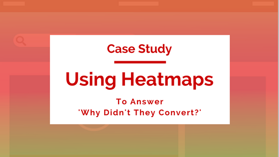
How bee-seen (a Bee Digital Company) Used Heatmaps To Uncover A Simple Mistake That Was Killing Conversions
This week we have a great case study to share that will show you how to leverage heatmap data on your blog content! This is a must read for anyone that offers free downloads or lead generation campaigns on their blog.
Let’s get to it!
About bee-seen digital:
Meet Bryan Plumb.

Bryan is the founder and director of bee-seen digital, a marketing agency for the education sector. Bryan and his team specialize in helping grow education companies via content, acquisition, and conversion strategies.
Since you’re reading this on the TruConversion blog, I’m sure you can guess this case study comes from some work Bryan and his team did on the conversion side ☺.
Tools Used
Heatmaps
Problem
The blog content just wasn’t converting readers into leads.

Bryan also included a downloadable worksheet at the end of the blog post. Downloading this worksheet is the primary conversion action on this post.

Unfortunately people weren’t asking for the worksheet and Bryan wanted to find out why!
Bryan added TruConversion to his page and wanted to see how his readers were behaving and hoped to figure out why they weren’t converting.
After collecting some click data, Bryan learned that people were clicking…just not on the offer.

Notice that when a visitor sees a bolded section or an underline they ACTUALLY CLICK THAT TEXT. Based on this heatmap a high percentage of people are clicking here so this isn’t a ‘rogue click’ scenario or some other outlying piece of data.
The user begins to experience click fatigue in addition to an added frustration of not getting what they want!
Think about it, what happens when you click something that takes too long to load? You click it again…and again…
In this case, visitors were clicking something that didn’t do anything! So the visitor that showed a general interest is turned off when nothing happens!
Well, the story doesn’t get any better from here…

The main offer on the page wasn’t getting nearly as many clicks as the inline content in the blog post (and Bryan actually wanted them to click here!).
Even worse, the [Download] text is clicked just as much as the form field and that text was…
…you guessed it…
NOT CLICKABLE.
After recovering from a severe headache brought on from a self inflicted head slap, Bryan knew what to do next.
Solution
Simply put: this blog post was leaking valuable clicks on sections that weren’t clickable. It needed more focus!
Bryan learned that text formatting was playing a massive role in how people interacted with the page. Bolded and underlined text is going to catch the attention of the reader and they are going to click.
If you have a section on your page where people are clicking but it wasn’t designed to be clicked you have two options:
1) Get it the heck off your page
2) Make it clickable with a corresponding offer
You only do the first option if there is no corresponding offer and the clicked section is becoming too much of a distraction.
In Bryan’s case he went for a mix of both options! He decided to remove sections that caused click confusion.
![Notice that [Download] text got the ax!](https://truconversion.wpengine.com/wp-content/uploads/BS-CS5.png "BS-CS5")

Remember that when you’re optimizing all you’re trying to do is make your website meet your users’ expectations. If they are clicking something it’s on you to either validate their action by providing them with what they expect or get it the heck off the page.
So how do your pages stack up? Try setting up a heatmap on your blog page or landing page to see what seemingly innocuous element is causing your conversions to flounder.
We’ve also taken the time to outline some pretty great heatmap strategies, so if this got you interested but you want to learn more definitely give this post a read.
Try it out and tell me about it in the comments!