

Imagine if you could implement one simple but effective tip to increase your conversion rate.
Better yet:
What if you could get 50 of these tips?
You’d most likely be excited about implementing them all, right?
Well, get ready to party since the team at TruConversion brings you . . .
. . . 50 effective tips for increasing conversion rate.
What’s more, we’ve simplified the essence of effectiveness by breaking them secrets down to nearly bite-sized pieces that you can easily digest and actually implement.
So, here we go:
Contents
1. Test Different Content Lengths
Different products, and even different audiences, require different content lengths. In a niche, short copy may do better than long copy and vice versa. But don’t just assume. It’s your job to test various lengths of your copy to see what works best with your prospects.

2. Offer Various Payment Methods
Different people prefer different payment methods—Credit card, PayPal, American Express, you name it. Don’t restrict buyers; offer flexibility. Consider providing various methods of payment to meet the preferences of all potential customers.
![]()
3. Create a Simplified Sales Funnel
Sometimes, a buyer may not be ready to buy from you immediately after they land on your website. Best thing to do is: set up a sales funnel that will allow you to drive them through the conversion process.

4. Create a Unique Value Proposition
Value proposition is one of the top factors that significantly influence conversion rate. What can your product do which other similar products in the market cannot do? How is it different? Are you offering any special benefit that competitors’ are not offering?
Tell that to potential buyers.

5. Integrate CTAs into Every Page and Content
This can be on the sidebar, footer area, webpages etc. For blog content, you may want to include a quick line (usually linked to your landing page) about your product at the end of every article.

6. Provide Proof of Results

More often than not people may want some evidence to support your claim before they can believe you. So, show customer testimonials, case studies, and even the results of how awesome your product has been. If numbers are your success indicators, such as you may have thousands of customers or your app has been downloaded 10,000+ times and still counting, then this is your social proof. Let potential customers know that. Nobody wants to be the only “moron” using a service.

7. Slay Your Jargon Dragon
Never try to woo buyers with convoluted gobbledygook. Did you understand that? Okay, maybe we shouldn’t actually woo you ourself. Here’s what that means. . . Keep fancy, complex industry terms down. Buyers don’t like being intimidated unnecessarily with business jargon.
8. Tackle Frictions
Not everyone who reads your sales copy will go straight to respond to your CTA. . . some will have disagreements to what you’re saying and may delay taking the offer due to their objections. So, it’s always better to address those differences and kick every friction off the way.
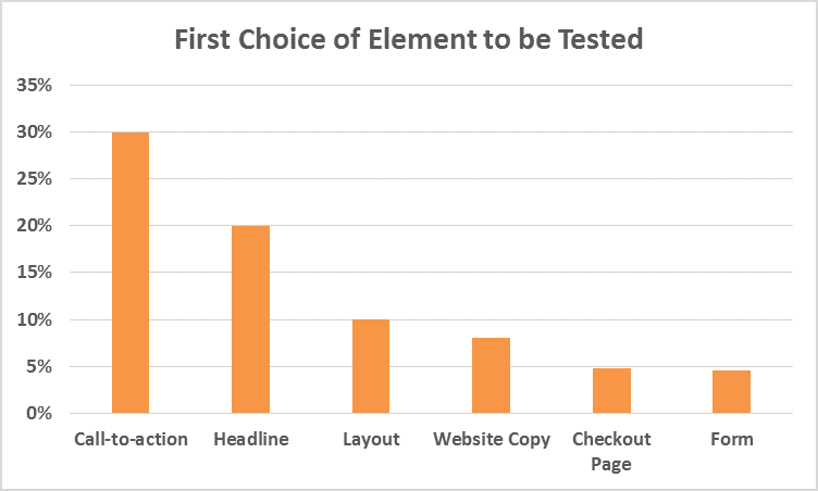
9. Test Everything
In real estate, it is location, location, location. In conversion rate optimization, it’s testing, testing, testing.
10. Provide Price-Match Guarantee
Though risky, price-matching can help boost sales. Price-match helps show that you care about keeping your prices competitive.
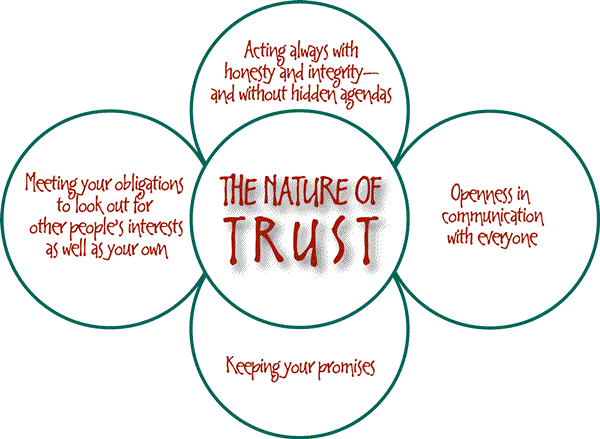
11. Build Trust
Trust is important and it’s important that you build it. Without it, visitors will not convert. . . at least in most cases. So, be real. Keep your business promises. Offer kick-ass product/services. Show that sincere, responsible and trustworthy people stand behind your site.
12. Write Product Descriptions That Sell
In most cases, potential buyers will want to know everything about what you’re offering. So, provide them with every detail they need to know about your product (including its features, benefits, and uses) by writing great product descriptions. You’d need to give enough information so that visitors could convince themselves and make a decision about taking the offer.
13. Invest In Quality Design
Bad websites kill conversion. So, when building your business website, not only should you give it quality design, keep conversion in mind as well. A winning combination involves aesthetics, practicality and convenience. Put into consideration elements such as typography, layout, images etc.
14. Don’t Coax with Flattery
Your site visitors are real people just like you. Don’t try to sweet-talk them into buying from you. Instead, write great copy that can help them make better buying decisions. Most visitors will leave if they find your copy to carry to dishonest statements.
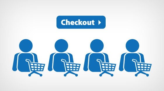
15. Offer Bonuses at Checkout
Some potential buyers do follow your sales funnel down to the checkout page. The majority, however, does not continue. But if you offer a discount, freebies or even a free shipping at the checkout, most of them will be willing to complete the buying process.
16. Regularly-updated Sites are Better
Both people and search engines prefer sites that are active. If you have a blog or a news section for instance, ensure that they’re updated regularly. Abandoned blogs are another way of saying “Hey, we folded last year. ”
17. Identify Your Buyer Personas
Basing your work on buyer personas prevents you from sitting on your butt in your comfortable office just making stuff up, which is the cause of most ineffective marketing. ~ David Meerman Scott
18. Include Team Members
Many business websites do not have “About” page, some do not even have a “Team Members” page. Adding details and photos of the people behind the business gives your business a face, helps to reduces risk and makes customers trust you more.
19. Avoid Errors
Usually, customers expect a level of professionalism from you. Broken links, misspellings, 404 pages and pages that are under construction all make you look like an amateur. Does this affect conversion? You bet!
20. Make Your Website Load Faster
Who wants to wait forever for sites to load? Not us either! If it takes longer than usual for your website or landing page to load, users may as well move on. There are billions of web pages available. Why would they wait?
Walmart found a 2 percent increase in conversions for every 1 second of improvement they made. (Source)

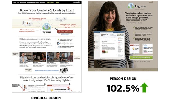
21. Use Great Images
Low-quality photos can make your brand appear unprofessional and can send the wrong information about your offer. Use professional-looking, stunning photos to drive home the benefits, uses etc., of your offer. As is the observation, pictures of happy, smiling people come with better probability of higher conversion rates.
37 signals achieved a 102.5% increase in sign-ups just for adding a picture of a smiling, happy person in the landing page of one of their web apps!
If you’re wondering where to get great images, here’s a list of 53+ free image sources composed by Bufferapp.
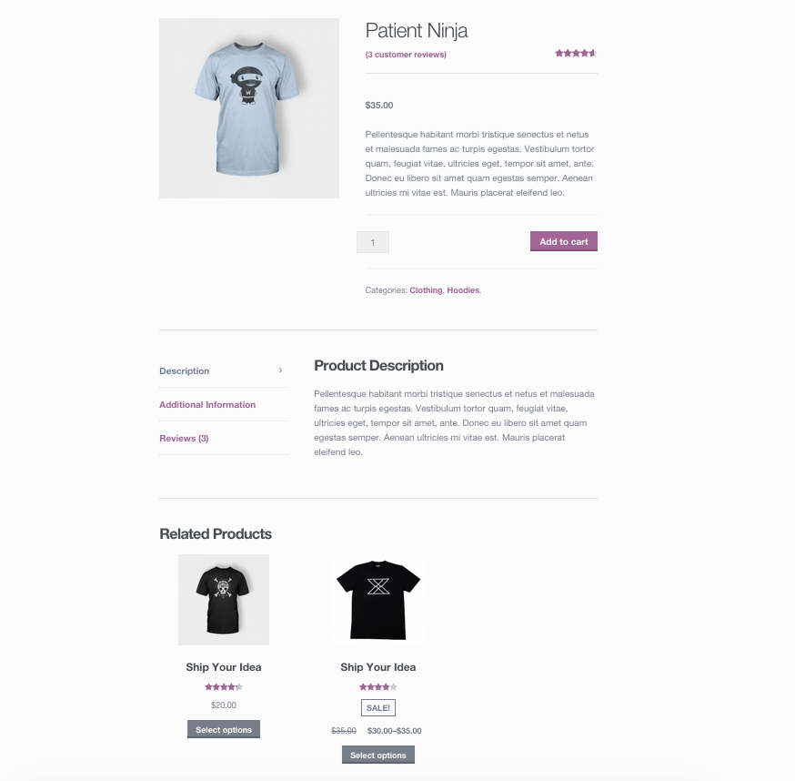
22. Recommend Related/Similar Products
If you have more than just one offer, it’ll only make sense to keep people on your website for as long as you can. . . so they can keep on engaging with your offers. Recommending related/similar product is sure way of doing this.
23. Cut Off Registrations
Requiring prospects to register before they can make an order is nothing but a plain obstruction and can limit your conversion rate. Instead offer a hassle-free, no-roadblock checkout to minimize the customer loss.
24. Show Demo
Add awesome demo to show what your product can do. Short, interesting videos are the key.

25. Include Customer Reviews
Just as proof of results, consumer reviews can come in helpful in substantiating your product quality. Hence, convincing people to accept your offer. In a study, Zendesk found that 88% of buyers were influenced by customer reviews in making a buying decision.

26. Make Clear Calls
Be clear about what you want readers to do next, whether to click on a button; fill out a form; download an app, or add to cart. This is where avoiding the use of vague CTA button texts such as “Click Here” comes in.
27. Include Privacy Assurance in Forms
Including a quick privacy statement at the end of opt-in forms can make a big difference in your conversion rate. This reduces risks and shows prospects that you care about their privacy. Here’s an example from a split-testing result:
And another example:

28. Make it Easy to Contact You
Even with a form on your site, people may still want to get in touch through other methods. Even beyond that, contact information authenticates your brand and shows prospects that you’re a real person with a real-world business. That said, in your marketing emails and website include your email address, phone number (optional) and office contact address (optional). Share them boldly.

29. Create Special Pages for Special Visitors
This could be special landing pages for pay-per-click ads, or a special page to receive and convert visitors coming from a guest post you wrote on a popular blog. Special pages make it easy to track and get visitors to do what you want them to do.
30. Test Variations of Your CTA Button
Elements to test include color, text, size, position, shape and so on. Below is an image showing how WriteWork.com – an education website for university and college students – A/B tested two variations of their call-to-action button and saw a little over 31 percent increase in conversion. (Source)

31. Use CTA Buttons Rather than Links
The button vs text link argument is pretty much an old debate among web marketers. But really, even old case studies found that buttons aren’t just more attention-grabbing than links, they are also more obvious and more clickable, especially on mobile devices.

32. Limit the Options
When there are too many call-to-actions on a page, people may end up not taking any action at all. Limit the number of CTAs you have on a page and be candid about what you want prospects to do. This may entail removing links and navigation menus as well, on the landing pages.
33. Compare with the Competition
It’s rare for someone to buy a product without first checking out what similar providers offer. Usually, they go where the best deals are. So, before your competitors take the lead, compare with the competition and tweak your offer accordingly to gain the competitive advantage over them.
34. Make Prospects Feel Safe
Buyers want to have a sense of security. Nobody wants to take risks buying from anyone. Make your customers feel safe. Some ways to do this: Include a money-back guarantee clearly shown near your form or purchase button. You could also choose to add a refund policy on your site, and so on.
35. Offer Free Trials
Free trial incentivizes (and makes it easy for) potential customers to get started using your product; it gives them a chance to test out the awesomeness of your product. If the potential customers think your product is as awesome as it claims to be, it’s only natural that they’ll continue using it. Of course, free trials should be for a limited period.
Here’s how HubSpot does that:

36. Use a Live Chat Tool
Let’s be clear, not everyone who visits your site will fill out your opt-in form or click on your order-now button. However, with a live chat technology, you can still get some of these people to get in touch with you. Chat tools allow visitors to ask questions and give you the opportunity to address their concerns and objections.

37. Use Urgency
You can include a sense of urgency in your CTAs, landing page headlines, homepage etc. This boosts conversion by instigating prospects to take action fast.

38. Try Different Color Combinations
Over the years, we’ve seen how testing various colors improved conversion rate. You can implement the same approach by split-testing different color on your landing page and website to which one converts better.
39. Ask for Just What You Need
When you’re collecting information via opt-in form, bear in mind that people don’t like filling out long forms and they don’t prefer giving out too much information, especially sensitive information. To get more people, you might have to ask for less. Reduce the fields.
40. Use Action Words in CTAs
Action words goad visitors to take action. So, instead of saying “We Want to Work With You” try “Hire Us.”

41. Let Your Website be User-friendly and Responsive
No matter how awesome your offer is or how persuasive your web copy is, if your website is not friendly enough, visitors will click away. Do you know what does this mean? Yes, lost opportunity!
42. Use Visual Cues
Using arrows or other directional cues, you can drive visitors’ attention to important conversion elements like CTAs, forms etc.

43. Craft Awesome Headlines
Headlines are important. Without a strong headline, your copy may not get read; thus, leading to less conversion. Great headlines drive people into reading your copy and into making a buying decision.

44. Keep Elements Above the Fold
Opt-in forms, calls-to-action copy, keep them all above the fold. Visitors spend 80% of their time looking at the elements above the fold and 20% looking at the elements below the fold.

45. Use Video to Humanize Your Brand
Including a sample video on homepage and landing pages shows that there are real people behind the business website.
46. Use Incentives
To really drive sign-ups, offer incentives. For instance, you can do this especially if you have an extra form you want people to fill.

47. Try Lite Versions
Some products come loaded with a chunk of offers which may not be of use to quite a few customers. As a result, such products usually end up selling at higher price than their basic features counterparts. Consequently, a vast percentage of customers does not buy them. It is recommended to strip off all those extras from the heavily loaded product and offer a lite version of the same product. It’d bring in more buyers that way.
48. Make Strong First Impression
Making a strong first impression can help you “get visitors in.” First impressions usually hinge on things like your website design, load time, responsiveness, color, content format etc.
49. Place a Form On Your Home Page
You may have a special page for collecting leads, but most visitors may not get to that page especially if they typed your website URL directly. Having a well-optimized form on your home page will help capture some leads before they leave.
50. Use Pop-up Sign-up Forms
Even with a form on your home page, visitors may still try to go away without signing up. When that’s the case, pop-up forms are your best bet. Pop-up forms work in different ways: popping up seconds after a visitor gets on your website, popping up when a visitor tries going away etc.
Enjoyed the tips? Take a moment to share them. How do you increase your website conversion rate? We’d love to hear from you in the comments section below!


2 Responses
This web site really has all of the information and facts I wanted concerning this subject and didn’t know who to ask.
Thanks, Minnesota web design! Looking forward to hearing more from you in the future! 🙂